Next Week's Risk Dashboard
- Sickies and nonfarm payrolls
- US population benchmarking could drag down the household survey
- Iran risks expected to heat up
- China’s National People’s Congress to set fresh plans…
- …that they never hit anyway
- China is finding work arounds to US tariffs…
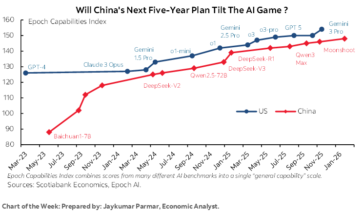
- …but catching up on AI may be more difficult
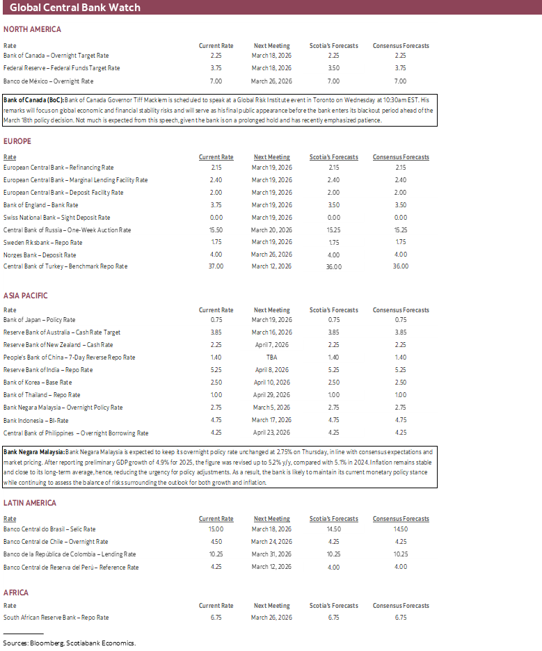
- BoC’s Macklem to speak on stability, offer GDP reaction
- Bank Negara expected to hold as ringgit hits psychological levels
- Australia’s economy expected to post strong growth again
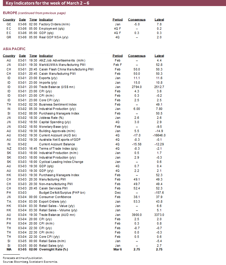
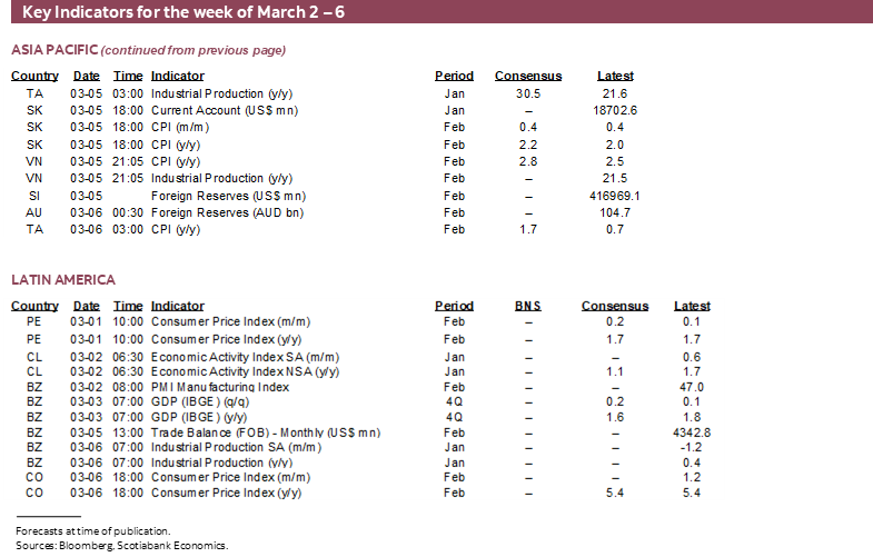
- CPI: Eurozone, Chile, Colombia, SK
- Global macro
Chart of the Week
This week’s ‘big three’ developments will include the following considerations along with a handful of other relatively more minor considerations. All three could become awkwardly entangled with one another.
One is Friday’s release of the world’s single most important macroeconomic indicator (nonfarm payrolls) that could inform pricing and timing of the Federal Reserve’s next move. The effects could ripple through the rates and currencies complexes and risk assets.
Two is China’s National People’s Congress that unfolds over the second half of the week into the next one. An awful lot has changed since the last one with markets watching closely for adjustments to macroeconomic policies and targets. Tariffs being one of them. A second being what Jay Parmar’s chart of the week on the front cover is getting at. China’s best AI model capabilities have persistently lagged the best capabilities of US AI models as measured by the Epoch Capabilities Index. Adjustments to China’s tech ambitions and self-reliance upon AI as a growth engine could be just as important to the NPC’s plans as dealing with trade tensions—and perhaps more so.
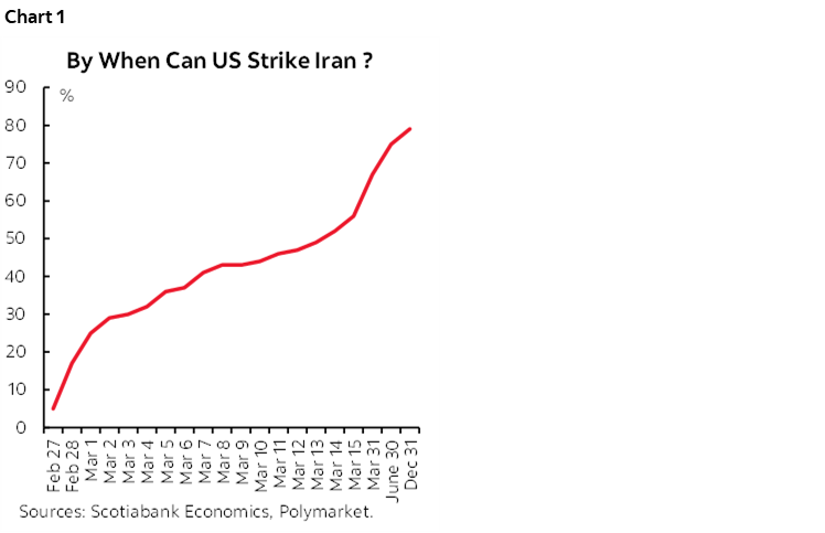
Three is developments around Iran. An awful lot of hardware has been called into the region, stoking concern that strikes may be imminent. The US keeps applying pressure on Iran to give up its nuclear ambitions while Iran keeps resisting. Warning signs keep arriving, including orders to leave American embassies in the region. For what it’s worth, the lottery ticket crowd is betting that the US doesn’t strike Iran until at least the following week, but the market odds of an attack this coming week are expected to roughly double (chart 1).
NONFARM—A SICK CALL
A lot could be riding on February’s nonfarm payrolls call when we get the numbers on Friday. Ditto for what happens to the unemployment rate. No chance of a policy rate change is priced for the March 18th FOMC decision with very little priced for the April 29th decision. If what follows is on the mark, then the reward may lie in paying the nearer term contracts in fed funds futures and OIS. That doesn’t require conviction that the Fed will cut in March, just the insertion of a little more chance until we hear the views of Committee members.
Step 1: What Drove January’s Payroll Gain?
The first step toward explaining the February nonfarm payrolls call is to understand what drove January’s report and hence whether the effects could reverse.
Touting the strength of the US labour market because of the surprise 130k gain in payrolls during January was basically the same as saying it’s a good thing to have so many people sick. That’s because the worst January flu season on record was responsible for boosting related hiring in the health sector. After all, every other indicator of the US job market going into the January report in early February was looking rather weak.
Of the 130k nonfarm payroll gain in January, 124k of the jobs were in the health and social services sectors. Within those sectors, 82k jobs were created in health care of which ambulatory care services including outpatient services were the biggest component (+50k), followed by hospitals (18k) and nursing and residential care facilities (13k). A sector that makes heavy use of on-call workers had all hands on-deck among doctors, nurses, and support workers as cases mounted.
Take that out health and social security and job growth was up a paltry 6k, or very close to my zero call for January. Where I got it wrong was on failing to understand how much of a surge of health hiring would be driven by influenza as an offset to expiring Affordable Care Act subsidies at the end of December.
Charts 2–4 show examples of the surge in influenza rates and hospitalizations. The season started later than seasonally normal and reached an historic high in January.
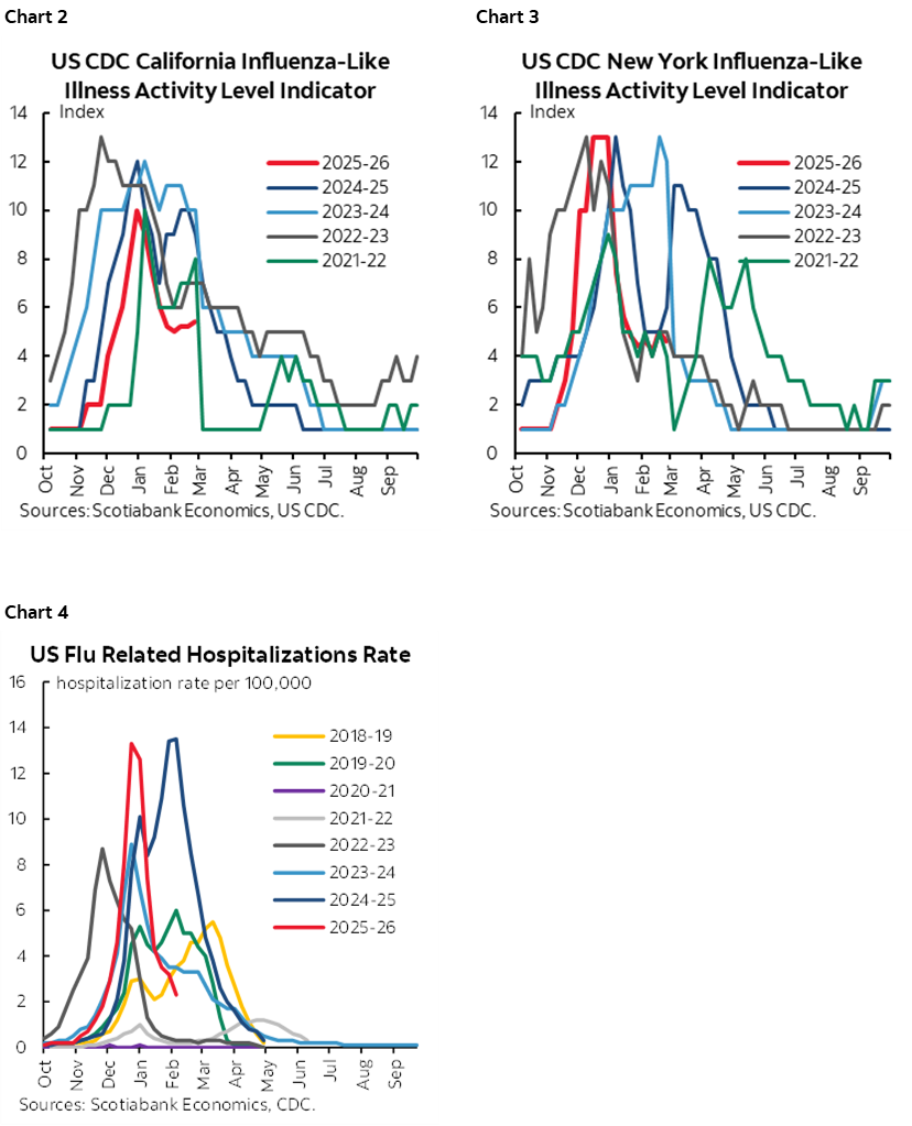
Chart 5 shows that seasonal hiring for health workers tends to pick up from September to December to prepare for coming sickness once vacations are over and schoolkids are back to licking their desks, rubbing their eyes, chewing on pencils and drinking from fountains among the cleaner examples of how viruses spread. The adults are worse!
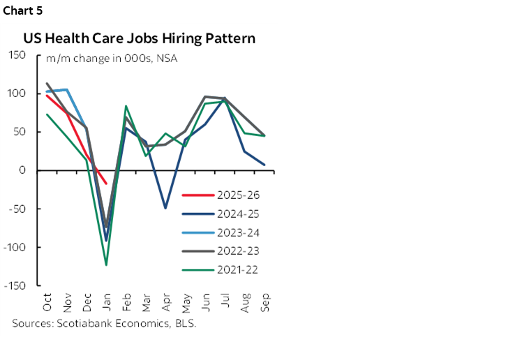
Except that this time around, the later start to the season created a sense that over-hiring had occurred over September–November which resulted in too little hiring in December compared to seasonal norms (charts 6–8). That effect coupled with a massive surge of influenza cases across the country drove January healthcare worker reductions to be much lower than seasonally normal (chart 9), hence the seasonally adjusted gains after applying compensating seasonal adjustment factors. I believe this argument dominated January nonfarm payrolls.
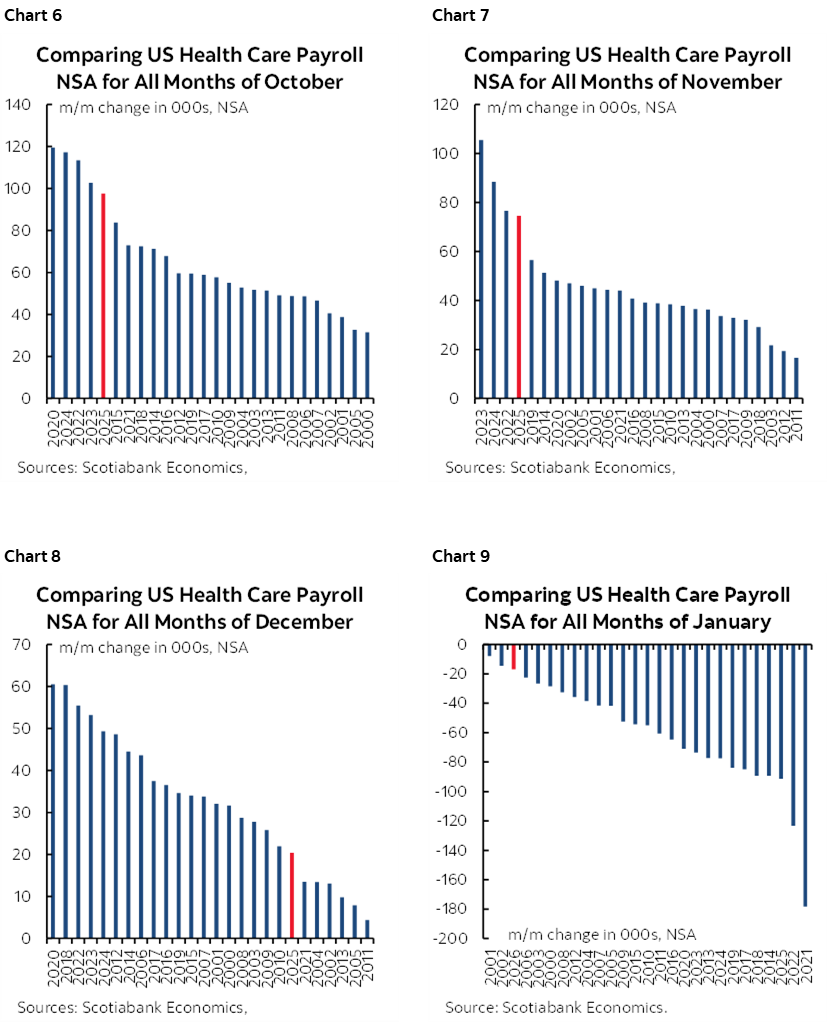
In fact, the 124k health and social security jobs that were created in January in seasonally adjusted terms—two-thirds of which were in the health care sector—was an all-time record for a month of January.
Step 2: The Hangover
That’s unlikely to repeat this time, thereby failing to mask the underlying weak trend in hiring ex-health and social services. Influenza rates have already been coming well off the peak at a quicker pace than in prior years (charts 2, 3 again). With this observation should go less health sector on-call workers through the reference period (nonfarm) and reference week (household survey).
A Downside Trend for Health Sector Hiring?
It could be that a bad flu season temporarily interrupted the aftereffects of expired Affordable Care Act subsidies that ended as the calendar flipped over to 2026. Studies like this one use a model to suggest that 286k to 340k jobs might be lost this year because of the ACA expiration. The authors reasonably reckon that there are direct and indirect effects on jobs. One is less appetite to hire. The other is the indirect effect that forces folks to spend more on pricier insurance options or leads millions to lose their insurance. Those effects probably drive higher precautionary saving and hence less consumption growth with adverse effects upon hiring. In addition to model uncertainty is uncertainty toward timing the losses and distributing them over the year.
Other Drivers
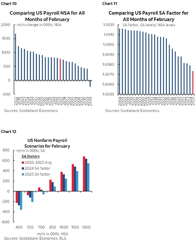
As for other drivers, February is normally a seasonal up-month for hiring (chart 10) that is controlled through a steady pattern of the lowest seasonal adjustment factors on record over recent years when comparing like months in history (chart 11). Reasonable scenarios around these two considerations point to more downside risk than upside risk this time (chart 12).
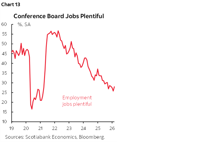
What consumers signal about the availability of jobs as indicated by the consumer confidence ‘jobs plentiful’ gauge is at its lowest since early 2021 (chart 13).
Initial jobless claims only inform the net picture between potential job losses and replacement hiring without telling us much of anything about the pace of job growth. Nevertheless, they remained in the low 200ks in the January and February nonfarm reference periods.
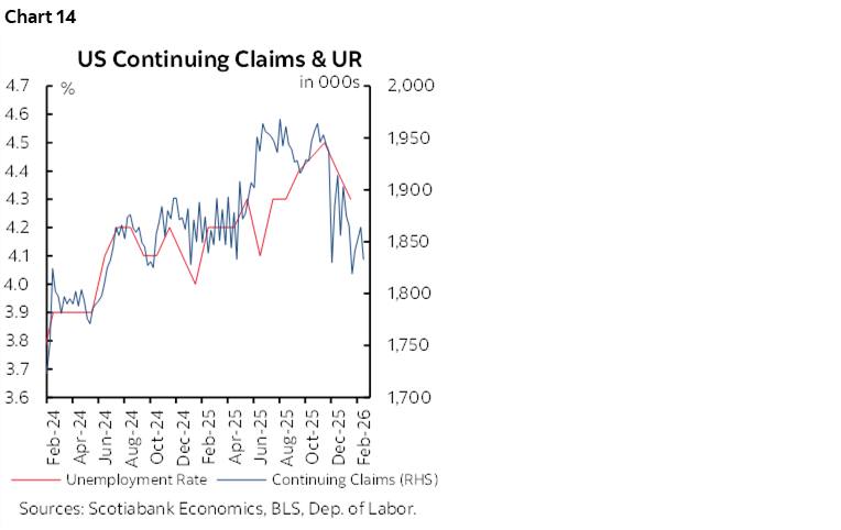
Volatile continuing claims might indicate some upside risk to the unemployment rate given the correlations (chart 14).
We’ll learn more about other readings on the health of the job market over the coming week. Weekly ADP private payrolls are tracking a monthly ADP gain of around 40–50k. February’s reading arrives on Wednesday. Challenger job layoffs (Thursday), ISM-manufacturing-employment (Monday), ISM-services-employment (Wednesday) and Revelio’s nonfarm measure (Thursday) will round out our understanding of the overall health of the US job market.
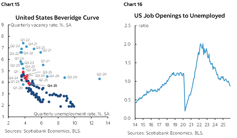
As for the equilibrium state of the overall US job market, it’s not bad, but could be better. Chart 15 shows the so-called Beveridge Curve. Where we presently sit is in the middle zone between the relationship between the job vacancy rate and the unemployment rate. It’s neither too hot nor too cold. Nevertheless, the shortages of job openings relative to the number of unemployed as signalled by two months of readings beneath one in chart 16 is disturbing if it continues. That would signal a turn of events toward job shortages that we haven’t seen in the US since April 2021 in the early days of recovering from the pandemic.
The Household Survey May Collapse
Normally the BLS would incorporate revised population counts in the January version of the household survey from which the unemployment rate is derived. This year that was delayed possibly until this report for February. I say possibly because the MLS has merely said they would do as “as soon as practicable.”
The effects could be profound in terms of large expected declines in the household survey’s measure of employment and the size of the labour force. This was first reviewed here.
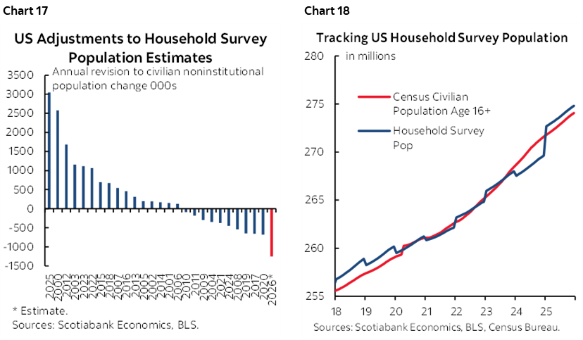
The purpose of the annual population count revisions is to benchmark what the BLS has been applying in terms of assumed population growth by month to what the Census Bureau estimates to have been the population change. They do it once per year only to the single month and do not incorporate revisions stemming from the updated population counts over prior months. That’s why there is always a discrete jump or drop in January’s estimates of the noninstitutionalized population 16+ within the household survey every January off of which employment and labour force changes are then derived.
This time, however, they'll be revising down. By a lot. That’s because ever since January of last year, the BLS has been using the CBO’s projected level of population counts as at that time and based on the 2024 vintage. This means they’re using population counts dating back to before ‘Inauguration Day’ after which immigration policy tightened rather sharply.
How much of a difference could this make? I tentatively figure that using current Census Bureau counts as at January this year would revise down the BLS estimate of the 16+ noninstitutionalized population by about 1.25 million people. This difference is derived from tracking the Census Bureau’s monthly population counts up to the present and the BLS household survey’s counts for the 16+ noninstitutionalized population. This would be a record downward revision as shown in chart 17 that shows this estimate along with annual population count revisions normally in January of each year. Chart 18 shows how the BLS measure of the 16+ noninstitutionalized population is presently overshooting the Census Bureau’s estimates.
If we apply a steady 59.8% emp:population ratio from this latest report, then the household survey's measure of employment could be revised down by about 750k jobs in February’s report next month as a one-off level adjustment. If we also apply a steady labour force participation rate of 62.5% from this latest report, then the labour force would be revised down by about 780k.
Because of this delay in revising population counts, January’s estimated 528k gain in employment and 387k gain in the labour force were misleading. Both would have probably been strong negatives if not for the delayed incorporation of more realistic population counts.
CHINA’S NATIONAL PEOPLE’S CONGRESS—A NEW FIVE-YEAR PLAN
China sets goals for 2026 and rolls out the new 15th five-year plan this week. The Two Sessions meetings run from March Wednesday 4th to March 11th. The last plan was set in the early days of the Trump Presidency and before ‘Liberation Day.’ Much has changed since.
The Chinese People's Political Consultative Conference (CPPCC), a political advisory body, kicks it off before the NPC session to debate, discuss and recommend on the Five-Year Plan draft (2026–2030) and the annual Budget.
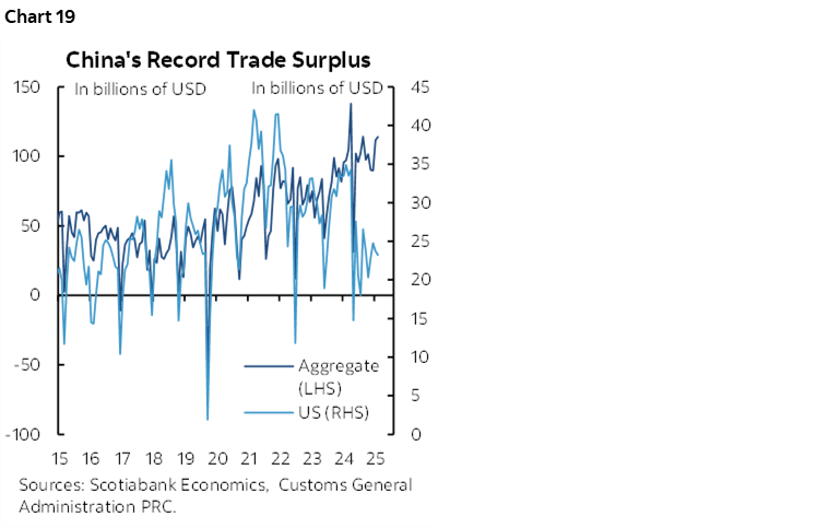
The NPC may set a growth target for 2026 that is similar to what was achieved in 2024 and 2025, or around 5%. A lower target is feasible and could signal adjustment difficulties to trade tensions with the US that have found other outlets (chart 19), but also ongoing problems stemming from falling property prices and hence relatively inelastic demand for money, China’s deterioration in competitiveness compared to other parts of Asia, and demographic challenges.
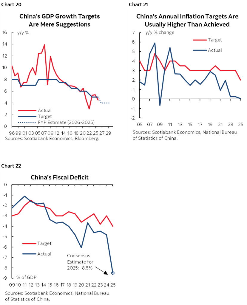
Treat the growth target with scepticism (chart 20). Ditto for the inflation target that is almost always missed (chart 21). Another ditto for fiscal deficit targets that are routinely missed (chart 22).
The Chinese government will also discuss economic, political and social priorities for the year with China watchers closely scrutinizing the discussions and the potential for an ongoing purge of China’s military.
CENTRAL BANKS—NONFARM REACTIONS
Central banks will be rather quiet for a while until they all come out of the woodworks around mid-March, but there will be a thing or two to follow this week. It will also be the final week for FOMC communications before slipping into blackout on March 8th before the March 18th decision, so watch for Committee members’ reactions to Friday’s payrolls. There is a high bar to moving the policy rate at that meeting barring a nasty nonfarm surprise.
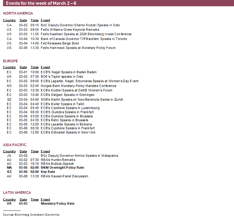
Bank Negara Malaysia—An Eye on the Ringgit
The only policy decision will be offered by Bank Negara Malaysia on Thursday. No action is expected as the policy rate is likely to stay at 2.75%. Growth is solid at 6.3% y/y. Inflation is low at 1.6% y/y. Negara has not changed its policy rate since July of last year. One thing to watch other than updated projections will be remarks about currency strength. The ringgit has appreciated by about 18% to the dollar since mid-2024 including a recent 8% move since September. Currency strength could challenge export growth and put downward pressure on inflation. To many Malaysians, approaching 3.80 to the dollar is of psychological importance and with a potential election call at some point this year.
Bank of Canada—So, About that GDP Print
Governor Macklem is back again for another fireside chat this time at Toronto’s Global Risk Institute on Wednesday. He has preached patience to date as complex supply and demand forces upon the inflation outlook are assessed. Key may be any reaction to Q4 GDP that was weaker than the BoC had expected but he’s likely to fade that because so much of it was due to a massive inventory drag effect while the domestic economy performed decently (recap here). Macklem’s appearance is billed as a focus upon global economic and financial stability risks.
GLOBAL MACRO—TYING UP LOOSE ENDS
Several countries will be releasing their final sets of data—covering last quarter's GDP, February PMIs, and inflation readings—before a wave of central banks lines up for their monetary policy meetings starting mid-March. Jay Parmar and I summarize them.
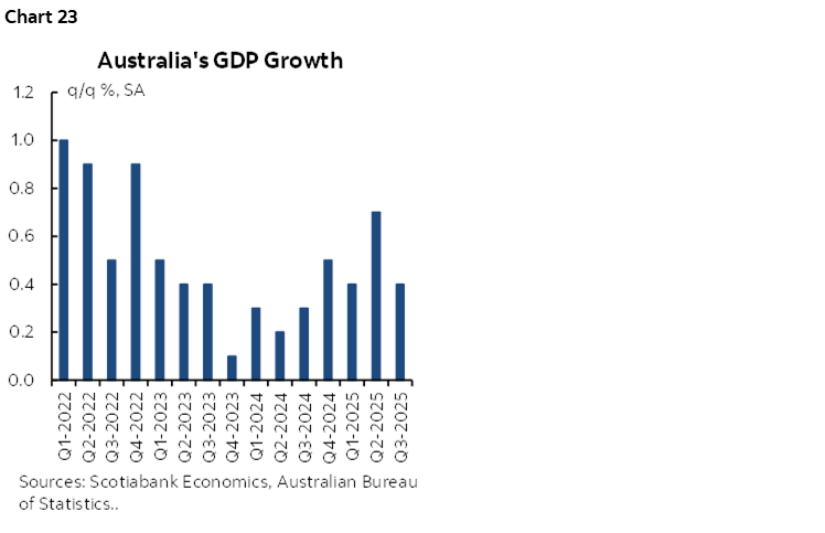
A key release will be Australia's Q4 GDP number (Tuesday), which is expected to show another quarter of strong economic growth (chart 23). Private demand has continued to strengthen and is being led by consumption and investment-and another stronger-than-expected print would influence RBA hike pricing, although the bar remains high for another 25bps hike in March but is mostly priced for April.
On the same day, Brazil's weak Q4 growth release is expected to strengthen the case for a 50bps cut in March, in line with earlier guidance from the central bank.
PMIs, meanwhile, will offer insights into ongoing economic momentum and close tracking of Q1 economic growth. China reports both its private and state PMIs on Tuesday, with the former expected to continue signaling expansion while the state-sector gauge remains sluggish. Switzerland and Mexico will release their PMIs on Monday, followed by Spain and Brazil on Wednesday.
The US updates ISM-manufacturing (Monday) and ISM-services (Wednesday) readings that will inform economic momentum in February along with measures and anecdotes covering order books, pricing plans, hiring and cap-ex plans. Also watch for vehicle sales that are expected to post a mild rebound (Tuesday).
Canada also refreshes the S&P manufacturing (Monday) and services (Wednesday) PMIs plus the Ivey gauge (Friday) and Q4 labour productivity that is likely to fall (Wednesday).
Finally, around a dozen countries will publish their February inflation readings this week. Italy, along with the Eurozone aggregate, begins on Tuesday, followed by Philippines & Switzerland on Wednesday; South Korea and Sweden on Thursday; and Chile, Colombia and Taiwan on Friday. None of these releases are expected to materially influence each country's upcoming monetary policy decisions. The key exception is Chile, where another soft inflation print (chart 24) would further support market expectations for a 25bps cut in March. For Colombia, the focus will be on the inflation expectations (chart 25), which spiked unexpectedly in January and will be closely watched by the central bank for signs of persistence.
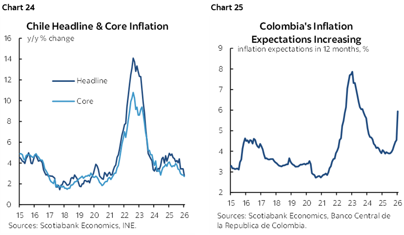
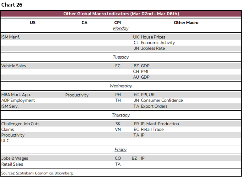
Chart 26 shows the rest of the global indicators scheduled for the week.
DISCLAIMER
This report has been prepared by Scotiabank Economics as a resource for the clients of Scotiabank. Opinions, estimates and projections contained herein are our own as of the date hereof and are subject to change without notice. The information and opinions contained herein have been compiled or arrived at from sources believed reliable but no representation or warranty, express or implied, is made as to their accuracy or completeness. Neither Scotiabank nor any of its officers, directors, partners, employees or affiliates accepts any liability whatsoever for any direct or consequential loss arising from any use of this report or its contents.
These reports are provided to you for informational purposes only. This report is not, and is not constructed as, an offer to sell or solicitation of any offer to buy any financial instrument, nor shall this report be construed as an opinion as to whether you should enter into any swap or trading strategy involving a swap or any other transaction. The information contained in this report is not intended to be, and does not constitute, a recommendation of a swap or trading strategy involving a swap within the meaning of U.S. Commodity Futures Trading Commission Regulation 23.434 and Appendix A thereto. This material is not intended to be individually tailored to your needs or characteristics and should not be viewed as a “call to action” or suggestion that you enter into a swap or trading strategy involving a swap or any other transaction. Scotiabank may engage in transactions in a manner inconsistent with the views discussed this report and may have positions, or be in the process of acquiring or disposing of positions, referred to in this report.
Scotiabank, its affiliates and any of their respective officers, directors and employees may from time to time take positions in currencies, act as managers, co-managers or underwriters of a public offering or act as principals or agents, deal in, own or act as market makers or advisors, brokers or commercial and/or investment bankers in relation to securities or related derivatives. As a result of these actions, Scotiabank may receive remuneration. All Scotiabank products and services are subject to the terms of applicable agreements and local regulations. Officers, directors and employees of Scotiabank and its affiliates may serve as directors of corporations.
Any securities discussed in this report may not be suitable for all investors. Scotiabank recommends that investors independently evaluate any issuer and security discussed in this report, and consult with any advisors they deem necessary prior to making any investment.
This report and all information, opinions and conclusions contained in it are protected by copyright. This information may not be reproduced without the prior express written consent of Scotiabank.
™ Trademark of The Bank of Nova Scotia. Used under license, where applicable.
Scotiabank, together with “Global Banking and Markets”, is a marketing name for the global corporate and investment banking and capital markets businesses of The Bank of Nova Scotia and certain of its affiliates in the countries where they operate, including; Scotiabank Europe plc; Scotiabank (Ireland) Designated Activity Company; Scotiabank Inverlat S.A., Institución de Banca Múltiple, Grupo Financiero Scotiabank Inverlat, Scotia Inverlat Casa de Bolsa, S.A. de C.V., Grupo Financiero Scotiabank Inverlat, Scotia Inverlat Derivados S.A. de C.V. – all members of the Scotiabank group and authorized users of the Scotiabank mark. The Bank of Nova Scotia is incorporated in Canada with limited liability and is authorised and regulated by the Office of the Superintendent of Financial Institutions Canada. The Bank of Nova Scotia is authorized by the UK Prudential Regulation Authority and is subject to regulation by the UK Financial Conduct Authority and limited regulation by the UK Prudential Regulation Authority. Details about the extent of The Bank of Nova Scotia's regulation by the UK Prudential Regulation Authority are available from us on request. Scotiabank Europe plc is authorized by the UK Prudential Regulation Authority and regulated by the UK Financial Conduct Authority and the UK Prudential Regulation Authority.
Scotiabank Inverlat, S.A., Scotia Inverlat Casa de Bolsa, S.A. de C.V, Grupo Financiero Scotiabank Inverlat, and Scotia Inverlat Derivados, S.A. de C.V., are each authorized and regulated by the Mexican financial authorities.
Not all products and services are offered in all jurisdictions. Services described are available in jurisdictions where permitted by law.