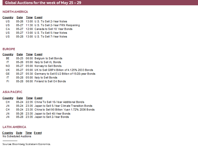
Next Week's Risk Dashboard
- Bond selloff — drivers and durability
- Not so fast with Fed hikes
- Annual benchmarking revisions may wipe out nonfarm payrolls…
- …and along with incremental evidence may rebalance the dual mandate risks
- Canadian bank earnings — a high bar after a massive run
- Canada’s economy — solid growth?
- RBNZ’s forward rate path will do the talking…
- …right before the NZ Budget
- BoK’s balancing act
- SARB expected to hike
- BoC, ECB to focus on risks to financial stability
- Inflation watch: US, Eurozone, Australia, Japan
- Global macro
- US markets shut Monday
Chart of the Week
Even though it moderated over the back half of this past week, is this bond selloff for real with much further to sustainably run? Or is it a tactical buying opportunity for fixed income investors?
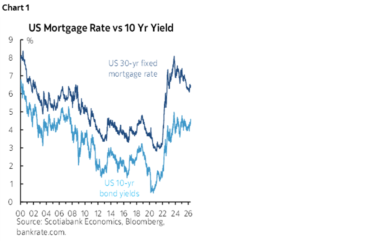
The US ten-year Treasury yield has indeed risen by roughly 60bps over about the past three months with about 25–30 bps of that very recently. In the grand history of bond selloffs, this one’s a 98-pound weakling. The nominal US 10-year yield is still within the broad trading range that has been in place since 2023 (chart 1). We’ve seen peaks in US 10-year yields like today’s earlier last year, in 2024 and in 2023. The aberration was the pandemic’s lows and the decade-long period of falling nominal yields post-GFC.
Going down the list of possible drivers of the selloff may inform whether this has further room to sustainably run or is just another range-bound trade and possibly poised to rally. Spoiler alert—I’m unconvinced it’s the former.
Fiscal Deficits & Crowding Out
Some of the concern stems from the US fiscal position but that is probably overstated because it isn’t judged in a holistic overall sense that considers the broad flow of funds position of the US economy.
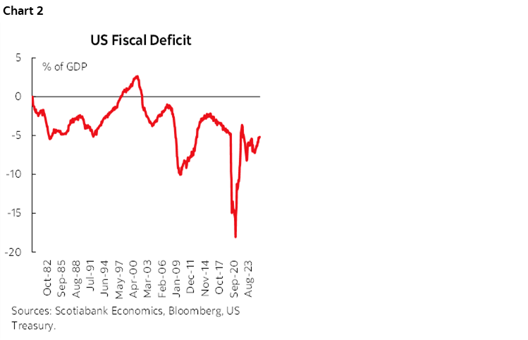
Chart 2 starts with Washington’s deficit. It’s big and ugly. Tax cuts keep getting provided by leveraging away the future when the higher interest bill, debt payback, and benefit reductions are incurred by future generations to pay for it. That comes at a cost to long-run growth.
But is it crowding out overall savings in a way that could cause even higher bond yields? That’s less clear in several respects.
On the surface, answering the question whether deficits cause higher interest rates poses the same dilemma to me as when I recall doing the CFA exams quite a few moons ago. I remember thinking ‘do I want to pass, or give the correct economist’s answer?’ I plugged my nose and passed. Good boy. But in reality, deficits don’t anywhere and everywhere cause higher interest rates. It depends.
One thing it depends upon is not in America’s favour. The US is chronically running pro-cyclical fiscal policy in an economy that doesn’t need constant deficit-financed pump-priming. It’s an economy in excess aggregate demand versus one with a vacuous pit of slack waiting for governments to fill it in. Even then, don’t get economists started on whether this works in the long-run as much has been learned from more interventionist periods in economic policy in past decades.
Regardless, an economy that was generating inflationary pressures before the war with Iran that further amplified those pressures isn’t helped by constantly inflaming the deficit as under Trump 1.0 and 2.0. If we’re right on downside growth risks, then excess demand conditions of the US economy may be reduced going forward which could help to alleviate some of the pressures.
The National Saving and Borrowing Picture
But another big consideration involves how the rest of the economy-wide borrowing and saving picture has been changing.
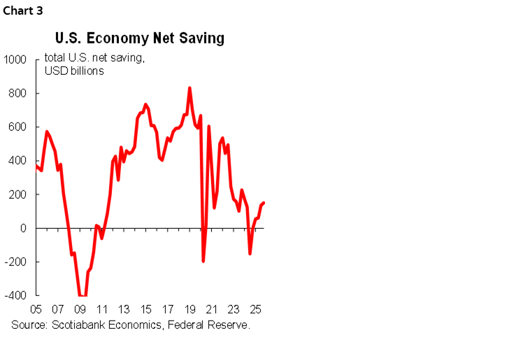
For starters, chart 3 shows the overall net saving status of the US economy using the Federal Reserve’s financial accounts of the US economy. High dissaving by the government is being offset by relatively high saving activity by businesses and households. The US needs to be careful it doesn’t have governments borrowing so much more rapidly as to drive a negative net saving picture but it’s not there. Yet. The net saving position of earlier periods is indeed being eroded.
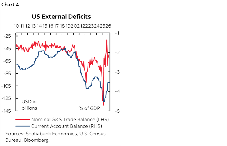
We can break that up by broad sectors using different sets of accounts. For one, the US has reduced its current account deficit with the rest of the world from the peak deficits in the pandemic but it remains high (chart 4). Some policies may further aggravate the balance.
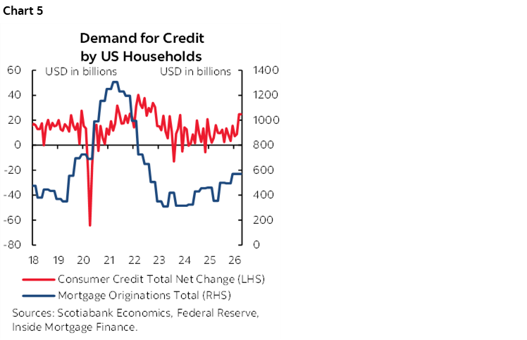
Second, borrowing is the other way of looking at the net demands on funding markets. Competition for borrowing also has to include household debt originations that remain well off the peaks coming out of the pandemic when activity surged and ‘nesting’ behaviour was more prevalent across spending patterns (chart 5). Uncertainty may further restrain borrowing.
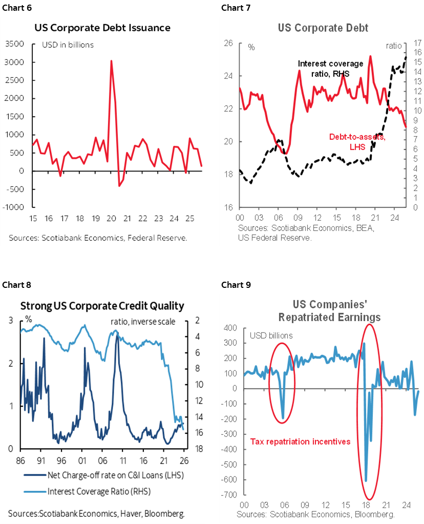
Third, corporate debt issuance is also off the pandemic peak (chart 6), debt to assets has been falling (chart 7), and interest coverage is sky high and this is driving low net charge-off rates (chart 8). Growth in retained earnings is strong and companies have been bringing foreign earnings retained abroad back home more recently (chart 9).
In other words, it’s feasible that deficit financing is sustainable in the short-run because of this overall framework of economy-wide saving and borrowing in addition to the privileges of being a reserve currency. It’s unclear whether private borrowing is being crowded out by Washington’s largesse, or if private borrowing would be relatively soft in any event which is where I lean.
A country like Canada, on the other hand, would probably be in trouble with deficit:gdp ratios like the US and absent a major reserve currency.
Fed Hikes?
Bonds have cheapened partly because markets have pivoted toward pricing Fed rate hikes. A little over a quarter point of rate hikes is priced into year-end and early next year compared to early March when markets were leaning toward pricing 50–75bps of cuts.
In my opinion, there is a very high bar to the FOMC pivoting toward hikes as a consensus call with a new incoming Chair in Kevin Warsh. It would be the granddaddy of all about-faces. It could also prompt renewed threats to Fed independence.
The Fed is already restrictive by contrast to many other global central banks like the BoC, ECB, BoJ etc. The policy rate is above most reasonable estimates of neutral.
Most of the present concern surrounds the price stability part of the Fed’s mandate. That’s relatively more transparent for markets to observe than risks to the full employment part of the mandate that also concerns the FOMC. Markets and forecasters can observe commodity prices in real time, make assumptions, and translate this into expectations for future inflation on top of pre-existing conditions. It’s still difficult, but less opaque than forming expectations on the future state of the job market.
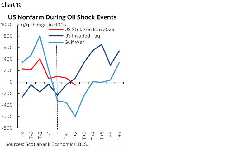
There are two risks concerning the job market: how it evolves and coming annual revisions. How it evolves will be patiently informed by data, but payrolls often suffer in energy shocks (chart 10) and the FOMC minutes noted discussions within Districts about weak hiring intentions.
On revisions, that’s deserving of a separate section.
Coming Annual Revisions May Wipe out Jobs
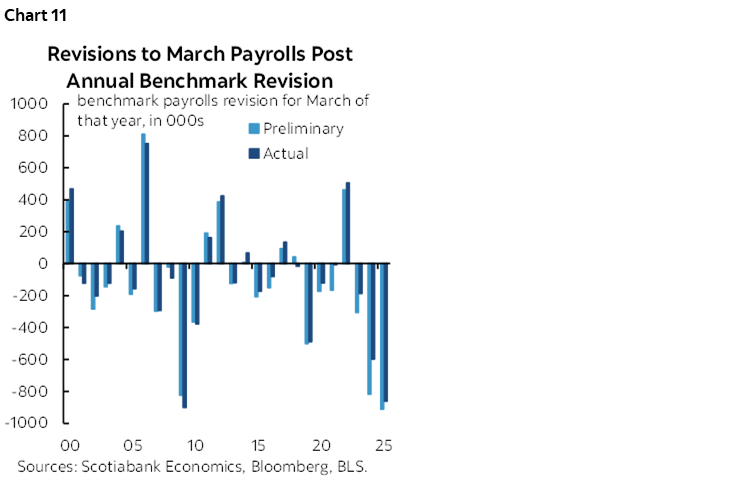
We’re probably faced with overstated job gains and will find out by how much when the preliminary annual benchmarking revisions arrive in September, likely about one week before the September FOMC meeting.
The past couple of years have seen blow outs in terms of negative revisions (chart 11). Last year’s revisions that apply to March payroll levels and prior months stretching back to the prior April took monthly payrolls down by an average of about 70k, or around 900k in total. This time around, it would take monthly average revisions of about -60k over April 2025 to March 2026 in this September’s revisions to wipe out 2026Q1 nonfarm payroll gains.
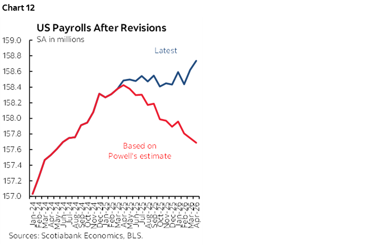
Chair Powell used to say that he thought monthly negative revisions this time would be around –60k. He stopped repeating this a few press conferences ago. The FOMC should resurrect such talk. Yet if this were to happen, then chart 12 shows that payrolls would go from a tepid trend to a clear downward trend. It would position the payrolls data we have seen to date since April 2025 as, well, rather fake.
The FOMC would face a real policy conundrum in that context with probably rising inflation and probably negative payroll revisions alongside what may be weak hiring as the shock effects ripple through the labour market over coming months and quarters.
We don’t have much ability to firmly assess the potential size of this year’s benchmarking payroll revisions since it’s based off quarterly state level data that heavily lags and that is heavily subject to its own revisions. Further, the BLS has tweaked some of its methodologies. Yet it’s unclear that the BLS’s revised methodologies will mean lower annual revisions this time.
Birth-Death Model Adjustments May be Overstating Job Gains
One source of those revisions is to go back and review what was done with birth-death model adjustments. When the BLS estimates payrolls, it seeks to control for net business openings and closings that may not be appropriately captured in its sampling. This approach can fail to adequately capture the effects on hiring of net business openings at moments of rapid change, like tariffs, commodity shocks, AI, shifting immigration policy, etc.
Birth-death model adjustments to the estimated change in monthly payrolls have been subject to upward drift since the pandemic struck as shown in the admittedly ugly chart 13. The adjustments are seasonally unadjusted and vary with the months (hence the variability). The difference in recent years has often meant adding hundreds of thousands more jobs each month than was the pre-pandemic norm for this approach.
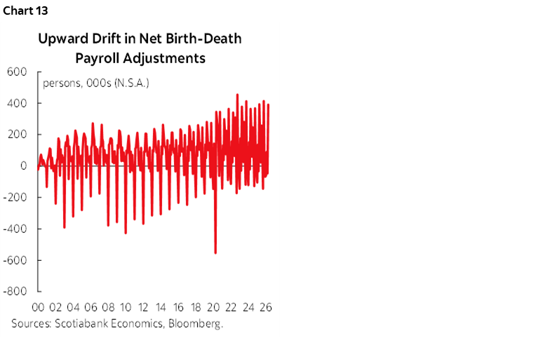
Chart 14 shows the effect it is having so far this year by comparing monthly birth-death model adjustments to payrolls in each of January through April compared to the pre-pandemic average.
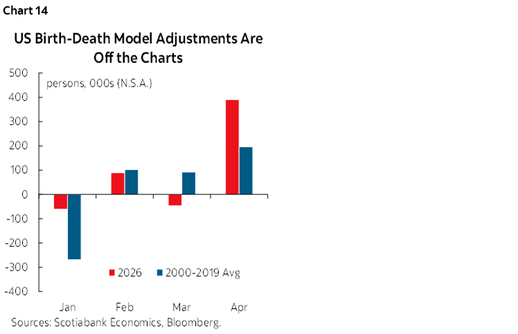
For instance, when April’s 115k seasonally adjusted job gain landed, a significant driver was the large 391k seasonally unadjusted, record-high birth-death model adjustment. If the average birth-death adjustment for months of April had instead been applied to each month this year, then April’s seasonally adjusted change in nonfarm payrolls using the same SA factors would have been a drop of about 223k instead of the reported gain of 115k.
The amplitudes at the peak adjustments are moving higher in the pandemic era which is likely overstating payrolls which is part of the reason for record annual negative annual benchmarking revisions in each of the past couple of years
I think we're teeing up another biggie this September that could put nonfarm payrolls on a clear downward trajectory from April 2025 to March 2026 when they deliver the preliminary annual benchmarking revisions.
Yet if material negative revisions land right before the September FOMC then there is the potential to restore greater balance between upside risk to inflation and downside risk to jobs that may mean a more cautious Committee regarding which direction to lean toward.
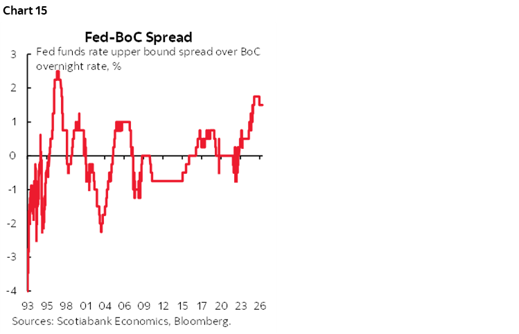
As for spillover effects, should the Fed truly move toward hiking, then presumably to make it worthwhile we’d be talking a minimum of 50bps and perhaps more. If that were to happen, the Fed versus BoC spread would hit new wides (chart 15). The currency implications combined with the cover of the Fed tightening could further raise the risk of BoC tightening. We’re nowhere near such a connection until we see what the Fed does but bear it in mind as an additional argument potentially affecting the BoC.
Other Assorted Treasury Drivers
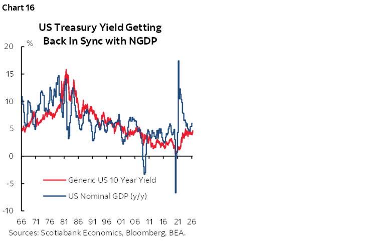
Over time the 10-year should ride around NGDP expectations (chart 16). Assumptions around potential real GDP growth plus long-term expected inflation would be a stretch to get up to 4.65% let alone sustainably higher toward 5%.
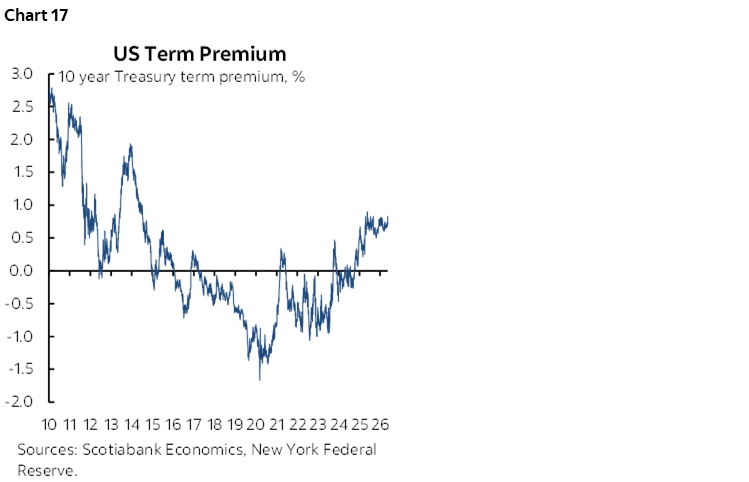
Term premia have risen (chart 17) but very suddenly against a historical pattern of abrupt swings and the estimated 10-year term premia from the NY Fed’s economists has only gone up by around 10bps above trend.
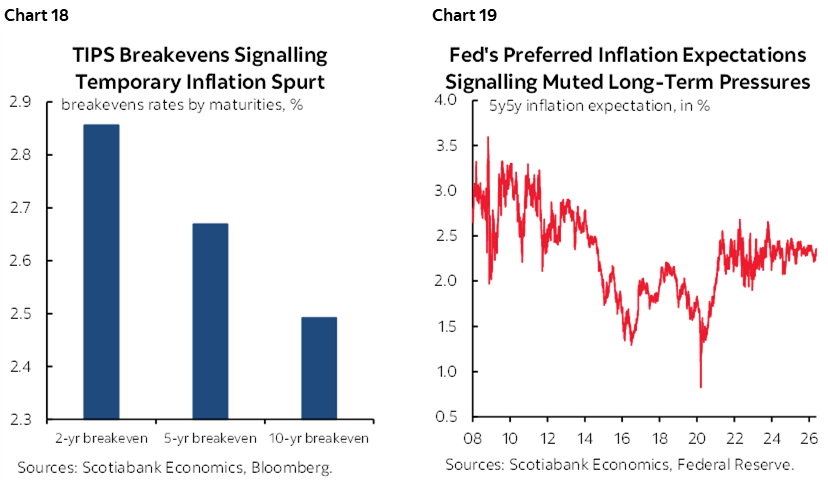
Inflation pricing has moved higher but mostly across nearer-term expectations. The US 2s breakeven rate has increased to 2.75% with the 10s breakeven at 2.4% (chart 18) while the Fed’s preferred five-year forward breakeven rate has moved up to about 2.35% (chart 19). I don’t put a lot of faith in measures of inflation expectations from markets or surveys, but for what it’s worth, the market is signalling this may be more of a short-lived inflation shock to the US that policy shouldn’t overreact against.
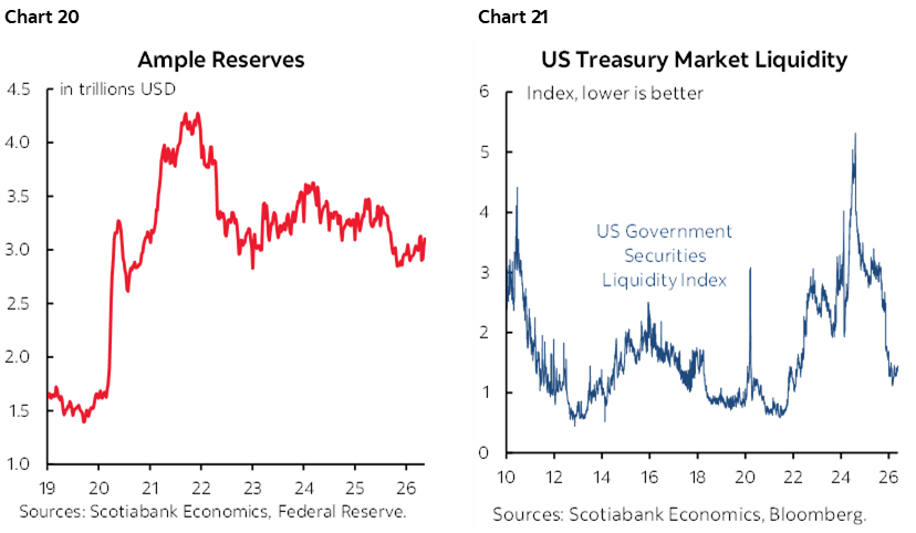
It’s not clear that liquidity has been impaired to the point to which bonds are suffering. Far from it in my opinion. For instance, reserves continue to climb to US$6¾ trillion (chart 20). Measures of bond market liquidity are healthy; chart 21 shows one whereby lower is better because it measures deviations from estimated fair value on an equally weighted portfolio of Treasury securities.
Regulatory changes are being designed to potentially raise appetite for US Treasuries. The Federal Reserve’s announcements about relaxed capital standards in March, plus relaxation of the Supplementary Leverage Ratio plus the Genius Act’s effects on stablecoin demand are among the considerations. Quantifying the potential impact net of how other investors respond is a key uncertainty.
Warnings
There are many more potential drivers of bond yields. Among the ones not discussed above are intangibles like sentiment including market manipulation as a risk to the Treasury market. Investors face enough uncertainty. They cannot also deal with EM-like tendencies whereby policy front-running by the administration creates a more uncertain investing regime at higher risk. The administration might not be able to resist jawboning or undertaking policy actions that would seek to artificially bring yields down.
Incoming Chair Warsh also needs to relatively quickly motivate the Federal Reserve to explain its plans for managing the balance sheet given his vacillating stance on the topic. He had advocated reducing it toward a more traditional, cleaner balance sheet but then moderated this guidance. It may be that Warsh will be disciplined by the bond market and broad liquidity considerations in a way that checks any desire to pursue rapid change.
As a wrap, experienced forecasters have seen many sudden bond market moves and normally set a high bar to being knocked off longer-run views by short-term moves. They speak in ranges, scenarios and simulations, not point forecasts that involve feigning precision. In fairness, however, the bond market is a notoriously complex beast that often disciplines and humbles the most experienced managers of the biggest bond pools. The US administration needs to pay heed to this and not overplay the supporting factors or further strain the risks. After all, bonds vote and have the capacity to vote out entire administrations.
CANADA’S ECONOMY—A SOLID DOMESTIC ECONOMY?
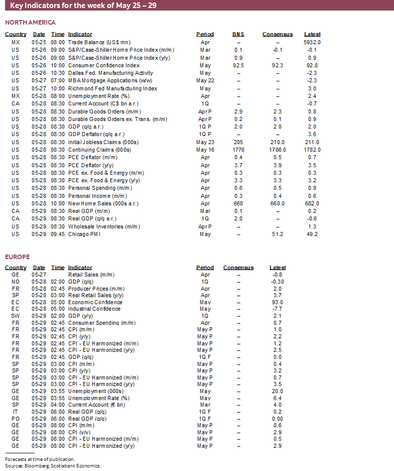
On Friday, Statistics Canada will release GDP figures for Q1 on a complete expenditure accounts basis, plus monthly GDP estimates for March, April, and any revisions to prior months.
They will be backward looking, but a round of GDP figures will help us understand more about momentum into the commodities shock. We’ll learn more about how much net slack there is in the Canadian economy and more about how the domestic economy is performing and over which the BoC has more influence than GDP.
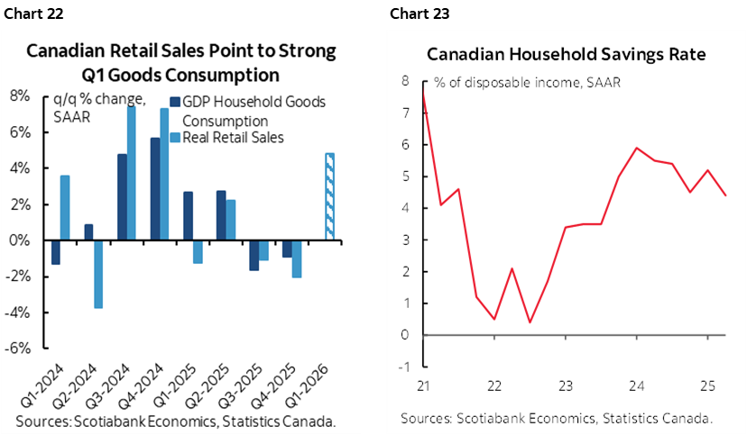
GDP is estimated to have grown by roughly 2% q/q at a seasonally adjusted and annualized pace in Q1. The consumer is tracking solid growth (chart 22). Whether that continues or not is unclear after early guidance that Q1 strength was followed by somewhat of a setback in April. When oil prices surged in anticipation of Russia’s invasion of Ukraine and the aftermath in 2022, Canadian consumers reacted by pushing their saving rate close to zero and rebuilding it later (chart 23). The saving rate, like currencies, serves as a shock absorber at least for a time.
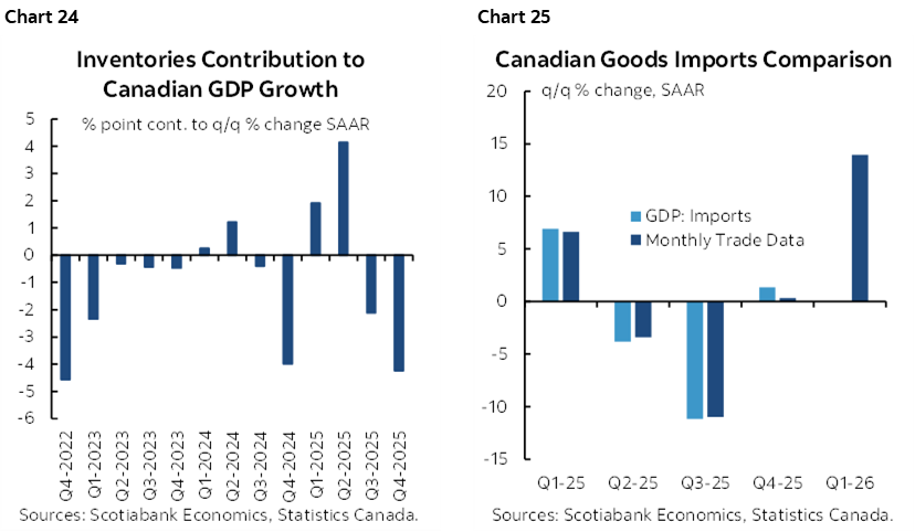
There may be a reversal of the inventory drag effect that held back Q4 GDP growth (chart 24) but that might be offset by a surge in imports that serves as a leakage effect on GDP growth (chart 25).
As for March monthly GDP on an income basis, Statcan had said toward the end of April that it was tracking ‘essentially unchanged’ as a rough guide. That was based upon trade-offs they loosely described as driven by gains in sectors like wholesale and transportation versus weakness in resources. There might be upside based upon our tracking of available activity readings.
April GDP, however, is a total wildcard. Statcan will release its preliminary estimate sans details. It’s important because it will help to inform momentum into Q2 GDP tracking.
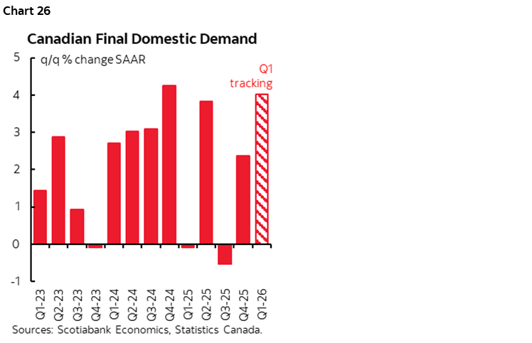
Key overall, however, may be what happens to the domestic economy as measured by final domestic demand. FDD adds consumer spending, investment and government spending. It excludes net trade and inventory effects. It’s a proxy for the health of the domestic economy and it is likely to post solid growth again after a reasonably decent prior pattern (chart 26).
Will it matter to the BoC? Slightly by way of evaluating whether Canada is adding, subtracting, or moving sideways on estimates economic slack. If we’re right with growth around 2%, then that would roughly double the BoC’s estimated noninflationary speed limit to growth and mildly reduce the small amount of spare capacity in the economy. That would be an interesting setup for inflation risk into the lagging effects of the strong gains across commodity prices.
CANADIAN BANK EARNINGS—A HIGH BAR
Canadian banks release Q2 earnings next week. The party starts with BNS (my employer), BMO and National Bank on Wednesday followed by TD, CIBC and RBC on Thursday, then Laurentian on Friday.
Chart 27 shows analysts’ average EPS expectations. They’re all expected to post earnings growth over the same quarter last year which is the somewhat appropriate comparator since earnings are not seasonally adjusted.
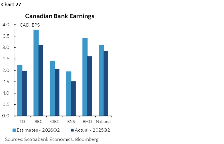
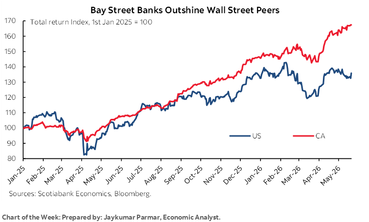
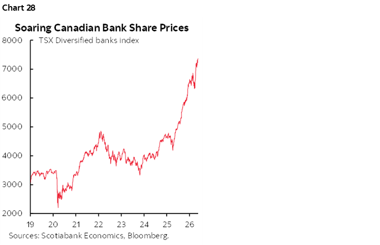
Chart 28 shows the massive surge in Canadian bank shares over the past year and Jay Parmar’s chart of the week on the front cover shows how the Canadian banks have vastly outperformed their American peers. Long undervalued, the Canadian banks have come roaring back and face a test at the halfway point of the fiscal year.
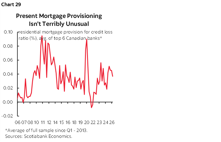
Expect a focus on credit quality. When you hear about collective provisions, be sure to put them in context which means scaling provisions to the size of the lending book. In the case of mortgage provisioning, to date the banks have merely mean-reverted on provisions relative to the total value of mortgages outstanding after abnormally low provisions and losses in the pandemic period when rates were rock bottom and supports were high (chart 29).
CENTRAL BANKS—HIKES AND CUES
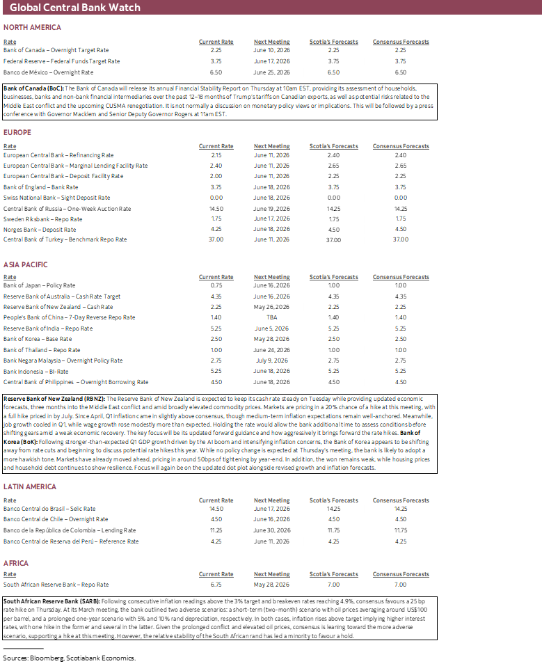
Three central banks will weigh in with decisions this week alongside assessments of financial stability from two others.
RBNZ—Updated Forward Rate Path Will Do the Talking
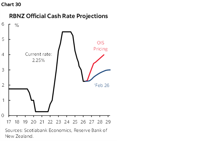
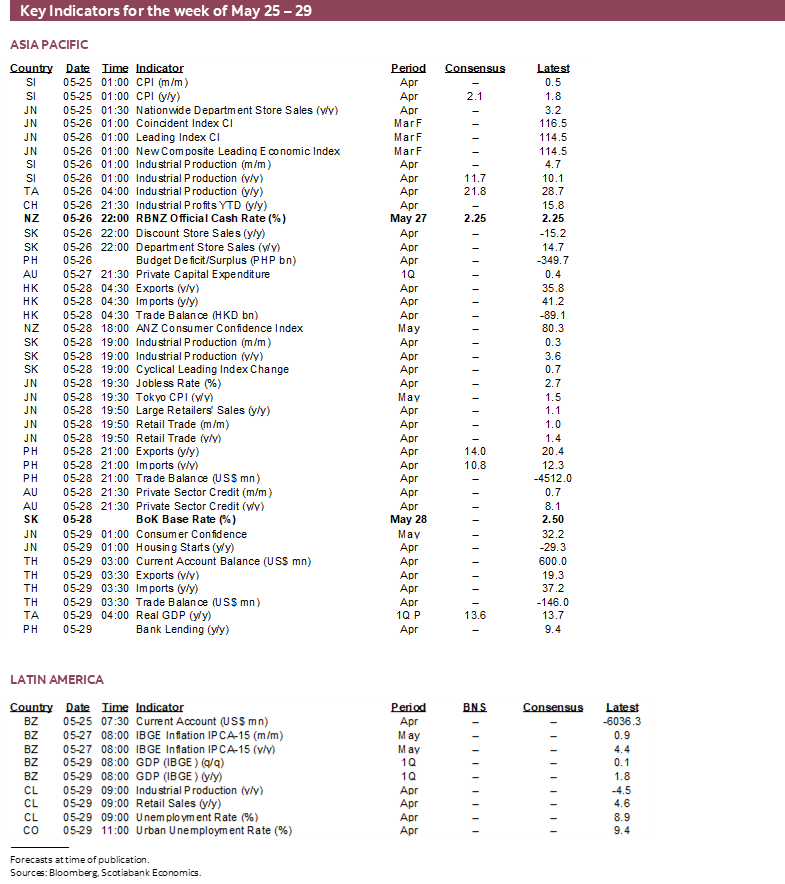
New Zealand’s central bank is widely expected to stay on hold at an official cash rate of 2.25% on Tuesday. Fresh forecasts to be delivered at this meeting may inform the bias including an updated explicit forward rate path. The prior path that was presented in February has fallen well behind market pricing (chart 30). Markets are pricing most of a hike by the July meeting and about 75bps of increases by year-end. At its last meeting on April 7th, the RBNZ cautioned that it didn’t wish to needlessly harm growth, but that it wouldn’t hesitate to act decisively if CPI inflation did not land on 2% in the medium-term.
Bank of Korea—Balancing Act
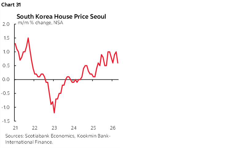
South Korea’s central bank is likely to hold its base rate at 2.5% on Thursday. Markets expect hike risk to begin to surface in the second half of the year. A strike at Samsung is estimated by the BoK to knock about ½% off of Q2 GDP growth which presumably will be regained when the strike ends. Like elsewhere, the trade off between growth and inflation risk is driving limits to patience. Watch this central bank if it tees up readiness to soon hike since it was a leader in hiking rates back in 2021 before most other central banks woke up. The won’s nearly 12% depreciation since last summer and ongoing depreciation recently has drawn attention by the Finance Ministry and the imported inflation risk may garner a hawkish reaction by the BoK. This is juxtaposed alongside stability considerations stemming from still hot hot prices (chart 31).
SARB—Cue the Action
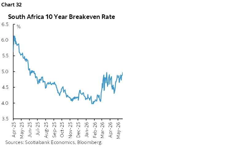
Most forecasters expect the South African Reserve Bank to hike its policy rate by another 25bps on Thursday. Deputy Governor Tshazibana said at the bank’s biannual monetary policy review on April 21st that SARB was ready to respond to the Iran war shocks. Inflation has been shooting higher to 4% y/y in April with core not far behind at 3.6% y/y. Inflation expectations measured by breakeven rates are pushing higher at 4.9% (chart 32). A hike would reinforce the scenarios that SARB laid out at its March meeting.
Bank of Canada Communications—Focus on Risks
Two events might garner some attention this week.
External part-time Deputy Governor Vincent speaks on “the labour market and structural change in the Canadian economy” on Tuesday. There will be no press conference.
Then two days later, Governor Macklem unveils the semi-annual Financial Stability Report and Financial System Survey. This event usually does not broach monetary policy topics and is by definition focused upon risks instead of base case scenarios. Treat with care.
ECB Communications—More Risks!
Minutes to the April meeting (Thursday) will follow the ECB’s assessment of risks to financial stability the day before.
GLOBAL MACRO—INFLATION WILL BE THE FOCUS
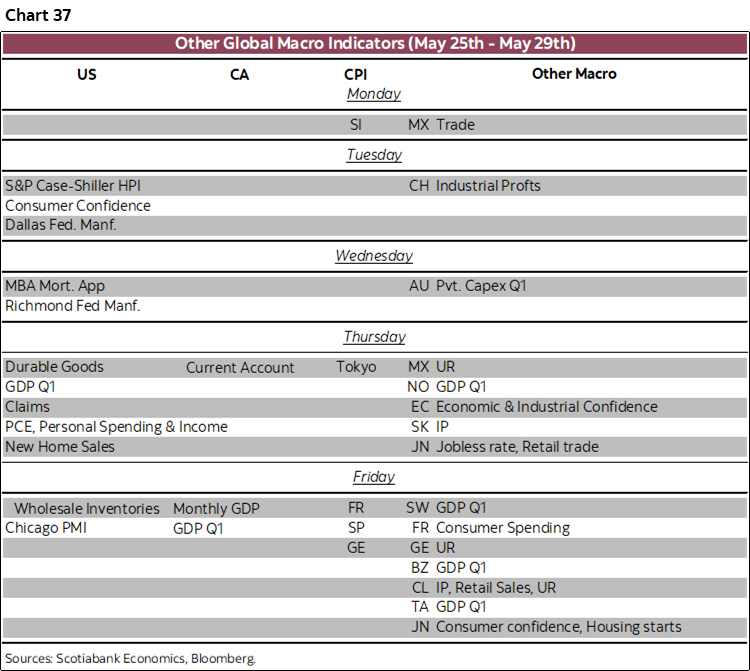
A slew of other global macro readings will also be offered and are summarized in in the accompanying table at the end. Much of the focus will be upon a round of global inflation readings.
Inflation Watch
The US, Eurozone, Japan, Australia, Brazil and Singapore update inflation measures over the coming week.
The Fed’s preferred PCE inflation gauge will be updated with April’s readings on Thursday. Total prices are estimated to rise by 0.4% m/m SA with core PCE up 0.3%. These estimates are based on what we already know about CPI, weighting differences between CPI and PCE, other methodological differences, and input from a subset of producer prices that are included in PCE. If correct, then these estimates would merely reinforce market sentiment surrounding the Fed’s outlook with volatility around any significant upside or downside surprises.
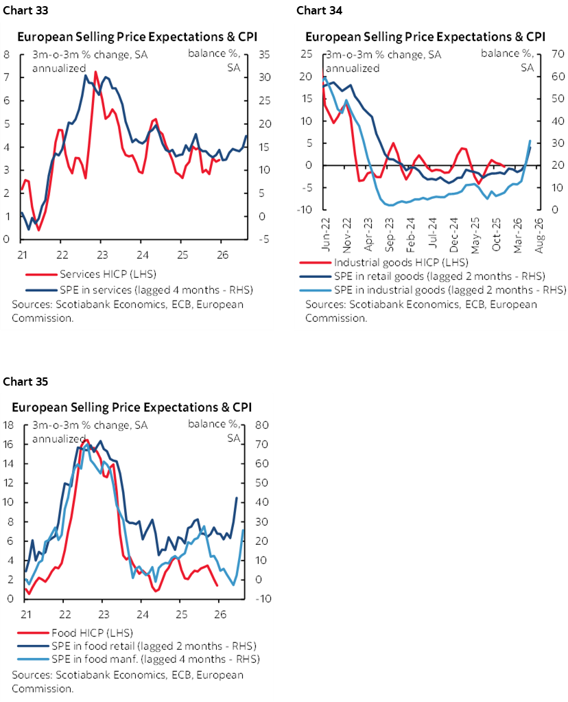
While the Eurozone CPI add-up for May won’t be available until the following week, markets should have most of what they need to estimate Eurozone inflation by Friday. That’s because each of Germany, France, Italy and Spain release that day. Those estimates will likely push total Eurozone CPI inflation over 3% y/y with core inflation inching closer toward 2½% y/y. Charts 33–35 show why the ECB is worried; soft survey data shows expectations for rising prices and pass through into categories like services, food, industrial and retail goods and there tends to be a reasonable correlation with what’s coming for actual inflation.
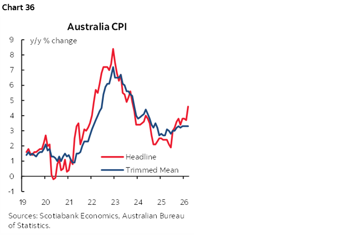
Australia’s monthly inflation readings for April (Tuesday) probably won’t be impactful to nearer-term RBA pricing with markets expecting the hike at the last meeting to give way to a pause on June 16th. The recent weak jobs report is one reason for this. Still, trimmed mean inflation could push closer to 3½% y/y with total CPI around 4½%—thereby well above the RBA’s 2–3% inflation target range (chart 36).
Tokyo CPI (Thursday), Singapore’s CPI (Monday) and Brazil’s inflation (Wednesday/Thursday) will round out the main focus upon the others.
Other Developments
New Zealand is pulling a Canada in reverse. The RBNZ’s decision arrives hours before New Zealand’s Finance Minister Wellington delivers her budget on Wednesday. This is the reverse order to how Canada did it last month. Pack your decisions so close together that your central bank can’t be expected to opine on the contents in a classic duck-and-weave.
US markets face an otherwise light line-up other than PCE. The main highlights include consumer confidence (Tuesday), personal income and spending (Thursday) that are both expected to post moderate growth in dollar terms but probably nothing in inflation-adjusted terms. Durable goods orders (Thursday) are forecast to post a large increase on transportation orders but core orders ex-defence and air may weaken after the prior massive 3.4% m/m surge.
Canada will focus on aforementioned GDP and bank earnings reports with only the wonky SEPH payrolls report for way back in March due out on Thursday. It’s too lagging and too unreliable to matter given it tends to get revised by tens of thousands of jobs each month it comes out.
Japan’s data dump on Thursday will bring out fresh readings for retail sales, industrial output, housing starts and the jobless rate to inform Q2 growth tracking.
How are European consumers holding up in the energy shock? We’ll find out when France updates consumer spending (Friday) and Germany refreshes retail sales perhaps this week, both for the month of April.

DISCLAIMER
This report has been prepared by Scotiabank Economics as a resource for the clients of Scotiabank. Opinions, estimates and projections contained herein are our own as of the date hereof and are subject to change without notice. The information and opinions contained herein have been compiled or arrived at from sources believed reliable but no representation or warranty, express or implied, is made as to their accuracy or completeness. Neither Scotiabank nor any of its officers, directors, partners, employees or affiliates accepts any liability whatsoever for any direct or consequential loss arising from any use of this report or its contents.
These reports are provided to you for informational purposes only. This report is not, and is not constructed as, an offer to sell or solicitation of any offer to buy any financial instrument, nor shall this report be construed as an opinion as to whether you should enter into any swap or trading strategy involving a swap or any other transaction. The information contained in this report is not intended to be, and does not constitute, a recommendation of a swap or trading strategy involving a swap within the meaning of U.S. Commodity Futures Trading Commission Regulation 23.434 and Appendix A thereto. This material is not intended to be individually tailored to your needs or characteristics and should not be viewed as a “call to action” or suggestion that you enter into a swap or trading strategy involving a swap or any other transaction. Scotiabank may engage in transactions in a manner inconsistent with the views discussed this report and may have positions, or be in the process of acquiring or disposing of positions, referred to in this report.
Scotiabank, its affiliates and any of their respective officers, directors and employees may from time to time take positions in currencies, act as managers, co-managers or underwriters of a public offering or act as principals or agents, deal in, own or act as market makers or advisors, brokers or commercial and/or investment bankers in relation to securities or related derivatives. As a result of these actions, Scotiabank may receive remuneration. All Scotiabank products and services are subject to the terms of applicable agreements and local regulations. Officers, directors and employees of Scotiabank and its affiliates may serve as directors of corporations.
Any securities discussed in this report may not be suitable for all investors. Scotiabank recommends that investors independently evaluate any issuer and security discussed in this report, and consult with any advisors they deem necessary prior to making any investment.
This report and all information, opinions and conclusions contained in it are protected by copyright. This information may not be reproduced without the prior express written consent of Scotiabank.
™ Trademark of The Bank of Nova Scotia. Used under license, where applicable.
Scotiabank, together with “Global Banking and Markets”, is a marketing name for the global corporate and investment banking and capital markets businesses of The Bank of Nova Scotia and certain of its affiliates in the countries where they operate, including; Scotiabank Europe plc; Scotiabank (Ireland) Designated Activity Company; Scotiabank Inverlat S.A., Institución de Banca Múltiple, Grupo Financiero Scotiabank Inverlat, Scotia Inverlat Casa de Bolsa, S.A. de C.V., Grupo Financiero Scotiabank Inverlat, Scotia Inverlat Derivados S.A. de C.V. – all members of the Scotiabank group and authorized users of the Scotiabank mark. The Bank of Nova Scotia is incorporated in Canada with limited liability and is authorised and regulated by the Office of the Superintendent of Financial Institutions Canada. The Bank of Nova Scotia is authorized by the UK Prudential Regulation Authority and is subject to regulation by the UK Financial Conduct Authority and limited regulation by the UK Prudential Regulation Authority. Details about the extent of The Bank of Nova Scotia's regulation by the UK Prudential Regulation Authority are available from us on request. Scotiabank Europe plc is authorized by the UK Prudential Regulation Authority and regulated by the UK Financial Conduct Authority and the UK Prudential Regulation Authority.
Scotiabank Inverlat, S.A., Scotia Inverlat Casa de Bolsa, S.A. de C.V, Grupo Financiero Scotiabank Inverlat, and Scotia Inverlat Derivados, S.A. de C.V., are each authorized and regulated by the Mexican financial authorities.
Not all products and services are offered in all jurisdictions. Services described are available in jurisdictions where permitted by law.