- Nonfarm payrolls have ground to a halt after another soft print
- A sudden turn in SA factors sans explanation prevented a loss of 100k
- Hours worked signal a stumbling economy into Q3
- Fed to cut 25bps, but may be more likely to work the dots than upsize
- This is the cost of broad policy uncertainty
- US nonfarm payrolls, m/m 000s // UR %, SA, August:
- Actual: 22 / 4.3
- Scotia: 0.0 / 4.1
- Consensus: 75 / 4.3
- Prior: 79 / 4.2 (revised from 73 / 4.2)
The US job market is definitely weakening below most estimates of lowered breakeven rates in light of tighter immigration policy. When paired with Chair Powell’s pivot at Jackson Hole, the result cements a rate cut on the 17th. The residual questions are how big and/or how frequent.
First, the results. Payrolls were up by only 22k (107k in four months) and very close to Scotia’s below consensus estimate within very noisy bands. It’s the fourth month in a row for weak payrolls (chart 1). The reasons were somewhat mixed in terms of the data drivers. In my opinion, they are less mixed in terms of the broad macro forces — uncertainty is clearly taking its toll and so are the effects of policies like tariffs and draconian immigration curbs. Own it!
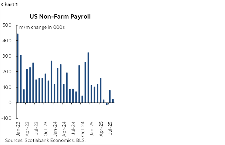
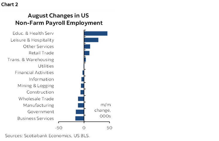
Chart 2 shows the change by sector. There were pluses led by education and health as well as leisure and hospitality sectors. Who knows, maybe the first benefits from visa-inducements and the second from tax-free tip money! But the offsets were diverse with weakness spread across multiple other sectors.
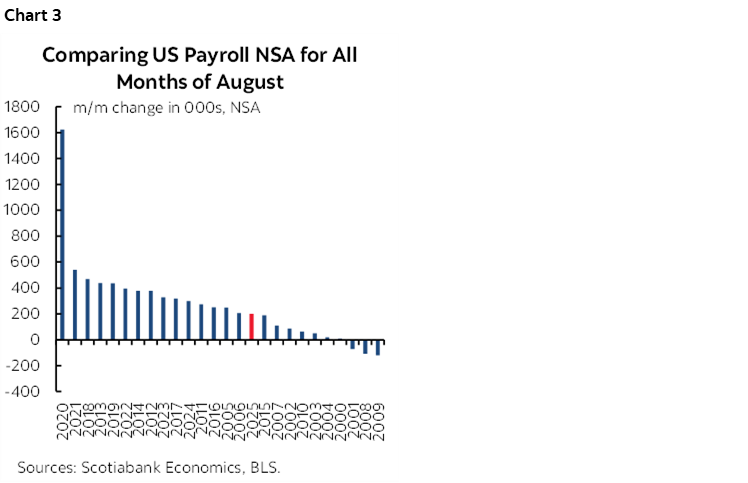
The month-over-month change in seasonally unadjusted payrolls was broadly in line with my concern that it would be on the weaker side (chart 3).
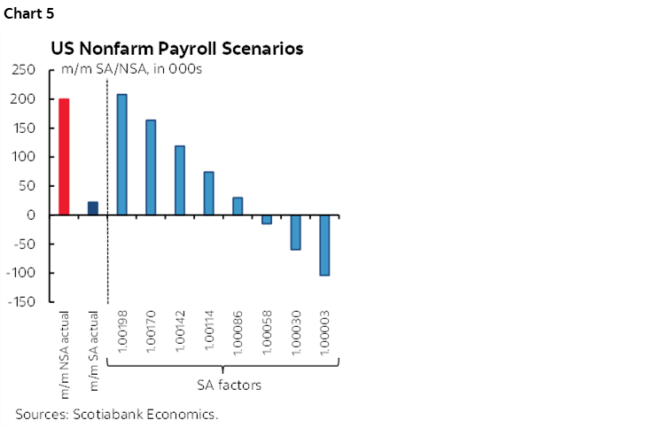
What was not was the sudden increase in the August seasonal adjustment factor (chart 4). A sharp downward trend over multiple years suddenly gave way to a higher SA factor this August. Why? We’ll be left to question how unfiltered the statistical methods truly were, versus any other rationale for suddenly messing with the SA factors. Were the knees-a-knockin’ at the BLS?
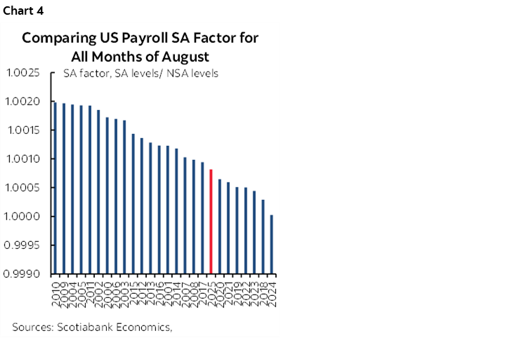
This matters because the number would have been even worse had the prior pattern of softening August SA factors held. The far right bar in chart 5 is what would have happened to payrolls this morning without suddenly doing an about face on SA factors. It saved markets from a sharp drop of around 100k.
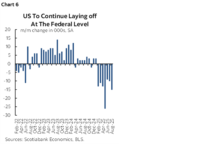
Federal government jobs fell by 15k (chart 6) with state and local governments little changed (-1k). The bigger shoe to drop arrives in October when DOGE layoff packages expire and hundreds of thousands drop off payrolls unless they find jobs elsewhere.
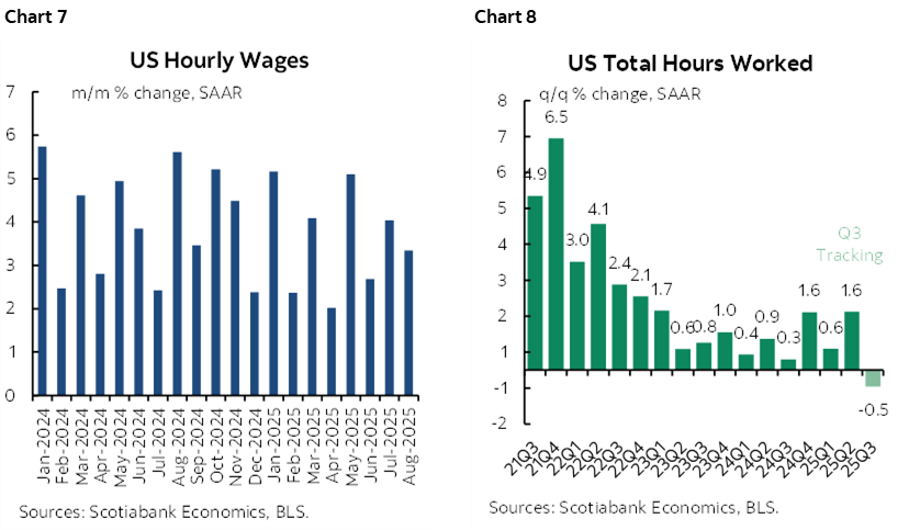
Wages were warm again (chart 7). Hours worked are signalling a warning sign for the US economy (chart 8). They were higher by 0.3% m/m SA in August, but the third quarter overall is tracking a drop of –0.5% q/q SAAR. Since GDP is an identity defined as hours times labour productivity, the US would need a solid acceleration of productivity and activity readings to keep GDP growth in the black.
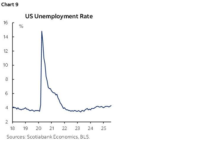
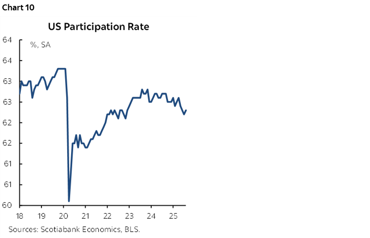
The unemployment rate edged higher to 4.3%. It’s still a fairly tight job market generating above-inflation wage pressures. The UR comes from the household survey which registered a gain of 288k jobs that wasn’t a surprise. It also registered what I thought was a surprising 436k surge in the labour force that I hadn’t expected. That’s the strongest gain in the labour force since April. I don’t have a great explanation as to why as immigration curbs have kicked in, so it’s either driven by the high noise in the survey or large re-entry into the workforce by folks already in the country and not hiding from ICE. Nevertheless, the increase does little to arrest the downward trend in the participation rate (chart 9).
In any event, data quality is low but whether that means upside or downside risk in future revisions is unclear. The first-pass collection rate was very low.
So what does it all mean for the Fed? Who cares about next week’s CPI. Chair Powell had already pivoted more toward concern about the job market in his Jackson Hole speech while dismissing inflation risk as transitory. That’s debatable over time, but these numbers will spook him. A quarter point cut is more likely than 50bps in my view, but the upsized risk can’t be ignored. I think the Committee may favour working the bias in the dot plot more aggressively than upsizing on the first pass and having markets push them toward subsequent upsizing. 25–25–25 into year-end may well be the signal and then we’ll start the tracking and changes for the refreshed 2026 dot plot. But don’t blame Powell. It’s the rest of the policy mixture that is the problem and Powell risks emboldening the administration’s policies if he goes too far by coming to the rescue.
DISCLAIMER
This report has been prepared by Scotiabank Economics as a resource for the clients of Scotiabank. Opinions, estimates and projections contained herein are our own as of the date hereof and are subject to change without notice. The information and opinions contained herein have been compiled or arrived at from sources believed reliable but no representation or warranty, express or implied, is made as to their accuracy or completeness. Neither Scotiabank nor any of its officers, directors, partners, employees or affiliates accepts any liability whatsoever for any direct or consequential loss arising from any use of this report or its contents.
These reports are provided to you for informational purposes only. This report is not, and is not constructed as, an offer to sell or solicitation of any offer to buy any financial instrument, nor shall this report be construed as an opinion as to whether you should enter into any swap or trading strategy involving a swap or any other transaction. The information contained in this report is not intended to be, and does not constitute, a recommendation of a swap or trading strategy involving a swap within the meaning of U.S. Commodity Futures Trading Commission Regulation 23.434 and Appendix A thereto. This material is not intended to be individually tailored to your needs or characteristics and should not be viewed as a “call to action” or suggestion that you enter into a swap or trading strategy involving a swap or any other transaction. Scotiabank may engage in transactions in a manner inconsistent with the views discussed this report and may have positions, or be in the process of acquiring or disposing of positions, referred to in this report.
Scotiabank, its affiliates and any of their respective officers, directors and employees may from time to time take positions in currencies, act as managers, co-managers or underwriters of a public offering or act as principals or agents, deal in, own or act as market makers or advisors, brokers or commercial and/or investment bankers in relation to securities or related derivatives. As a result of these actions, Scotiabank may receive remuneration. All Scotiabank products and services are subject to the terms of applicable agreements and local regulations. Officers, directors and employees of Scotiabank and its affiliates may serve as directors of corporations.
Any securities discussed in this report may not be suitable for all investors. Scotiabank recommends that investors independently evaluate any issuer and security discussed in this report, and consult with any advisors they deem necessary prior to making any investment.
This report and all information, opinions and conclusions contained in it are protected by copyright. This information may not be reproduced without the prior express written consent of Scotiabank.
™ Trademark of The Bank of Nova Scotia. Used under license, where applicable.
Scotiabank, together with “Global Banking and Markets”, is a marketing name for the global corporate and investment banking and capital markets businesses of The Bank of Nova Scotia and certain of its affiliates in the countries where they operate, including; Scotiabank Europe plc; Scotiabank (Ireland) Designated Activity Company; Scotiabank Inverlat S.A., Institución de Banca Múltiple, Grupo Financiero Scotiabank Inverlat, Scotia Inverlat Casa de Bolsa, S.A. de C.V., Grupo Financiero Scotiabank Inverlat, Scotia Inverlat Derivados S.A. de C.V. – all members of the Scotiabank group and authorized users of the Scotiabank mark. The Bank of Nova Scotia is incorporated in Canada with limited liability and is authorised and regulated by the Office of the Superintendent of Financial Institutions Canada. The Bank of Nova Scotia is authorized by the UK Prudential Regulation Authority and is subject to regulation by the UK Financial Conduct Authority and limited regulation by the UK Prudential Regulation Authority. Details about the extent of The Bank of Nova Scotia's regulation by the UK Prudential Regulation Authority are available from us on request. Scotiabank Europe plc is authorized by the UK Prudential Regulation Authority and regulated by the UK Financial Conduct Authority and the UK Prudential Regulation Authority.
Scotiabank Inverlat, S.A., Scotia Inverlat Casa de Bolsa, S.A. de C.V, Grupo Financiero Scotiabank Inverlat, and Scotia Inverlat Derivados, S.A. de C.V., are each authorized and regulated by the Mexican financial authorities.
Not all products and services are offered in all jurisdictions. Services described are available in jurisdictions where permitted by law.