- Payrolls fell by 92k in February
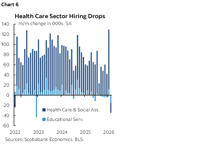
- Health hiring was down on much more than strikes…
- ...but it’s the trend in private ex-health that is disturbing
- The participation rate is falling, unemployment rate is rising
- Wage growth is solid with tax refunds coming as a temporary lift
- The Fed will be paralyzed for some time…
- ...as both parts of the dual mandate are deteriorating
- Nonfarm payrolls m/m 000s / UR %, SA, February:
- Actual: -92 / 4.4
- Scotia: 10 / 4.4
- Consensus: 55 / 4.3
- Prior: 126 / 4.3 (revised from 130 / 4.3)
The US job market is clearly teetering. Nonfarm payrolls fell by 92,000 in the February reference period that pre-dated the war in Iran. That was below all estimates but Scotia (#1 ranked) was closest on the street especially given guidance in my weekly that there was “more downside risk than upside risk this time” but I guess I chickened out. Revisions also removed 69k jobs. We now know why Trump’s social media account was quiet going into the report this time.
MARKETS AND THE FED
The US 2-year yield is down by about 5–6bps post-data in a bull steepener move. The S&P is off by 1¾% this morning. A few more basis points were added to cumulative Fed cut pricing this year that has markets leaning toward –50bps by year-end. Very little is priced in OIS until we get out toward June contract pricing.
Complicating market reactions was the nearly simultaneous headline about Kuwait shutting down oil production as transportation bottlenecks have driven storage to capacity. WTI is up 10% on the day.
I think the FOMC is going to sound utterly paralyzed on March 18th. Both parts of the dual mandate are deteriorating and they won’t have a clue how to balance them by way of what to do in the short-term. Hawks will be worried about inflation, more neutral minded folks will look through some of the inflation risk to deteriorating jobs and they’ll cancel each other out with inaction until greater clarity on the extent and duration of the energy shock and the deterioration of the job market is realized.
DETAILS, DETAILS!
Chart 1 shows that the labour market is in more trouble than too many people are willing to accept. Private sector jobs excluding health care have been down way more often than up for an extended period.
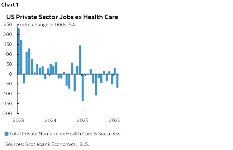
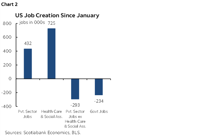
Chart 2 shows the cumulative changes in nonfarm payrolls since Inauguration Day. The only reason private payrolls have been up since then has been healthcare.
What drove the weakness this time? Two things. One being that healthcare jobs did indeed drop by 34k after a revised gain of 129k in January. In fact, the seasonally unadjusted drop in health care payrolls was the worst month of February on record (chart 3). We look at NSA numbers and compare like months for this category because of the seasonal flu effect.
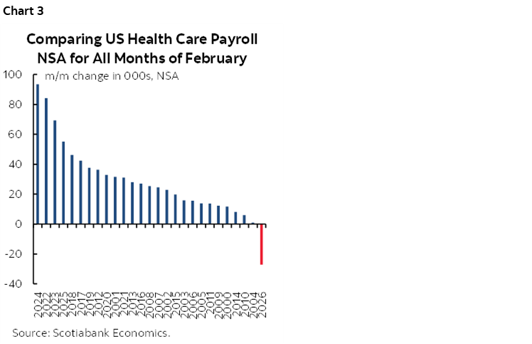
I don’t accept the BLS guidance for why health hiring was so poor. They pinned it on strike activity (NY nurses) that pushed employment at offices of physicians lower by 37k m/m SA (-36k m/m NSA) in February. Yet it wasn’t just the related ‘ambulatory care’ category that fell (-34k) as other categories were also weak in seasonally unusual fashion. If, for instance, we added back the physicians offices drop of –36k NSA to chart 3, then you still would have had one of the weakest health care employment changes for like months of February in history. I still think the flu season’s peak in January and then abatement in February drove much of the moderation after an unsustainable flu-driven surge in January. Episodes like this add to my distrust.
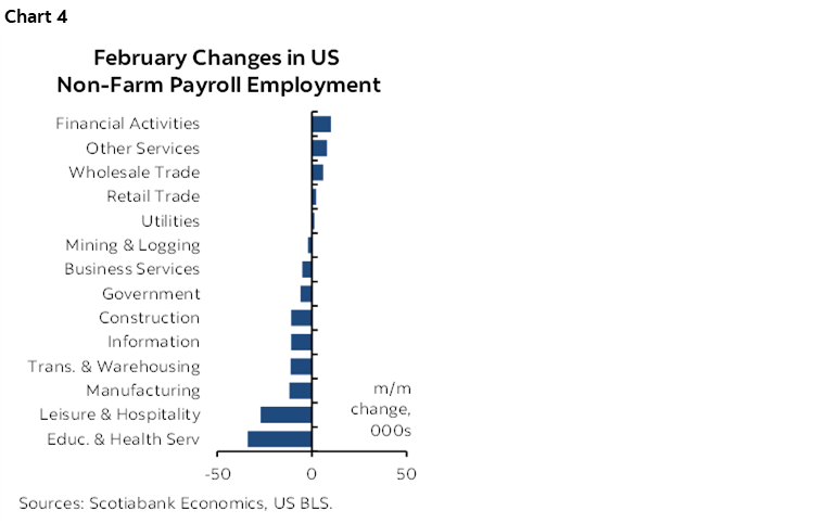
Chart 4 shows the breakdown of changes in nonfarm payrolls by sector. Goods sector jobs fell by 25k with services employment down 61k. It wasn’t just health care. Education jobs were down 16k. Transportation and warehousing fell 11k. Temp help was down 7k. Apparently it wasn’t a very fun month (February, who knew!) as leisure and hospitality employment fell by 27k.
The only thing being brought back home to America insofar as the manufacturing sector is concerned are applications for jobless benefits (chart 5). A lot of them and for an extended period dating back to 2023 so we can’t just pin it on tariffs.
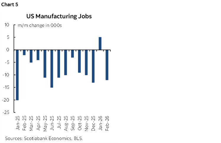
Chart 6 comes back to showing how massive the swings in health and education hiring have been of late.
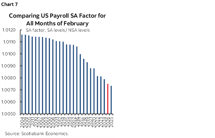
Two other points can be made on data quality. Adding to the downside risk was the second lowest seasonal adjustment factor on record (chart 7). This tamps down the change in payrolls and was close to our expectations.
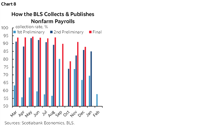
Adding to data quality concerns was one of the worst initial data collection rates in some time (chart 8). Revision risk could be high as a result and the extended pattern usually takes the numbers lower. I wouldn’t be the least bit surprised to see payrolls drop by well over 100k in February when revisions land.
Incorporation of the annual population benchmarks into the companion household survey sparked considerable turmoil. Get this. Last month, the BLS told us that the household survey measure of employment was UP by 528k and the labour force expanded by 387k in January. Today, after inclusion of population revisions they normally do in January but that were postponed and included as revisions today, they are now reporting that January’s household survey employment fell by a whopping 895k and the labour force shrank by 1.03 million. Roughly 1½ million fewer jobs and labour force participants than initially guided and you want us to take the numbers seriously in terms of calculating the unemployment rate? Pure. Garbage. This is not top tier data you expect from an advanced economy.
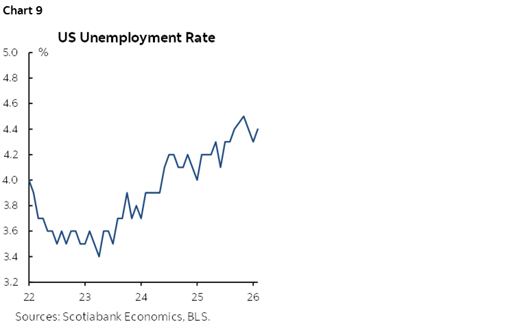
The unemployment rate is still low, but has been trending higher from about 3.4% at the low to a full percentage point higher now (chart 9).
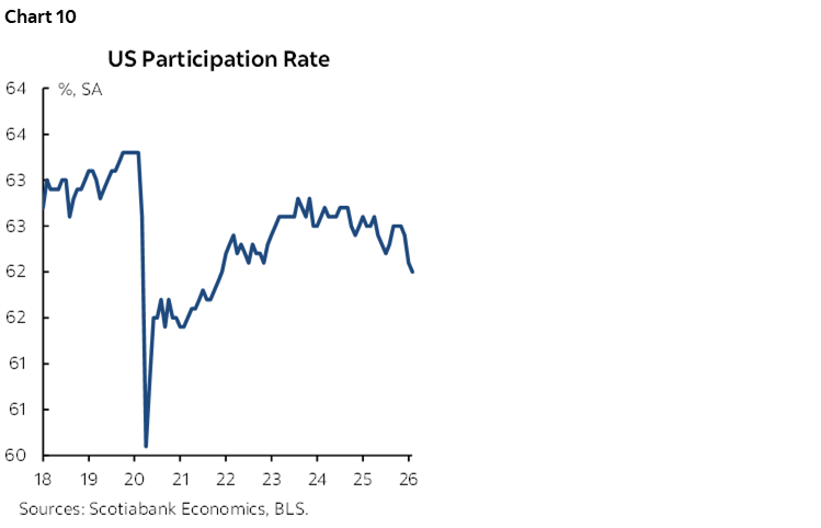
The labour force participation rate fell again. It is at its lowest since December 2021 (chart 10).
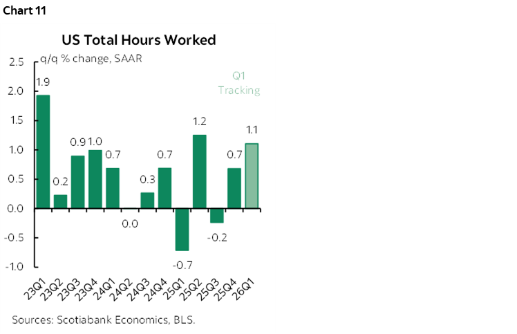
Hours worked slipped by –0.1% m/m SA with rounding up. Hours are tracking about 1.1% q/q SAAR growth in Q1 which is a small pick-up from Q4 (chart 11). Since GDP is hours times productivity, US GDP growth continues to be dependent upon sustained productivity growth.
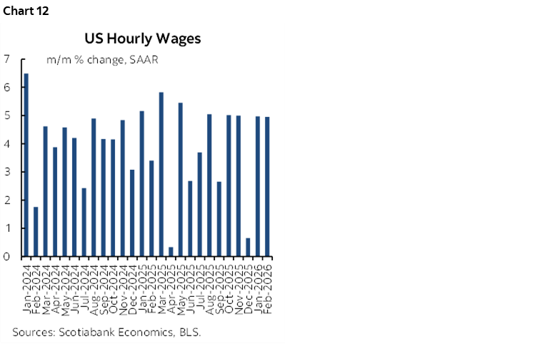
Wage growth remains firm at an annualized rate of almost 5% (chart 12). It’s running at 3.4% q/q SAAR from 4% the previous quarter which supports compensation within overall personal income that is going to get a modest lift from tax refunds.
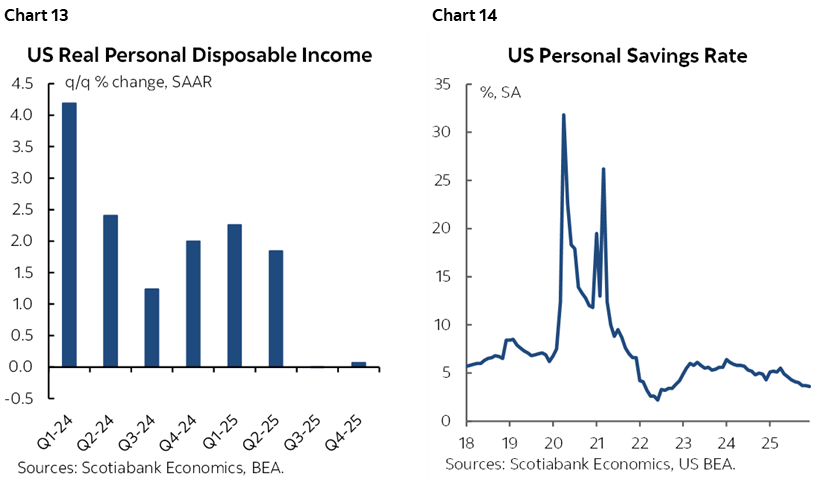
PDI may get a lift in Q1 after two flat quarters (chart 13). Still, tax refunds are a weak foundation for a consumer call. They may spur a temporary spending surge that’s likely to be modest. Or they may be horded given the uncertainty in a precautionary saving sense. Still, the saving rate has been pushing lower for some time as Americans smooth the effects of weak incomes on consumption by saving less to date (chart 14).
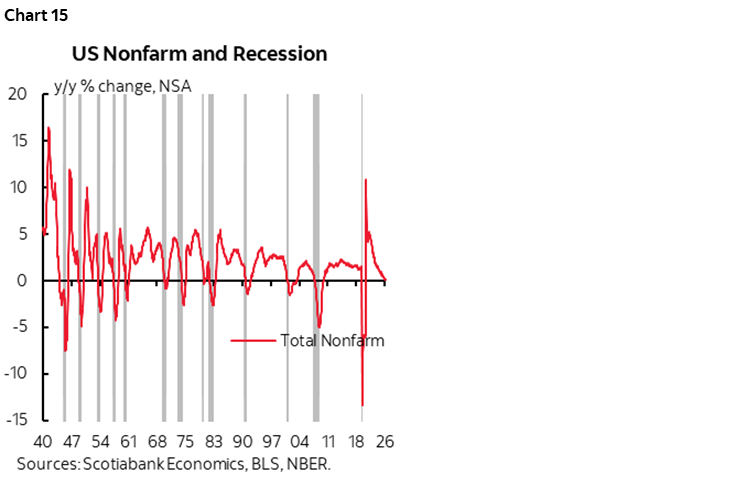
Let’s just hope the trend in chart 15 goes no further but what it’s showing is an understated risk as shocks to the US economy mount, many of which are self-imposed.
DISCLAIMER
This report has been prepared by Scotiabank Economics as a resource for the clients of Scotiabank. Opinions, estimates and projections contained herein are our own as of the date hereof and are subject to change without notice. The information and opinions contained herein have been compiled or arrived at from sources believed reliable but no representation or warranty, express or implied, is made as to their accuracy or completeness. Neither Scotiabank nor any of its officers, directors, partners, employees or affiliates accepts any liability whatsoever for any direct or consequential loss arising from any use of this report or its contents.
These reports are provided to you for informational purposes only. This report is not, and is not constructed as, an offer to sell or solicitation of any offer to buy any financial instrument, nor shall this report be construed as an opinion as to whether you should enter into any swap or trading strategy involving a swap or any other transaction. The information contained in this report is not intended to be, and does not constitute, a recommendation of a swap or trading strategy involving a swap within the meaning of U.S. Commodity Futures Trading Commission Regulation 23.434 and Appendix A thereto. This material is not intended to be individually tailored to your needs or characteristics and should not be viewed as a “call to action” or suggestion that you enter into a swap or trading strategy involving a swap or any other transaction. Scotiabank may engage in transactions in a manner inconsistent with the views discussed this report and may have positions, or be in the process of acquiring or disposing of positions, referred to in this report.
Scotiabank, its affiliates and any of their respective officers, directors and employees may from time to time take positions in currencies, act as managers, co-managers or underwriters of a public offering or act as principals or agents, deal in, own or act as market makers or advisors, brokers or commercial and/or investment bankers in relation to securities or related derivatives. As a result of these actions, Scotiabank may receive remuneration. All Scotiabank products and services are subject to the terms of applicable agreements and local regulations. Officers, directors and employees of Scotiabank and its affiliates may serve as directors of corporations.
Any securities discussed in this report may not be suitable for all investors. Scotiabank recommends that investors independently evaluate any issuer and security discussed in this report, and consult with any advisors they deem necessary prior to making any investment.
This report and all information, opinions and conclusions contained in it are protected by copyright. This information may not be reproduced without the prior express written consent of Scotiabank.
™ Trademark of The Bank of Nova Scotia. Used under license, where applicable.
Scotiabank, together with “Global Banking and Markets”, is a marketing name for the global corporate and investment banking and capital markets businesses of The Bank of Nova Scotia and certain of its affiliates in the countries where they operate, including; Scotiabank Europe plc; Scotiabank (Ireland) Designated Activity Company; Scotiabank Inverlat S.A., Institución de Banca Múltiple, Grupo Financiero Scotiabank Inverlat, Scotia Inverlat Casa de Bolsa, S.A. de C.V., Grupo Financiero Scotiabank Inverlat, Scotia Inverlat Derivados S.A. de C.V. – all members of the Scotiabank group and authorized users of the Scotiabank mark. The Bank of Nova Scotia is incorporated in Canada with limited liability and is authorised and regulated by the Office of the Superintendent of Financial Institutions Canada. The Bank of Nova Scotia is authorized by the UK Prudential Regulation Authority and is subject to regulation by the UK Financial Conduct Authority and limited regulation by the UK Prudential Regulation Authority. Details about the extent of The Bank of Nova Scotia's regulation by the UK Prudential Regulation Authority are available from us on request. Scotiabank Europe plc is authorized by the UK Prudential Regulation Authority and regulated by the UK Financial Conduct Authority and the UK Prudential Regulation Authority.
Scotiabank Inverlat, S.A., Scotia Inverlat Casa de Bolsa, S.A. de C.V, Grupo Financiero Scotiabank Inverlat, and Scotia Inverlat Derivados, S.A. de C.V., are each authorized and regulated by the Mexican financial authorities.
Not all products and services are offered in all jurisdictions. Services described are available in jurisdictions where permitted by law.