- Core CPI inflation is trending up with rising breadth…
- ...driven by core services and some tariff evidence
- Fed’s preferred core PCE is tracking on the fence between 0.2–0.3
- Upsizing next week amid political pressure and data quality issues would be dicey
- US CPI / core CPI, m/m %, SA, August:
- Actual: 0.380 / 0.346
- Scotia: 0.3 / 0.3
- Consensus: 0.3 / 0.3
- Prior: 0.2 / 0.3
US core CPI inflation has accelerated over the past three months. This morning’s 0.346% m/m SA print was a smidge away from rounding up to a 0.4% core reading. Core PCE is on track for a 0.2–0.3% reading on September 26th after the Fed decision next Wednesday but they’ll have a good sense of the reading now. Such a core PCE reading would follow rounded-up 0.3% prints in the prior two months absent revisions.
Treasuries rallied somewhat on the back of the numbers and likely as a relief trade in that a higher than consensus number was just barely averted.
Next week’s FOMC meeting remains overpriced in my opinion. The first step toward easing is likely to be a careful -25bps cut, yet fed funds futures continue to lean toward a touch more. With financial conditions buoyant, GDP growth still tracking firmly as a correlated guide to dual mandate variables, and core inflation accelerating, it would be dicey to upside out of the starting gates amid data quality issues and political pressure.
DETAILS—BROADENING PRESSURES
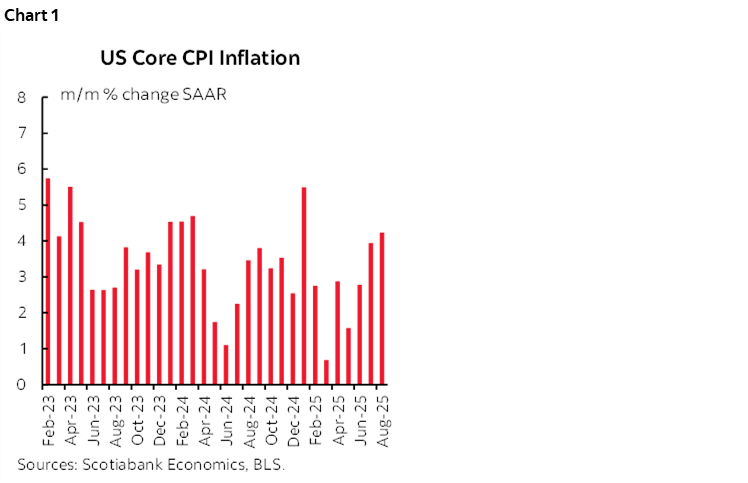
The last three months of core CPI m/m SAAR inflation readings have been 2.8% in June, 3.9% in July and 4.2% in August (chart 1). That’s the warmest three-month moving average (3.65%) since January. What this tells us is that some combination of volatile relief and distorted seasonality created an optical illusion that inflation was ebbing in months like March and May. It is not.
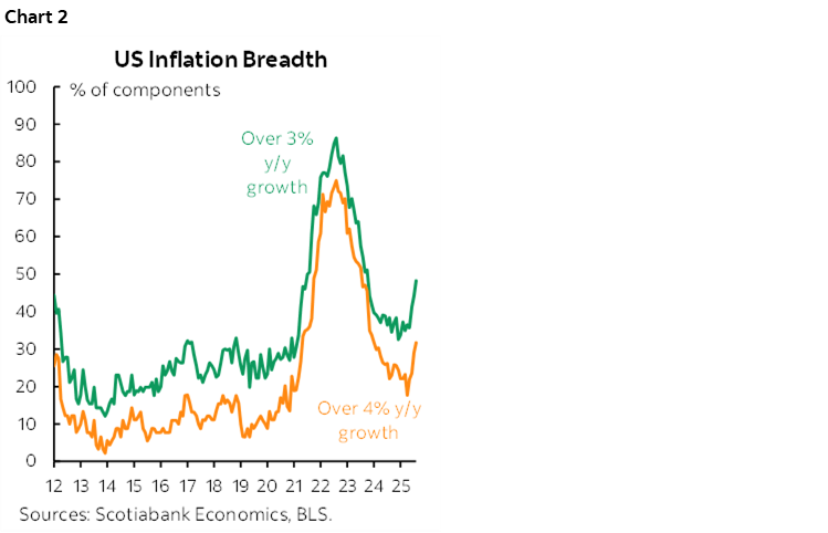
Further, the breadth of price pressures continues to be rising again (chart 2). That’s a disturbing sign that price pressures are once again fanning out with half the CPI basket up by over 3% y/y and over one-third of the basket over 4%.
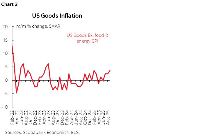
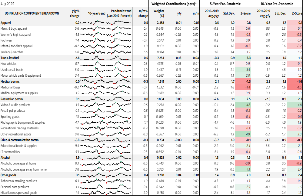
Prices for core goods ("commodities less food and energy") were up by 0.3% m/m SA which continues to be a mild acceleration (chart 3). This is the category where tariffs on goods would be most likely to show up which I’ll come back to.
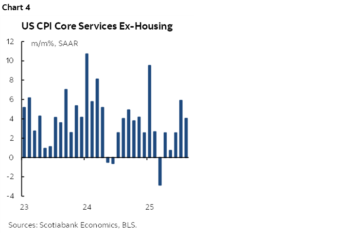
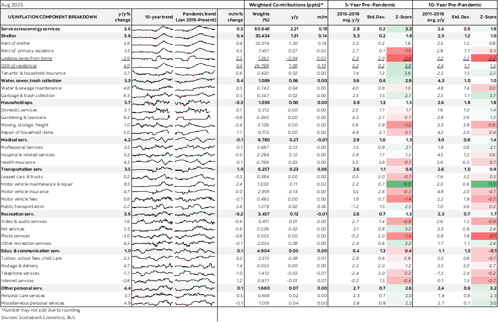
Core services inflation (ie: ex-shelter and energy services) remained warm a 0.3% m/m SA after the prior 0.5% jump (chart 4) It’s running at 4% m/m SAAR. Who needs tariffs with core services inflation like that. This should be of greater concern to the Fed if it is inclined to look through tariff effects. Core service prices are more closely influenced by domestic economy considerations and are exhibiting significant stickiness.
Back to core goods prices. Chart 5 provides a weighted breakdown of the contributing drivers of this category. Some of these categories are obviously prone to potential tariff effects, like vehicles, swiss watches, imported tools/hardware etc. New vehicle prices were up 0.3% m/m SA but used vehicle prices were up a whopping 1% m/m SA. Used vehicle prices may also indirectly reflect tariff effects as used vehicles may be at a very early stage of exhibiting something akin to the pandemic when new vehicle prices were rising so folks went for used.
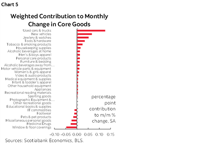
In other words, I wouldn't shout if from the rooftops, but it would be equally inappropriate and arguably politicized to say there is zero evidence of tariff effects.
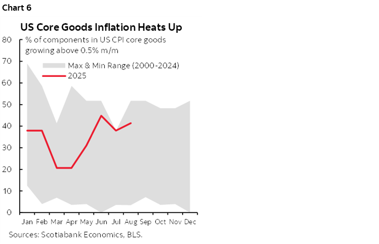
Chart 6 offers another way of looking at the category; core goods inflation is running toward the upper bound of experiences this decade.
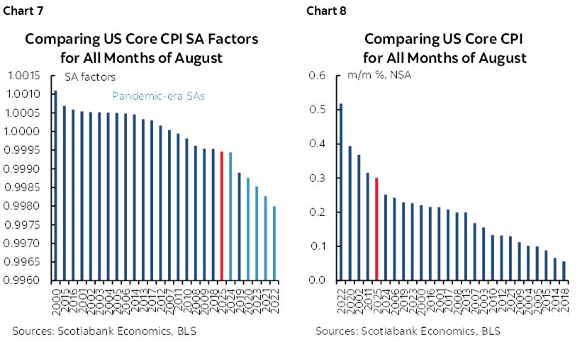
The SA factor bias continues to ebb in 2024 and 2025 compared to earlier years (chart 7). I don’t judge this to have been a meaningful distortion this time as perhaps the BLS is reining in this effect. Chart 8 shows that the seasonally unadjusted increase in core prices was among the hotter readings compared to like months of August in history.
Implications for Core PCE Inflation
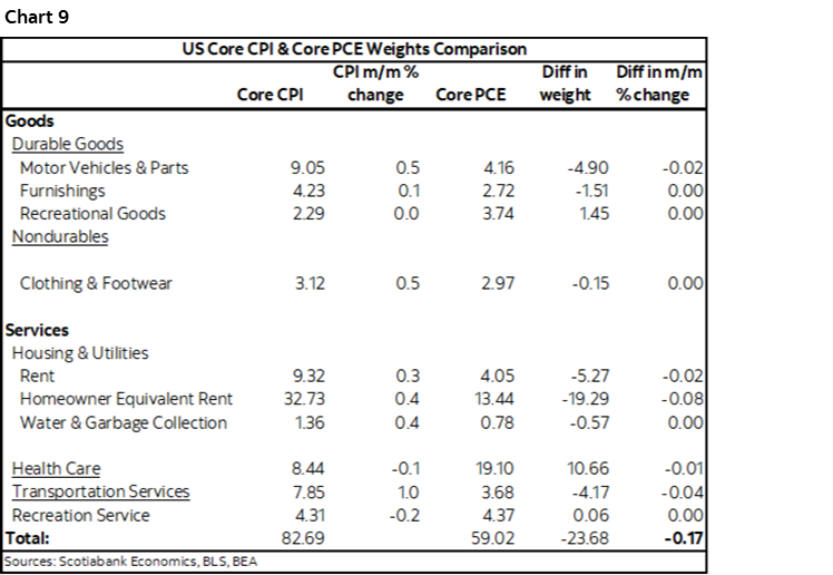
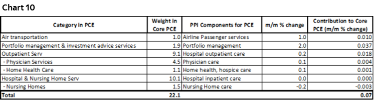
Converting to core PCE probably means a reading of 0.2–0.3% m/m SA. Taking account of weight differences in the two baskets (chart 9) plus the pertinent categories from yesterday’s PPI report (chart 10) puts the estimate close to the middle of that range. The wildcard is other methodological differences, different SA factors, and how the dynamic basket weights used in PCE versus CPI’s fixed annual weights translate into substitution effects.
Other Details
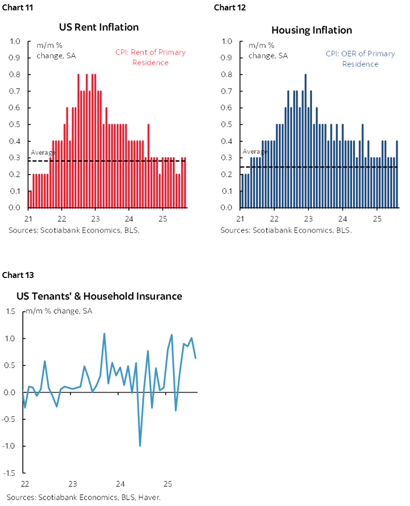
In addition to core services, other service categories were warm. Shelter inflation accelerated to 0.4% m/m SA. Rent of primary residence did likewise at 0.4% m/m SA which was the hottest since April (chart 11). OER was up 0.4%—the warmest since March (chart 12). Home insurance is also contributing (chart 13).
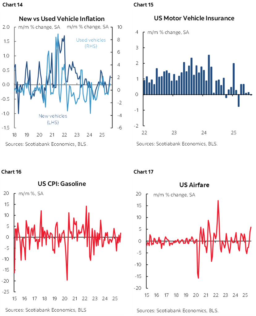
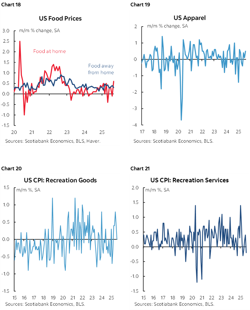
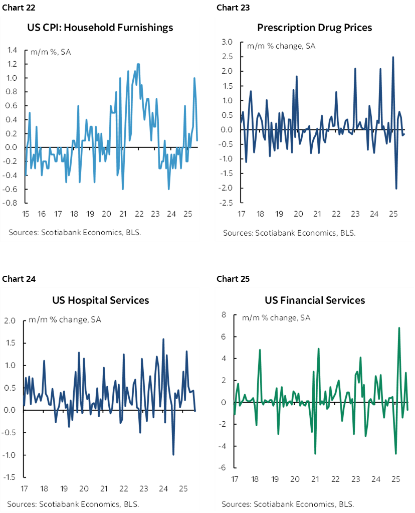
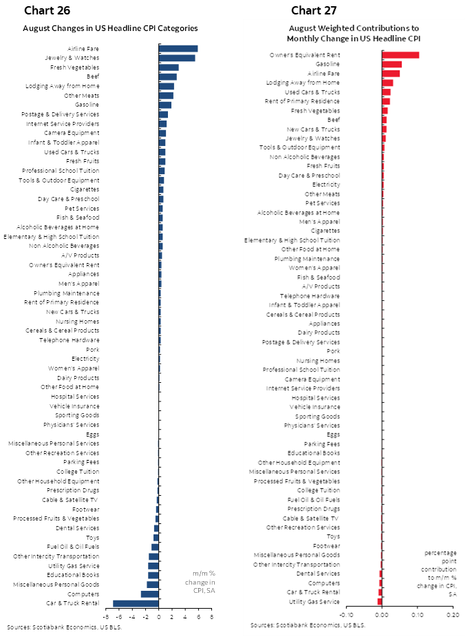
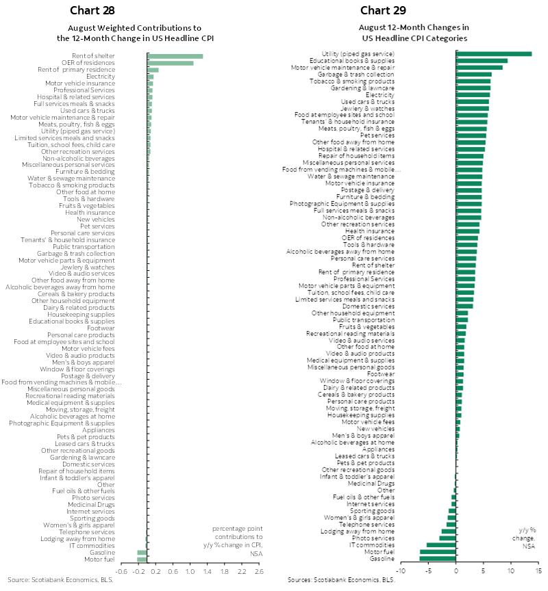
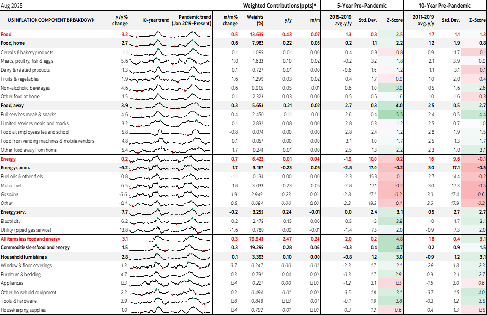
Charts 14–25 provide further breakdowns of components. Charts 26–27 break down the basket in m/m % changes by component and the weighted contributions to the m/m % change in total CPI. Charts 28–29 do likewise for y/y equivalents. See the accompanying table for more details.
We'll get the imputed share of the CPI basket using alternative methods just after 11amET.
DISCLAIMER
This report has been prepared by Scotiabank Economics as a resource for the clients of Scotiabank. Opinions, estimates and projections contained herein are our own as of the date hereof and are subject to change without notice. The information and opinions contained herein have been compiled or arrived at from sources believed reliable but no representation or warranty, express or implied, is made as to their accuracy or completeness. Neither Scotiabank nor any of its officers, directors, partners, employees or affiliates accepts any liability whatsoever for any direct or consequential loss arising from any use of this report or its contents.
These reports are provided to you for informational purposes only. This report is not, and is not constructed as, an offer to sell or solicitation of any offer to buy any financial instrument, nor shall this report be construed as an opinion as to whether you should enter into any swap or trading strategy involving a swap or any other transaction. The information contained in this report is not intended to be, and does not constitute, a recommendation of a swap or trading strategy involving a swap within the meaning of U.S. Commodity Futures Trading Commission Regulation 23.434 and Appendix A thereto. This material is not intended to be individually tailored to your needs or characteristics and should not be viewed as a “call to action” or suggestion that you enter into a swap or trading strategy involving a swap or any other transaction. Scotiabank may engage in transactions in a manner inconsistent with the views discussed this report and may have positions, or be in the process of acquiring or disposing of positions, referred to in this report.
Scotiabank, its affiliates and any of their respective officers, directors and employees may from time to time take positions in currencies, act as managers, co-managers or underwriters of a public offering or act as principals or agents, deal in, own or act as market makers or advisors, brokers or commercial and/or investment bankers in relation to securities or related derivatives. As a result of these actions, Scotiabank may receive remuneration. All Scotiabank products and services are subject to the terms of applicable agreements and local regulations. Officers, directors and employees of Scotiabank and its affiliates may serve as directors of corporations.
Any securities discussed in this report may not be suitable for all investors. Scotiabank recommends that investors independently evaluate any issuer and security discussed in this report, and consult with any advisors they deem necessary prior to making any investment.
This report and all information, opinions and conclusions contained in it are protected by copyright. This information may not be reproduced without the prior express written consent of Scotiabank.
™ Trademark of The Bank of Nova Scotia. Used under license, where applicable.
Scotiabank, together with “Global Banking and Markets”, is a marketing name for the global corporate and investment banking and capital markets businesses of The Bank of Nova Scotia and certain of its affiliates in the countries where they operate, including; Scotiabank Europe plc; Scotiabank (Ireland) Designated Activity Company; Scotiabank Inverlat S.A., Institución de Banca Múltiple, Grupo Financiero Scotiabank Inverlat, Scotia Inverlat Casa de Bolsa, S.A. de C.V., Grupo Financiero Scotiabank Inverlat, Scotia Inverlat Derivados S.A. de C.V. – all members of the Scotiabank group and authorized users of the Scotiabank mark. The Bank of Nova Scotia is incorporated in Canada with limited liability and is authorised and regulated by the Office of the Superintendent of Financial Institutions Canada. The Bank of Nova Scotia is authorized by the UK Prudential Regulation Authority and is subject to regulation by the UK Financial Conduct Authority and limited regulation by the UK Prudential Regulation Authority. Details about the extent of The Bank of Nova Scotia's regulation by the UK Prudential Regulation Authority are available from us on request. Scotiabank Europe plc is authorized by the UK Prudential Regulation Authority and regulated by the UK Financial Conduct Authority and the UK Prudential Regulation Authority.
Scotiabank Inverlat, S.A., Scotia Inverlat Casa de Bolsa, S.A. de C.V, Grupo Financiero Scotiabank Inverlat, and Scotia Inverlat Derivados, S.A. de C.V., are each authorized and regulated by the Mexican financial authorities.
Not all products and services are offered in all jurisdictions. Services described are available in jurisdictions where permitted by law.