- Nonfarm beat expectations, driving ytd job gains
- The household survey lost jobs, driving large ytd job losses…
- ...as the labour force shrinks
- The gulf may be explained by small businesses being hit harder by negative shocks
- The FOMC would be unwise to react in either direction…
- ...if it’s a supply shock driving weakness in total employment and softer wage gains
- US nonfarm payrolls m/m 000s / UR %, SA, April:
- Actual: 115 / 4.3
- Scotia: 10 / 4.2
- Consensus: 65 / 4.3
- Prior: 185 / 4.3 (revised from 178 / 43)
I’ll take my lumps first from an accountability standpoint before turning to why it doesn’t matter that payrolls were solid. Payrolls exceeded my expectations by an amount that is at the outer bound of what might be explained by nonfarm’s 90% confidence band. It’s hard to dismiss an interpretation that payrolls grew by considerably more than I expected. Instead of being #1 ranked I’m #3 now out of 70+ nonfarm forecasters. I used to like Fridays.
Markets were not really impressed. The US 2 year yield barely reacted. The dollar remained weak on the day. S&P futures only moved up by about 25bps. That could be because other factors—like waiting on Iran—are more dominant, but there may be another explanation for why you should ignore nonfarm if not from a market reaction standpoint then from a logical one.
The US gained 115k payroll positions last month while the companion household survey showed a drop of 226,000 jobs. That divergence isn’t just a one-month thing. Nonfarm is up 304,000 ytd while the household survey’s measure of employment is down by 1.3 million.
As chart 1 shows, this is the second largest divergence between what the two measures say about ytd job growth in modern history behind only the pandemic year of 2020. Both measures are noisy but the household survey is much noisier, yet relative noise should shake out over time and leaves one wanting a better explanation for this divergence.
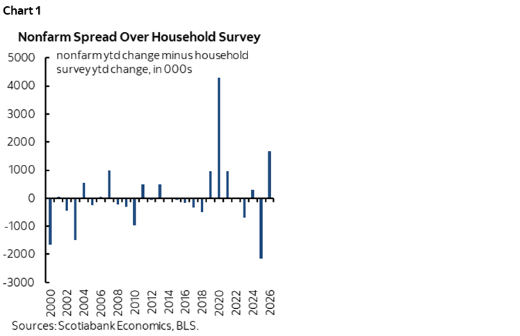
One possibility for this striking divergence is that American small businesses are more likely to be off-payrolls and they are getting slammed harder than typically larger payroll employers. That may be good for productivity if it acknowledges that bigger firms are better able to manage today’s shocks ranging from AI to immigration policy to tariffs to just plain uncertainty. It’s not great for workers. If it’s bad for workers and good for productivity, then on neither count should one necessarily react hawkishly to the overall set of numbers just because nonfarm was decent.
What’s causing this? Similar to Canada, the 1.37 million ytd contraction in US household survey employment is associated with a 1.5 million ytd contraction in the US household survey’s measure of the labour force. Hence why the UR has only dipped by 0.1 now versus year-end 2025. Supply and demand are cancelling each other out.
So, tighten because of nfp being up ytd? Loosen because household employment is tanking? Be neutral because the UR is roughly unchanged? Shrug and scream “Dang it Spock, I ‘m just an economist!”?
The answer may lie in what differentiates the US from Canada specifically in terms of what is happening to discouraged workers. There has been a definite upward trend in discouraged workers in the US since 2023. This means that the softness in the pool of labour may be less likely to be driven by tighter immigration policy in the US relative to Canada, and more likely to be driven by folks dropping like flies which is a bad signal to the Fed.
The 25-54 category is where much of this has been happening since 2023 with a smaller assist from 55 plus. The latter category of worker has been more inclined to simply check out at a later stage of careers rather than blaming it on being discouraged about the job market.
Details
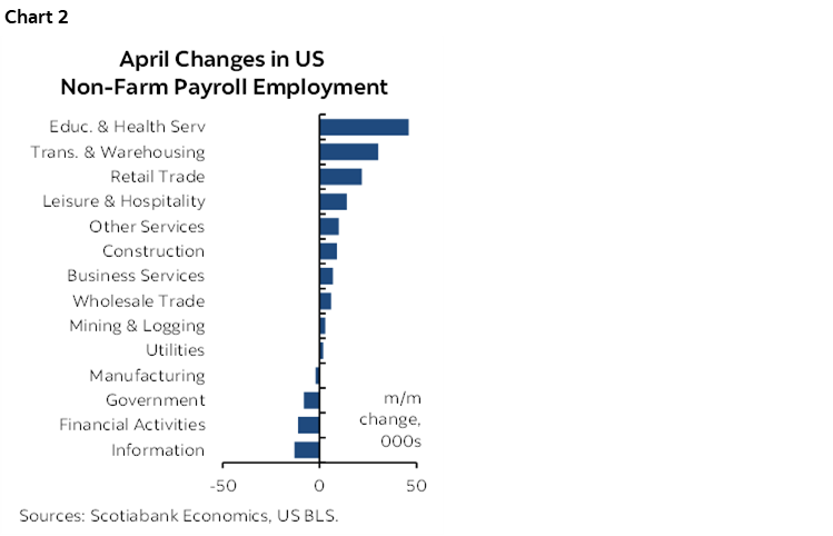
As for details, chart 2 shows considerable breadth to the change in nonfarm payrolls on a sector basis. Education and health was the biggest single driver of the gain and once again it was specifically health that drove this category with a 54k rise. That was slower than the 91k jump in March as expected but still resilient.
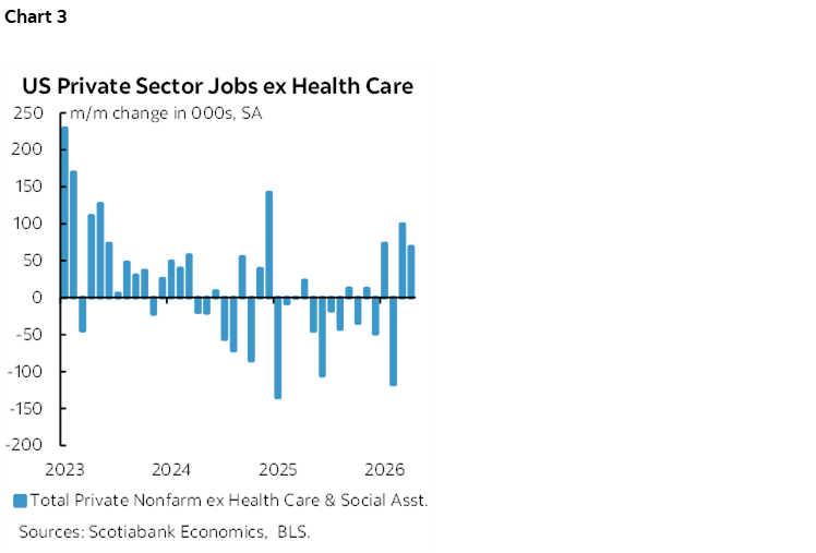
Nevertheless, chart 3 shows the encouraging part. Private nonfarm payrolls excluding health care were up solidly for a second consecutive month. They’ve been up smartly in three of the past four months against an otherwise uninspiring prior trend.
Revisions were small with just 16k wiped off the prior two months of payroll gains. Revisions have recently become smaller than normal.
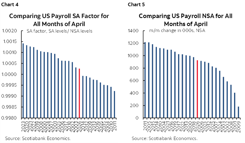
The seasonal adjustment factor was only slightly lower than last year and than we had assumed (chart 4). The reason for the stronger headline print than expected was because the seasonally unadjusted change in jobs was higher than expected (chart 5).
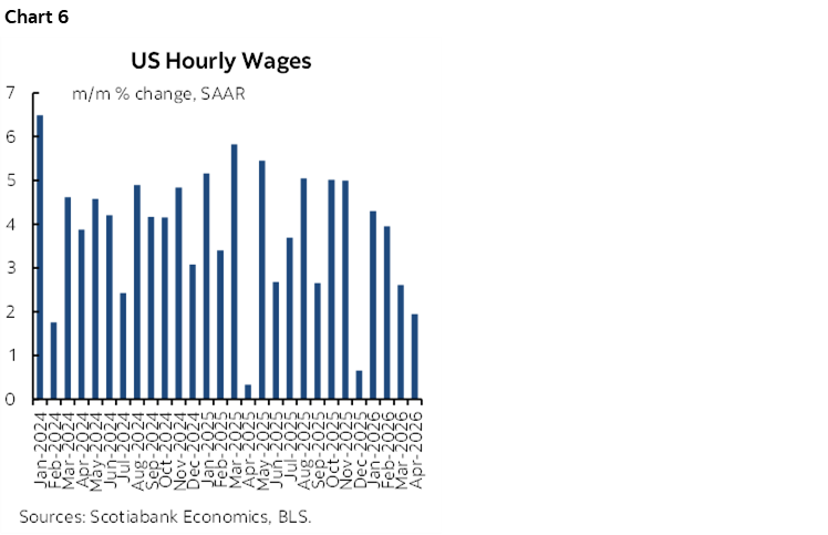
Wage growth cooled last month (chart 6). It has been cooling since the peak in January. It remains to be seen how workers and employers behave on this measure going forward in the context of soaring prices. It’s also important to point out that wage growth by this measure has cooled as labour productivity growth has cooled in Q4 and Q1.
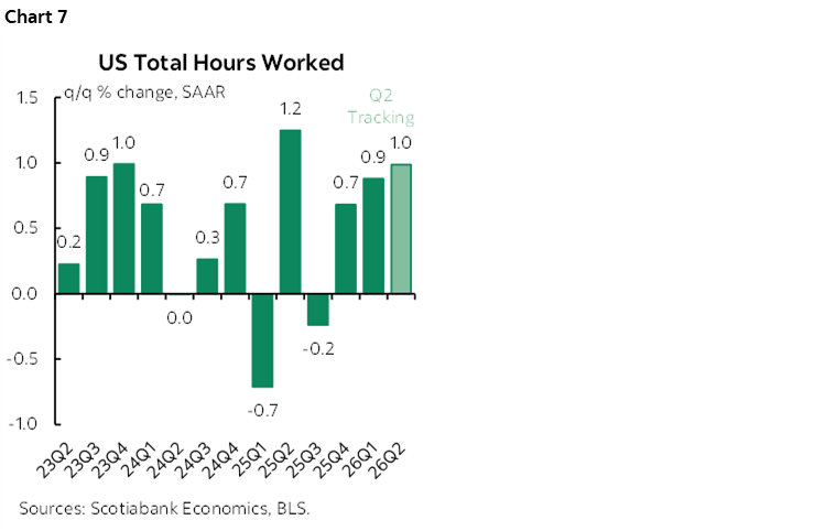
Hours worked were up by 0.4% m/m SA in April but are cooling on a trend basis. Hours were up by just 0.9% q/q SAAR in Q4 and are very tentatively tracking a gain of just 1% in Q2 (chart 7). Alongside cooling trend labour productivity, this points to expectations for cooling trend GDP growth. Recall that GDP is hours worked times labour productivity.
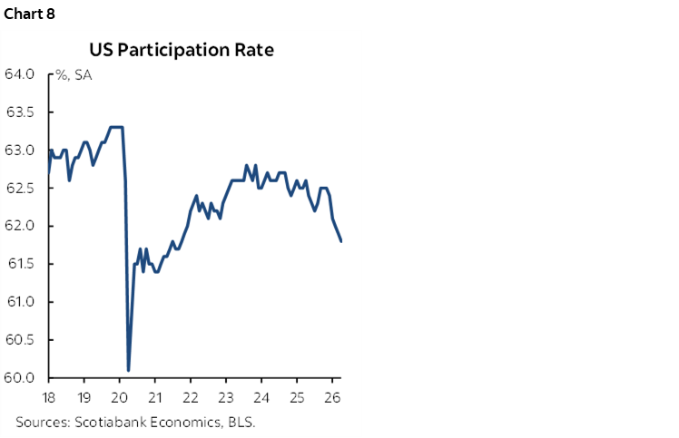
And I’ll conclude by re-emphasizing the disturbing retreat from the US labour force in chart 8. If people are withdrawing from the labour force because they are discouraged and if that’s part of why total household survey employment is weak while wage growth is ebbing, then you shouldn’t react hawkishly.
Now, if we could only settle the inflation debate but that will take at least as long as it takes to evaluate shock risks to the labour market before the FOMC feels comfortable doing much of anything.
DISCLAIMER
This report has been prepared by Scotiabank Economics as a resource for the clients of Scotiabank. Opinions, estimates and projections contained herein are our own as of the date hereof and are subject to change without notice. The information and opinions contained herein have been compiled or arrived at from sources believed reliable but no representation or warranty, express or implied, is made as to their accuracy or completeness. Neither Scotiabank nor any of its officers, directors, partners, employees or affiliates accepts any liability whatsoever for any direct or consequential loss arising from any use of this report or its contents.
These reports are provided to you for informational purposes only. This report is not, and is not constructed as, an offer to sell or solicitation of any offer to buy any financial instrument, nor shall this report be construed as an opinion as to whether you should enter into any swap or trading strategy involving a swap or any other transaction. The information contained in this report is not intended to be, and does not constitute, a recommendation of a swap or trading strategy involving a swap within the meaning of U.S. Commodity Futures Trading Commission Regulation 23.434 and Appendix A thereto. This material is not intended to be individually tailored to your needs or characteristics and should not be viewed as a “call to action” or suggestion that you enter into a swap or trading strategy involving a swap or any other transaction. Scotiabank may engage in transactions in a manner inconsistent with the views discussed this report and may have positions, or be in the process of acquiring or disposing of positions, referred to in this report.
Scotiabank, its affiliates and any of their respective officers, directors and employees may from time to time take positions in currencies, act as managers, co-managers or underwriters of a public offering or act as principals or agents, deal in, own or act as market makers or advisors, brokers or commercial and/or investment bankers in relation to securities or related derivatives. As a result of these actions, Scotiabank may receive remuneration. All Scotiabank products and services are subject to the terms of applicable agreements and local regulations. Officers, directors and employees of Scotiabank and its affiliates may serve as directors of corporations.
Any securities discussed in this report may not be suitable for all investors. Scotiabank recommends that investors independently evaluate any issuer and security discussed in this report, and consult with any advisors they deem necessary prior to making any investment.
This report and all information, opinions and conclusions contained in it are protected by copyright. This information may not be reproduced without the prior express written consent of Scotiabank.
™ Trademark of The Bank of Nova Scotia. Used under license, where applicable.
Scotiabank, together with “Global Banking and Markets”, is a marketing name for the global corporate and investment banking and capital markets businesses of The Bank of Nova Scotia and certain of its affiliates in the countries where they operate, including; Scotiabank Europe plc; Scotiabank (Ireland) Designated Activity Company; Scotiabank Inverlat S.A., Institución de Banca Múltiple, Grupo Financiero Scotiabank Inverlat, Scotia Inverlat Casa de Bolsa, S.A. de C.V., Grupo Financiero Scotiabank Inverlat, Scotia Inverlat Derivados S.A. de C.V. – all members of the Scotiabank group and authorized users of the Scotiabank mark. The Bank of Nova Scotia is incorporated in Canada with limited liability and is authorised and regulated by the Office of the Superintendent of Financial Institutions Canada. The Bank of Nova Scotia is authorized by the UK Prudential Regulation Authority and is subject to regulation by the UK Financial Conduct Authority and limited regulation by the UK Prudential Regulation Authority. Details about the extent of The Bank of Nova Scotia's regulation by the UK Prudential Regulation Authority are available from us on request. Scotiabank Europe plc is authorized by the UK Prudential Regulation Authority and regulated by the UK Financial Conduct Authority and the UK Prudential Regulation Authority.
Scotiabank Inverlat, S.A., Scotia Inverlat Casa de Bolsa, S.A. de C.V, Grupo Financiero Scotiabank Inverlat, and Scotia Inverlat Derivados, S.A. de C.V., are each authorized and regulated by the Mexican financial authorities.
Not all products and services are offered in all jurisdictions. Services described are available in jurisdictions where permitted by law.