- US core CPI undershot market and consensus expectations
- Distorted seasonal adjustments lessened data reliability…
- ...as we await the estimate for the imputed share of the basket due to budget cuts
- Markets reacted more than the FOMC will
- US CPI / core CPI, m/m % change, SA, May:
- Actual: 0.08 / 0.13
- Scotia: 0.2 / 0.3
- Consensus: 0.2 / 0.3
- Prior: 0.22 / 0.24
US core CPI inflation was soft again in May. If you believe it, and I’ll come back to why you should be much more guarded toward data reliability than the market robots who pounced on the Treasury curve to drive lower yields in the aftermath. They’re putting the artificial in artificial intelligence in my books.
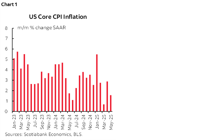
At 0.13% m/m SA, CPI excluding more volatile food and energy components was beneath both the implied market and consensus estimates that were both in the 0.2–0.3 range. Chart 1 shows the annualized m/m SAAR rates (1.6%). The 3moMA is 1.7%.
Headline CPI was up only 0.08% m/m SA which is only weaker than core CPI through rounding effects that basically shows both at 0.1%. Lower gasoline prices (-2.6% m/m SA) and a modest 0.3% m/m rise in food prices were both about as expected.
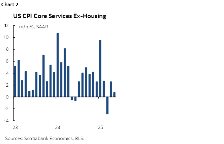
There were two main reasons for why CPI was soft. One is that core services CPI that excludes housing and energy services was only up by 0.06% m/m SA (chart 2). That’s at the low end of the recent monthly norms as only March’s –0.24% reading for that component was softer.
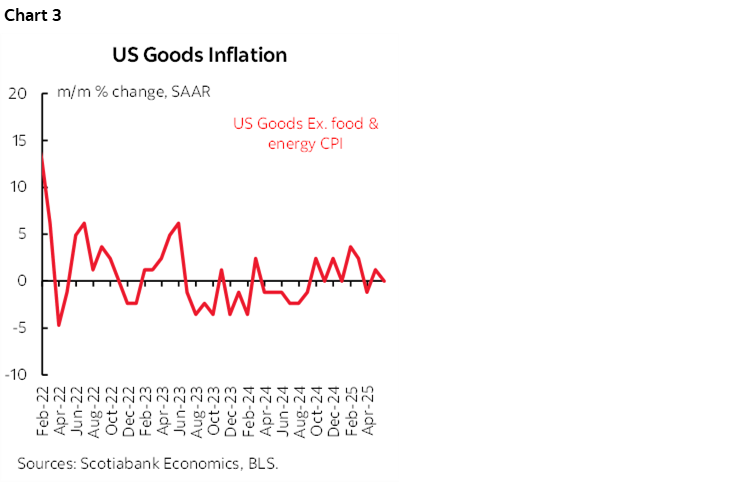
The other reason is that core goods prices were also soft. Commodities excluding food and energy were flat at 0% m/m SA (chart 3).
What drove soft core service prices? Rent of primary residence was the weakest reading since April 2021 without rounding. OER was firm and in line with expectations. Airfare was soft. Volatile financial service prices fell. Hospital service prices increased at a softer pace. Recreation service prices fell. Vehicle insurance was up at a similar pace.
What drove soft core goods prices? Apparel prices fell. New (-0.3% m/m SA) and used (-0.5%) vehicle prices slipped.
FAKE SA FACTORS
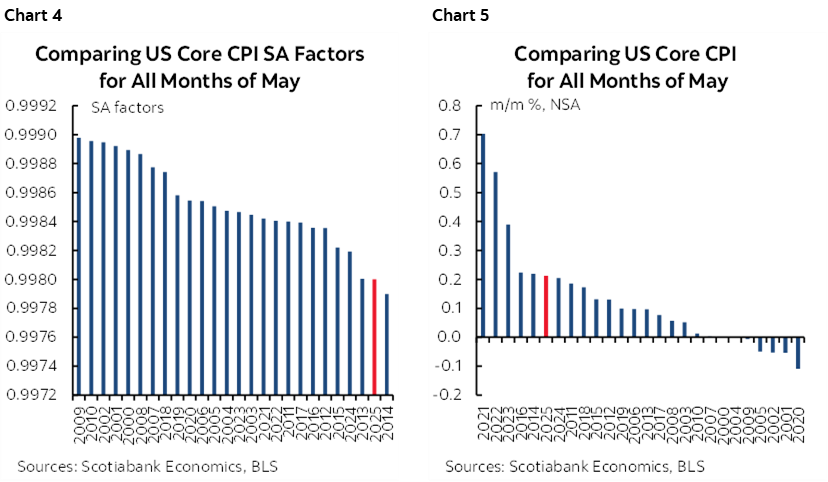
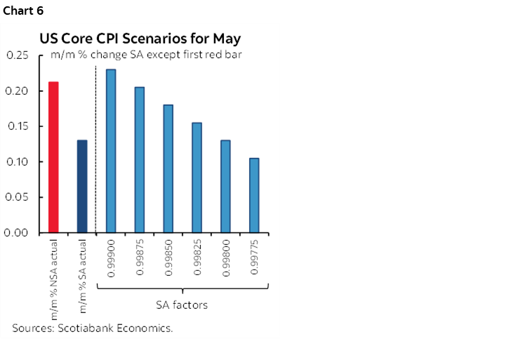
Now back to the reliability issue. The first reason why we should be careful is that seasonal adjustment factors drove the core CPI undershoot and I hadn’t expected that this time. The SA factors for May are normally more spread out than for some other months, but this time, the SA factors for 2025 and 2024 are among the lowest in history compared to like months of May (chart 4). This distorted the fact that in m/m NSA terms, the rise of core CPI really wasn’t at all out of the ordinary for a month of May (chart 5).
What effect that had is illustrated in chart 6. At alternative SA factors that have been used in prior months of May, core CPI could have easily rounded to about 0.2% m/m SA. That still would have been weaker than expected, but not quite as weak.
WHAT’S THE IMPUTED SHARE THIS TIME?
Then we have the issue of imputed data. We’re waiting for the BLS to update this post and this one with figures for May. Budget cutbacks have caused the BLS to rely much more heavily on shaky methods to make up inflation stats. Their April estimate showed that the share of the basket subject to alternative estimation methods—like relying upon prices for comparable products instead of actual products and relying upon prices in other regional markets absent data from as many of them as before—shot up to almost a third of the basket from a prior normal run-rate of about 10%. Triple the prior share of the basket was made up absent actual data collection. We need to see what the share was for May. It should be updated simultaneously, yet the last time it was at least updated on the same day as the CPI release itself.
One could surmise that the aim was to destabilize faith in institutions through cutbacks that lessen the reliability of the data so that you can argue that amid the uncertainty the Fed should bend the knee before the administration’s wishes.
TRUMP PUSHED THE FED AGAIN
President Trump weighed in after the fact with this post. On data reliability alone I would disagree with him. I’d also disagree because tariff and supply chain effects lie ahead with uncertain timing and magnitudes. But what I really disagree with is cutting by a full point just to lower interest on the debt. It could boomerang if the bond market blows up and drives longer yields through the roof while ditching the dollar because of a total lack of faith in a politicized Fed. It could boomerang if it drives inflation. All happening right into midterms.
CHARTS APLENTY!
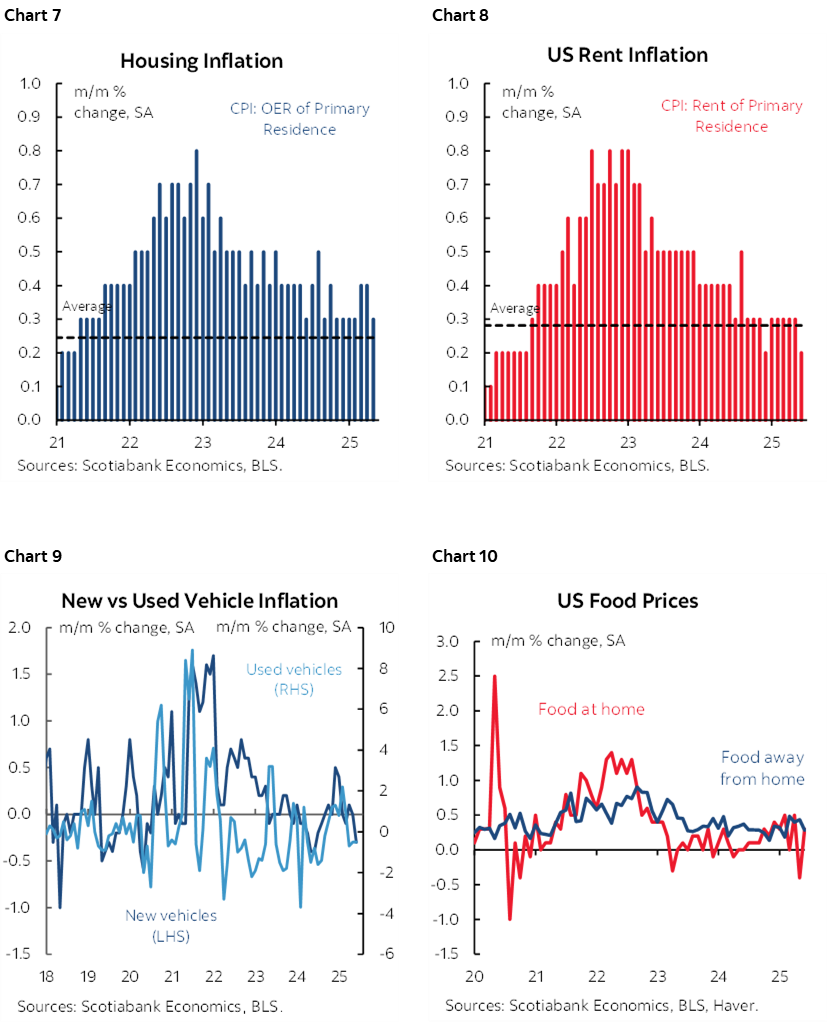
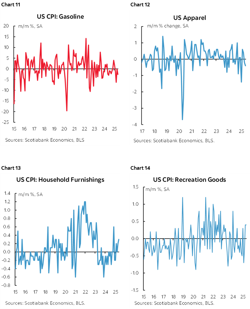
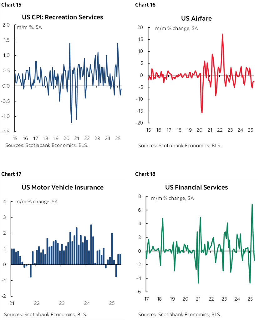
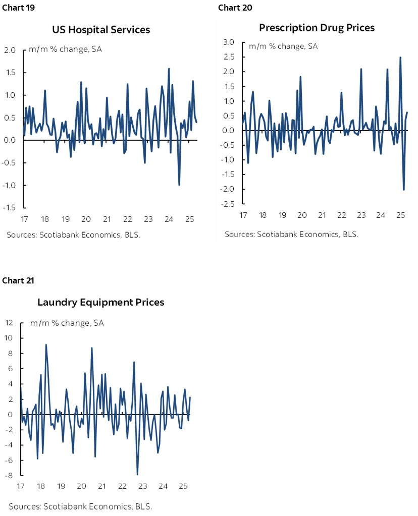
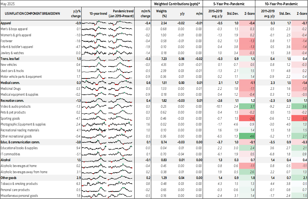
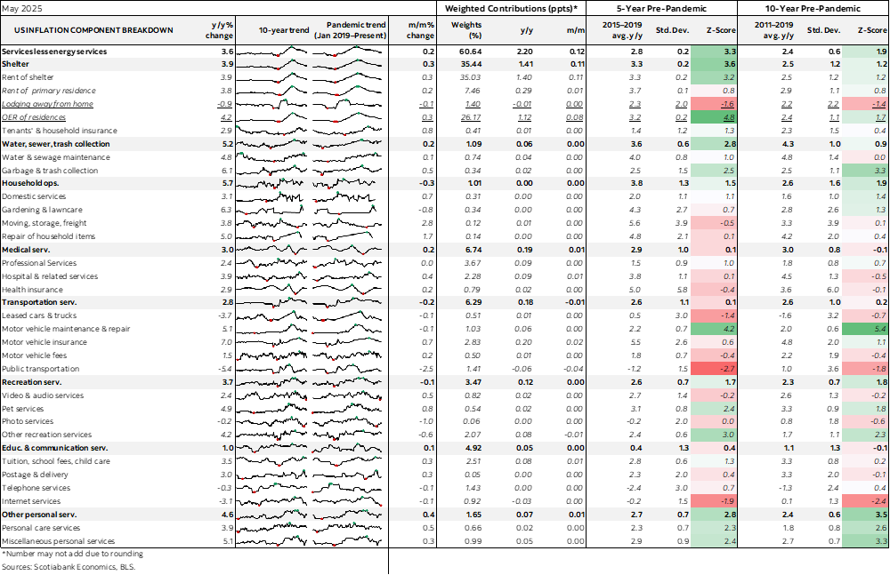
Now for charts aplenty since many clients express support for including them. Charts 7–21 give a sampling of the trends in various key components.
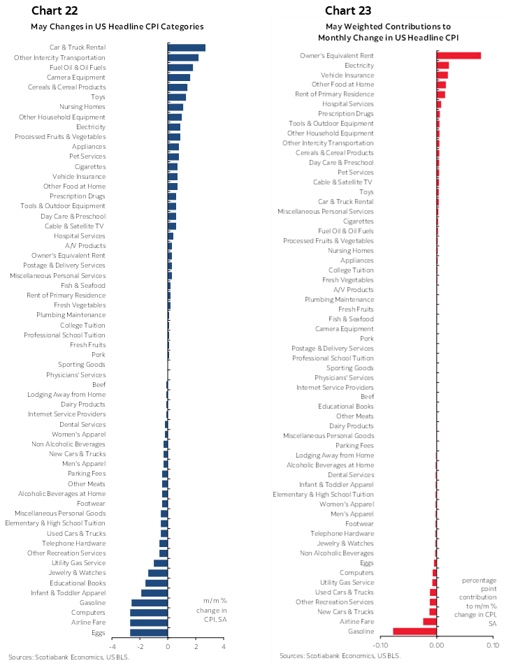
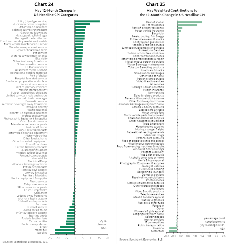
Charts 22–23 break down the basket’s components in m/m % terms and in weighted m/m % contributions respectively. Charts 24–25 do likewise in y/y terms.
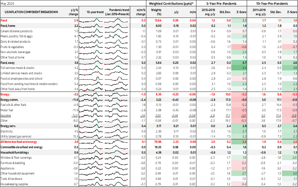
Finally, please see the accompanying table that breaks down the basket in greater detail.
DISCLAIMER
This report has been prepared by Scotiabank Economics as a resource for the clients of Scotiabank. Opinions, estimates and projections contained herein are our own as of the date hereof and are subject to change without notice. The information and opinions contained herein have been compiled or arrived at from sources believed reliable but no representation or warranty, express or implied, is made as to their accuracy or completeness. Neither Scotiabank nor any of its officers, directors, partners, employees or affiliates accepts any liability whatsoever for any direct or consequential loss arising from any use of this report or its contents.
These reports are provided to you for informational purposes only. This report is not, and is not constructed as, an offer to sell or solicitation of any offer to buy any financial instrument, nor shall this report be construed as an opinion as to whether you should enter into any swap or trading strategy involving a swap or any other transaction. The information contained in this report is not intended to be, and does not constitute, a recommendation of a swap or trading strategy involving a swap within the meaning of U.S. Commodity Futures Trading Commission Regulation 23.434 and Appendix A thereto. This material is not intended to be individually tailored to your needs or characteristics and should not be viewed as a “call to action” or suggestion that you enter into a swap or trading strategy involving a swap or any other transaction. Scotiabank may engage in transactions in a manner inconsistent with the views discussed this report and may have positions, or be in the process of acquiring or disposing of positions, referred to in this report.
Scotiabank, its affiliates and any of their respective officers, directors and employees may from time to time take positions in currencies, act as managers, co-managers or underwriters of a public offering or act as principals or agents, deal in, own or act as market makers or advisors, brokers or commercial and/or investment bankers in relation to securities or related derivatives. As a result of these actions, Scotiabank may receive remuneration. All Scotiabank products and services are subject to the terms of applicable agreements and local regulations. Officers, directors and employees of Scotiabank and its affiliates may serve as directors of corporations.
Any securities discussed in this report may not be suitable for all investors. Scotiabank recommends that investors independently evaluate any issuer and security discussed in this report, and consult with any advisors they deem necessary prior to making any investment.
This report and all information, opinions and conclusions contained in it are protected by copyright. This information may not be reproduced without the prior express written consent of Scotiabank.
™ Trademark of The Bank of Nova Scotia. Used under license, where applicable.
Scotiabank, together with “Global Banking and Markets”, is a marketing name for the global corporate and investment banking and capital markets businesses of The Bank of Nova Scotia and certain of its affiliates in the countries where they operate, including; Scotiabank Europe plc; Scotiabank (Ireland) Designated Activity Company; Scotiabank Inverlat S.A., Institución de Banca Múltiple, Grupo Financiero Scotiabank Inverlat, Scotia Inverlat Casa de Bolsa, S.A. de C.V., Grupo Financiero Scotiabank Inverlat, Scotia Inverlat Derivados S.A. de C.V. – all members of the Scotiabank group and authorized users of the Scotiabank mark. The Bank of Nova Scotia is incorporated in Canada with limited liability and is authorised and regulated by the Office of the Superintendent of Financial Institutions Canada. The Bank of Nova Scotia is authorized by the UK Prudential Regulation Authority and is subject to regulation by the UK Financial Conduct Authority and limited regulation by the UK Prudential Regulation Authority. Details about the extent of The Bank of Nova Scotia's regulation by the UK Prudential Regulation Authority are available from us on request. Scotiabank Europe plc is authorized by the UK Prudential Regulation Authority and regulated by the UK Financial Conduct Authority and the UK Prudential Regulation Authority.
Scotiabank Inverlat, S.A., Scotia Inverlat Casa de Bolsa, S.A. de C.V, Grupo Financiero Scotiabank Inverlat, and Scotia Inverlat Derivados, S.A. de C.V., are each authorized and regulated by the Mexican financial authorities.
Not all products and services are offered in all jurisdictions. Services described are available in jurisdictions where permitted by law.