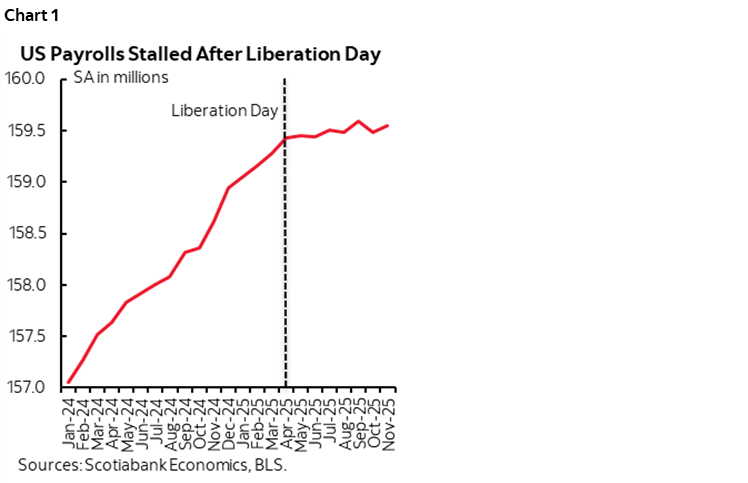
- US payrolls have flatlined since ‘Liberation Day’
- Three reasons why nonfarm payrolls are in even worse shape than they appear
- Payrolls are flashing orange on 2026 recession risk into midterms
- How should the Fed react? Jobs versus inflation versus moral hazard.
- Scotia Economics ranks #1 on US nonfarm payrolls forecasts
- Nonfarm payrolls m/m 000s / UR %, SA, November:
- Actual: 64 / 4.6
- Scotia: 50 / 4.4
- Consensus: 50 / 4.6
- Prior: -105 (no revisions as Oct was a delayed first reading)
- Nonfarm payrolls m/m 000s / UR %, SA, October
- Actual: -105 / NA
- Scotia: -90 / NA
- Consensus: -25k (very thin, many shops did not contribute)
- Prior: 108 / 4.4 (revised from 119k / 4.4)
After inheriting a period of robust job growth, nonfarm payrolls have not grown since ‘Liberation Day’ in April (chart 1) and I’ll explain why the numbers are much worse than the headlines indicate.
Take a hint. I believe that massive uncertainty reflected in confidence surveys and uncertainty indices has roiled US hiring confidence. This has taken the form of tariff policies, immigration policies, and general policy uncertainty. US monetary policy has probably been too tight relative to this higher uncertainty that has damaged jobs. AI-driven changes have probably been a minor role to date. Revisions that I’ll come to point to deeper issues with estimating US jobs that date back to last year and are ongoing.
First the numbers, then reasons why there is something worse lurking beneath headlines.
On net, the new information across August through November points to a weak US labour market. Payrolls were up by 64k in November which roughly matched my 50k estimate and consensus. Payrolls fell by 105k in October which roughly matched my estimate of -90k. Revisions to August and September took payrolls down by -33k over those two months as August went from -4k to -26k, and September went from 119k to 108k.
REASONS WHY PAYROLLS WERE EVEN WEAKER THAN THE HEADLINE...
Three factors point toward a job market that may be a whole lot weaker than the official headline figures indicate.
...INCLUDE REMOVING HEALTH SECTOR HIRING...
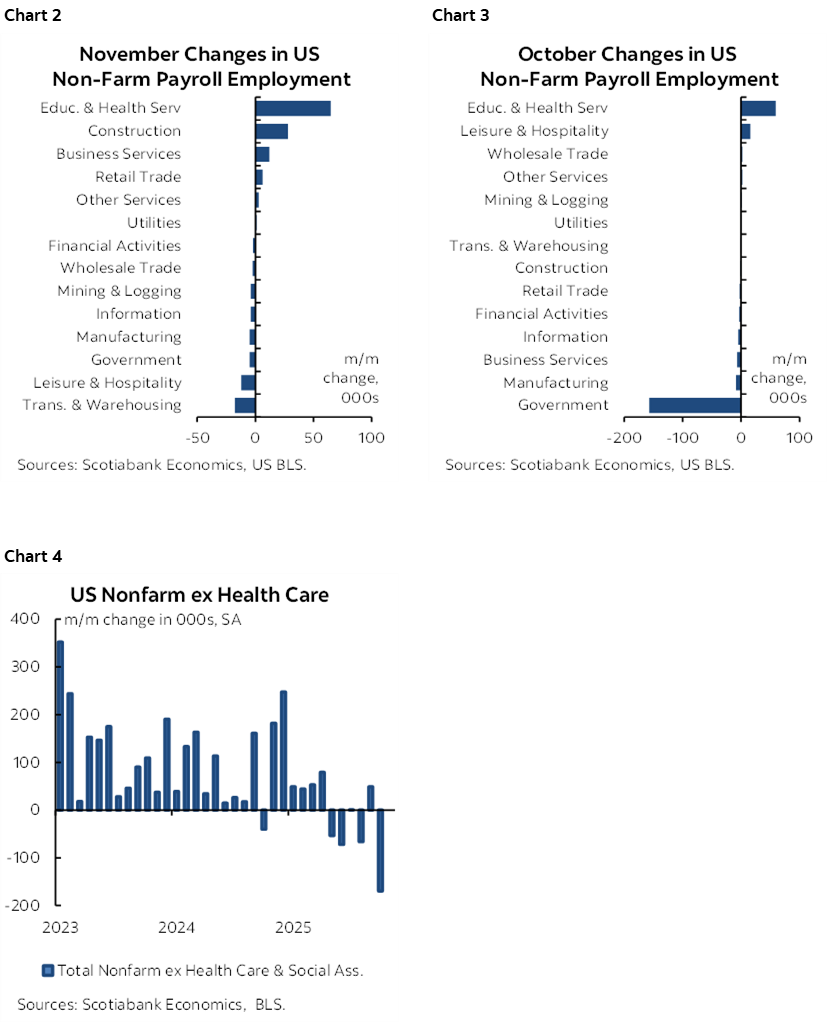
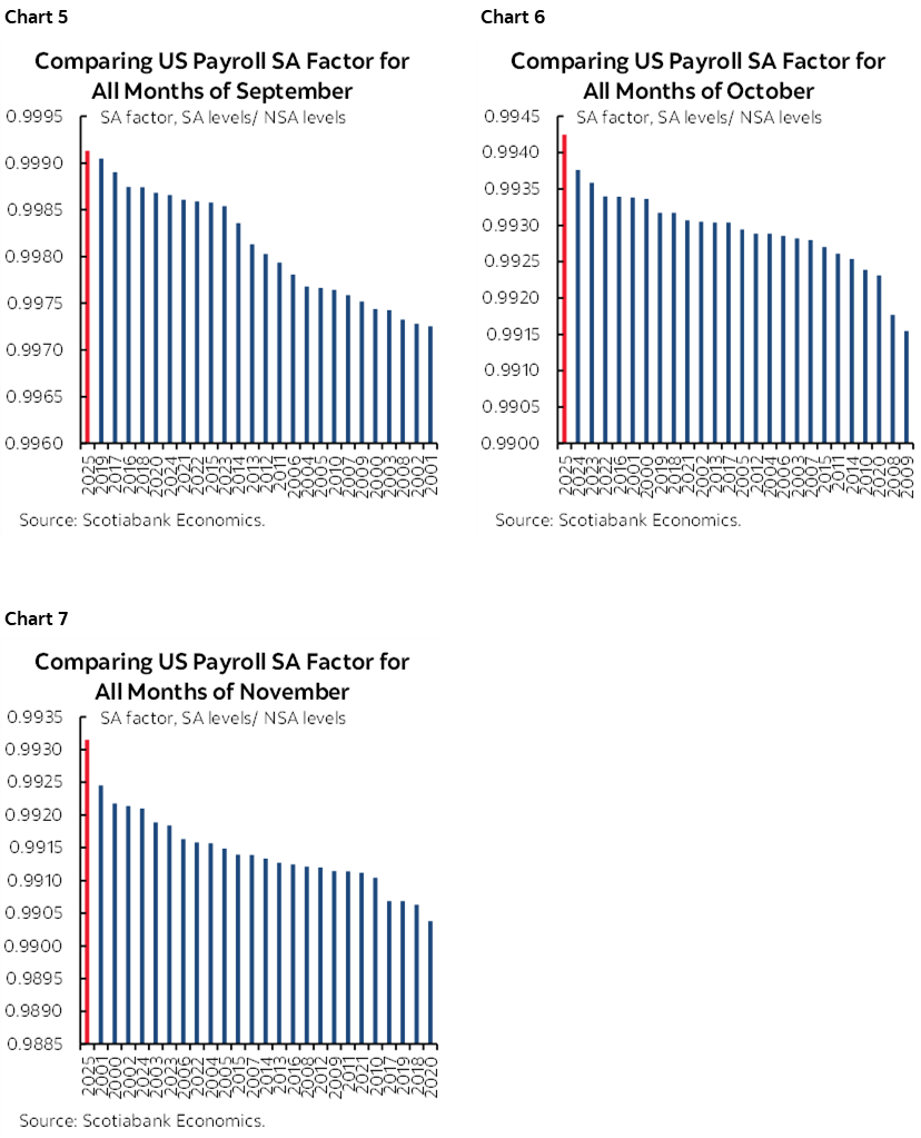
For one, on a sector basis, the health care sector was almost the only game in town (chart 2, 3). Remove that, and payrolls fell in four of the past five months (chart 4). Some of this health sector hiring is because of postings that offer visas that are more valuable under tighter immigration policy. Will health sector hiring evaporate if health care subsidies expire on schedule at the end of this year?
...QUESTIONING FISHY SA FACTORS...
The second reason why the weak payroll reports were even weaker than they appeared is that seasonal adjustment factors were fishy once again. Each of September, October and November used SA factors that were record highs comparing like months in history (charts 5–7).
Recall that President Trump fired the BLS Commissioner on August 1st and then nominated E.J. Antoni to replace her, but subsequently withdrew the nomination.
Now, what if the BLS had not chosen to use the highest SA factors on record for each of the past three months during which President Trump dramatically ramped up his criticisms of the BLS? Charts 8, 9 and 10 provide the answer. Sheer misery is the result. Payrolls probably would have plummeted in each month at virtually any other SA factor. With no explanation from the BLS.
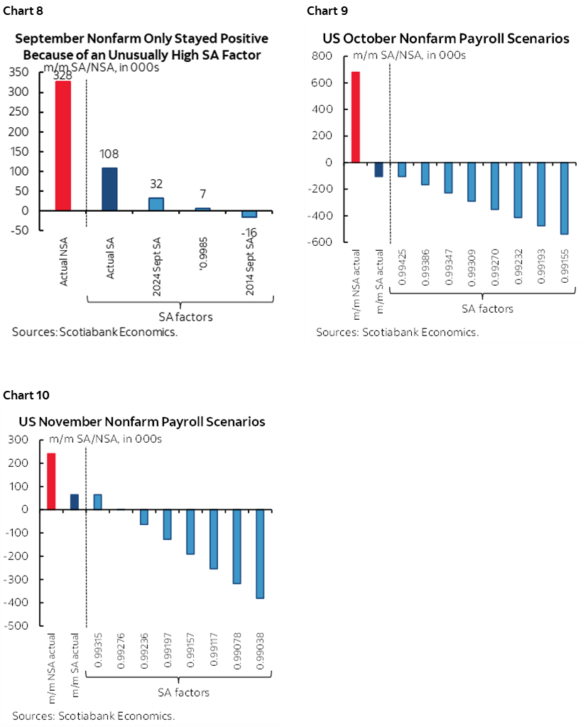
While I know there are statistical methods behind SA factors, a) they suffer from a recency bias skewed toward recent years that may not be appropriate, and b) to go to extreme highs in recent months looks awfully darn fishy when the data agency is under attack and hoping a favourable replacement is chosen as Commissioner and maybe even the acting Commissioner. Wall Street won’t embrace this issue. It must. Economists have a job to do in questioning what’s going on here given the importance of the issue.
...AND HOW TWO TYPES OF DOWNWARD REVISIONS WILL PLAY A MAJOR ROLE IN 2026
A third reason why payrolls are even weaker than they appear relates to expectations for two major rounds of revisions that will be coming in 2026.
One of those rounds of revisions relates to Chair Powell’s remark in last week’s press conference when he observed that payrolls are around 60k weaker per month since April of this year than they appear. Here were his direct quotes from the transcript (here):
"Payroll jobs averaging 40,000 per month since April. We think there's an overstatement in these numbers by about 60,000. So that would be negative 20,000 per month."
"And there's been something of a systematic overcount. And so we expected and it corrected twice a year. So the last time they corrected it, we thought the correction would be 8 or 9 hundred thousand. I won't get the numbers exactly right. And that was exactly what happened. So we think that that has persisted. And so there was an overcount in the payroll job numbers, we think, continuing. And it will be corrected. I don't have the exact month in my head right now. But—and that's just—I don't—again, I think forecasters generally understand that. So—and we think it's about 60 thousand a month. So 40 thousand jobs could be negative 20. And, you know, that could be wrong by 10 or 20 in either direction."
This is because of tracking of state level data through the Census Bureau’s Quarterly Census of Employment and Wages that points to downward revisions. A caution here is that QCEWS data can be subject to its own revisions and often sheds misleading signals.
These revisions to April 2025 onward won’t be available until September 2026—just before the US midterms—when the preliminary QCEWS data is released.
If that caution from Powell still holds now given fresh data, then US nonfarm payrolls would be flat in November, down 165k in October, up 48k in September, down 86k in August and up only 12k in August. That’s a US labour market that is dead flat without even taking into consideration the other reasons why payrolls may be overstated.
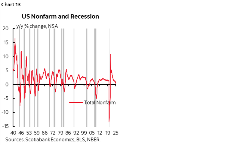
In addition to Powell’s cautions on payrolls since April of this year, recall that we still have to incorporate massive downward revisions to the SA payrolls level as explained back here. The preliminary estimate of annual revisions to the level of nonfarm payrolls in March 2025 that was provided this past September was a record -911k (chart 11). In February 2026 when the January 2026 payrolls report is release we’ll get the final annual revisions to March 2025 payrolls drawn from fuller QCEWS data and those revisions to the preliminary revision estimates can also be large (chart 12).
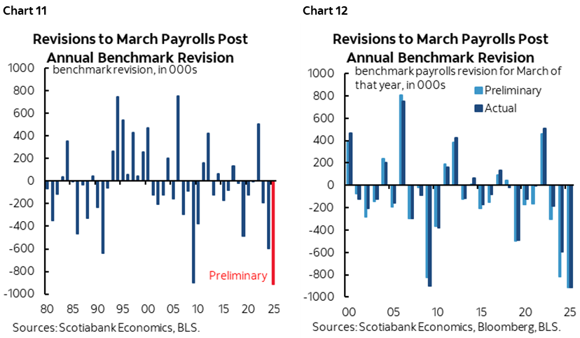
The point is that US payrolls are wildly overstated a) to March of this year, and b) possibly since then as well. When we get the revisions in February and September they are likely to show a much weaker US job market than the present nonfarm payroll levels indicate.
COURTING A MIDTERM DISASTER?
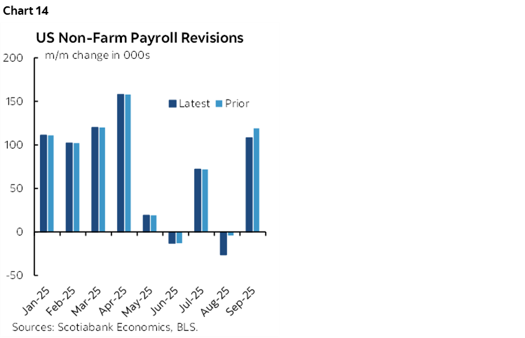
Please Santa, stop the trend in chart 13. It plots the y/y growth in nonfarm payrolls and grey bars for every recession since the 1940s. If this trend continues, the US is on the verge of a recession call. That’s anything but evident in GDP tracking up to Q3, but we’re forward looking. It’s possible that productivity growth will remain strong going forward and continue to lift GDP, but for consumers, it’s wages times jobs that get them paid and drive spending.
Clearly a recession in 2026 would be the worst possible nightmare for the GOP in the November 7th midterm elections. A massive policy pivot by the Trump administration may be needed in very short order to avert such an outcome and this primarily includes trade and immigration policies while doing nothing to further aggravate the fiscal imbalances.
OTHER DETAILS
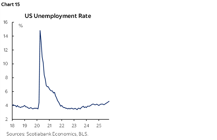
Chart 14 shows the revisions to August and September given the convention of revising the two prior months each time new payroll figures are released. Fuller revisions tracking is done semi-annually.
The unemployment rate crept up to 4.6%. The low was in April 2023 (3.4%). Chart 15. The UR is above the OECD’s and CBO’s NAIRU estimates.
Hours worked are tracking flat in Q3 and a q/q annualized gain of under 1% in Q4 (chart 16). Clearly Q3 GDP tracking ahead of next week’s figures is buoyant because of productivity gains. The US economy will need to repeat this in Q4 and beyond.
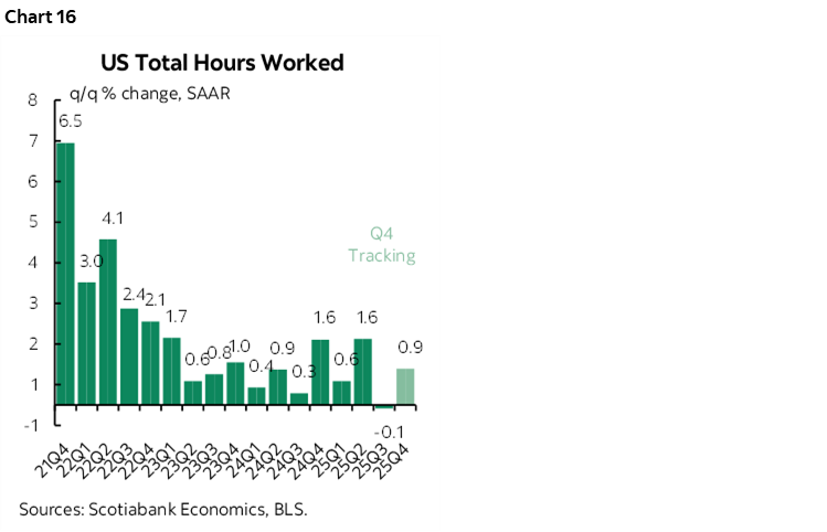
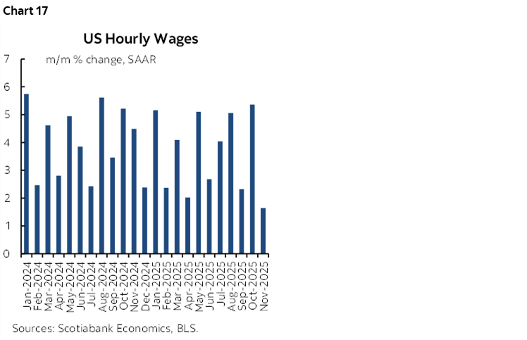
Chart 17 shows wage growth. It decelerated in November after a very strong October.
HOW SHOULD THE FED REACT?
Herein lies the conundrum. If the FOMC cuts, it will embolden arguably damaging policies in other areas that are contributing to this weakness, like protectionism and over-tightening of immigration policy including against highly skilled labour. The Fed could perversely wind up encouraging more of the policies that are harming the US and world economies and driving our forecast for world GDP growth to be the weakest since 2020.
But the Fed has somewhat of a straight jacket placed upon it by Congress to adhere to full employment and price stability dual mandate goals. It has to react to a weakening job market pending what the Committee’s updated views on inflation risk may be.
Therefore we take today’s readings as tentatively supportive of our call for another FOMC rate cut on January 28th. We continue to predict easing down to 3% by Spring. And I hope history judges such action and the possible knock on effects on markets and other policies kindly.
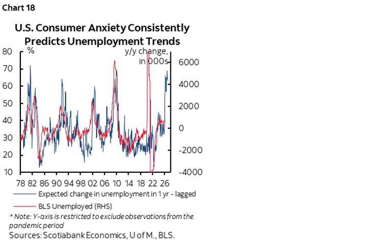
Finally, I’ll repeat one of my favourite charts for the US labour market (chart 18). Who is the best forecaster of the US unemployment rate? US consumers, it seems. They’re seeing something in the job market that we’re all reacting to in lagging fashion as revisions and distortions creep into the picture. I hope they’re wrong on 2026. What they say in the UMich sentiment survey about the expected unemployment rate one-year ahead is very strongly correlated with how it evolves. Dismiss soft data? Ok, there’s a case for that. There’s also a case for how ears to the ground and hovering near water coolers within their companies make US workers better at expecting what’s actually coming at us in advance of when economists forecast it.
Our concern is part of why we have US Ts rallying into 2026. Depending upon how the Fed reacts, equities, credit and broader risk appetite may be vulnerable.
DISCLAIMER
This report has been prepared by Scotiabank Economics as a resource for the clients of Scotiabank. Opinions, estimates and projections contained herein are our own as of the date hereof and are subject to change without notice. The information and opinions contained herein have been compiled or arrived at from sources believed reliable but no representation or warranty, express or implied, is made as to their accuracy or completeness. Neither Scotiabank nor any of its officers, directors, partners, employees or affiliates accepts any liability whatsoever for any direct or consequential loss arising from any use of this report or its contents.
These reports are provided to you for informational purposes only. This report is not, and is not constructed as, an offer to sell or solicitation of any offer to buy any financial instrument, nor shall this report be construed as an opinion as to whether you should enter into any swap or trading strategy involving a swap or any other transaction. The information contained in this report is not intended to be, and does not constitute, a recommendation of a swap or trading strategy involving a swap within the meaning of U.S. Commodity Futures Trading Commission Regulation 23.434 and Appendix A thereto. This material is not intended to be individually tailored to your needs or characteristics and should not be viewed as a “call to action” or suggestion that you enter into a swap or trading strategy involving a swap or any other transaction. Scotiabank may engage in transactions in a manner inconsistent with the views discussed this report and may have positions, or be in the process of acquiring or disposing of positions, referred to in this report.
Scotiabank, its affiliates and any of their respective officers, directors and employees may from time to time take positions in currencies, act as managers, co-managers or underwriters of a public offering or act as principals or agents, deal in, own or act as market makers or advisors, brokers or commercial and/or investment bankers in relation to securities or related derivatives. As a result of these actions, Scotiabank may receive remuneration. All Scotiabank products and services are subject to the terms of applicable agreements and local regulations. Officers, directors and employees of Scotiabank and its affiliates may serve as directors of corporations.
Any securities discussed in this report may not be suitable for all investors. Scotiabank recommends that investors independently evaluate any issuer and security discussed in this report, and consult with any advisors they deem necessary prior to making any investment.
This report and all information, opinions and conclusions contained in it are protected by copyright. This information may not be reproduced without the prior express written consent of Scotiabank.
™ Trademark of The Bank of Nova Scotia. Used under license, where applicable.
Scotiabank, together with “Global Banking and Markets”, is a marketing name for the global corporate and investment banking and capital markets businesses of The Bank of Nova Scotia and certain of its affiliates in the countries where they operate, including; Scotiabank Europe plc; Scotiabank (Ireland) Designated Activity Company; Scotiabank Inverlat S.A., Institución de Banca Múltiple, Grupo Financiero Scotiabank Inverlat, Scotia Inverlat Casa de Bolsa, S.A. de C.V., Grupo Financiero Scotiabank Inverlat, Scotia Inverlat Derivados S.A. de C.V. – all members of the Scotiabank group and authorized users of the Scotiabank mark. The Bank of Nova Scotia is incorporated in Canada with limited liability and is authorised and regulated by the Office of the Superintendent of Financial Institutions Canada. The Bank of Nova Scotia is authorized by the UK Prudential Regulation Authority and is subject to regulation by the UK Financial Conduct Authority and limited regulation by the UK Prudential Regulation Authority. Details about the extent of The Bank of Nova Scotia's regulation by the UK Prudential Regulation Authority are available from us on request. Scotiabank Europe plc is authorized by the UK Prudential Regulation Authority and regulated by the UK Financial Conduct Authority and the UK Prudential Regulation Authority.
Scotiabank Inverlat, S.A., Scotia Inverlat Casa de Bolsa, S.A. de C.V, Grupo Financiero Scotiabank Inverlat, and Scotia Inverlat Derivados, S.A. de C.V., are each authorized and regulated by the Mexican financial authorities.
Not all products and services are offered in all jurisdictions. Services described are available in jurisdictions where permitted by law.