- US core inflation accelerated, pumping the 3-mo MA above target
- Where evidence of tariff pass-through is creeping into the data
- Two strong caveats on data quality
- Markets scaled back FOMC cut pricing
- Scotia’s forecast remains for the FOMC to be on hold this year
- US CPI / core CPI, m/m % change, SA, June:
- Actual: 0.29 / 0.23
- Scotia: 0.2 / 0.3
- Consensus: 0.3 / 0.3
- Prior: 0.1 / 0.1
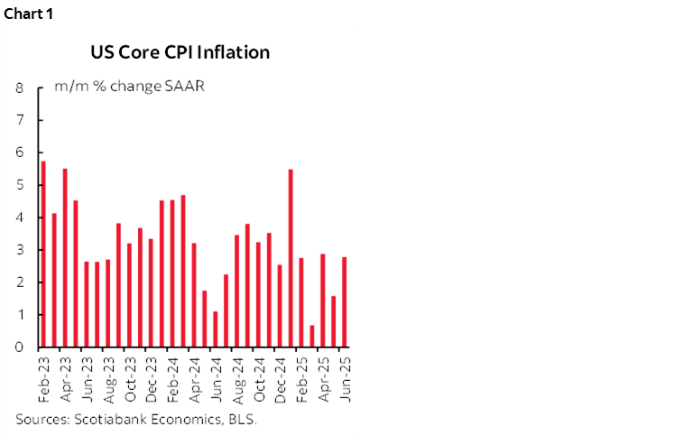
Core CPI inflation edged up a bit last month to 2.77% m/m at a seasonally adjusted and annualized rate (chart 1). The past three months have been 2.9%, 1.6% and 2.8% for a three-month moving average of 2.4%. The FOMC is likely to say that’s hardly screaming out for rate cuts regardless of what the administration says. Furthermore, core inflation would have been higher yet if not for a cooked SA factor, while further evidence points to impaired data reliability due to BLS funding cuts.
This is also how markets generally reacted to the data. The US 2-year yield moved up by about 3–4bps post-data. Markets continue to price no move by the Fed on July 30th and edged September cut pricing a little lower to about 14bps.and full-year cut pricing was ratcheted back by about 5bps to well under a half point of cumulative cuts priced by the end of 2025. Our forecast remains no cut this year.
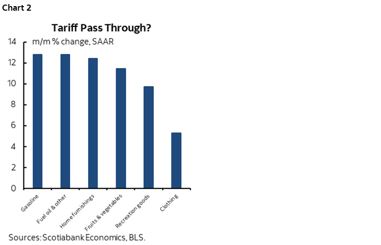
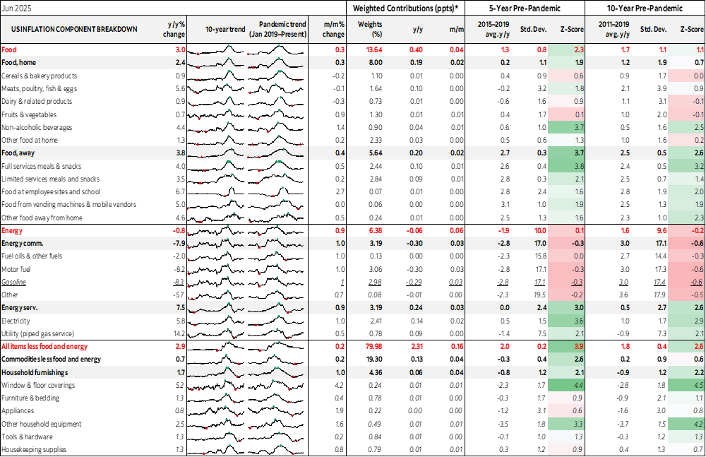
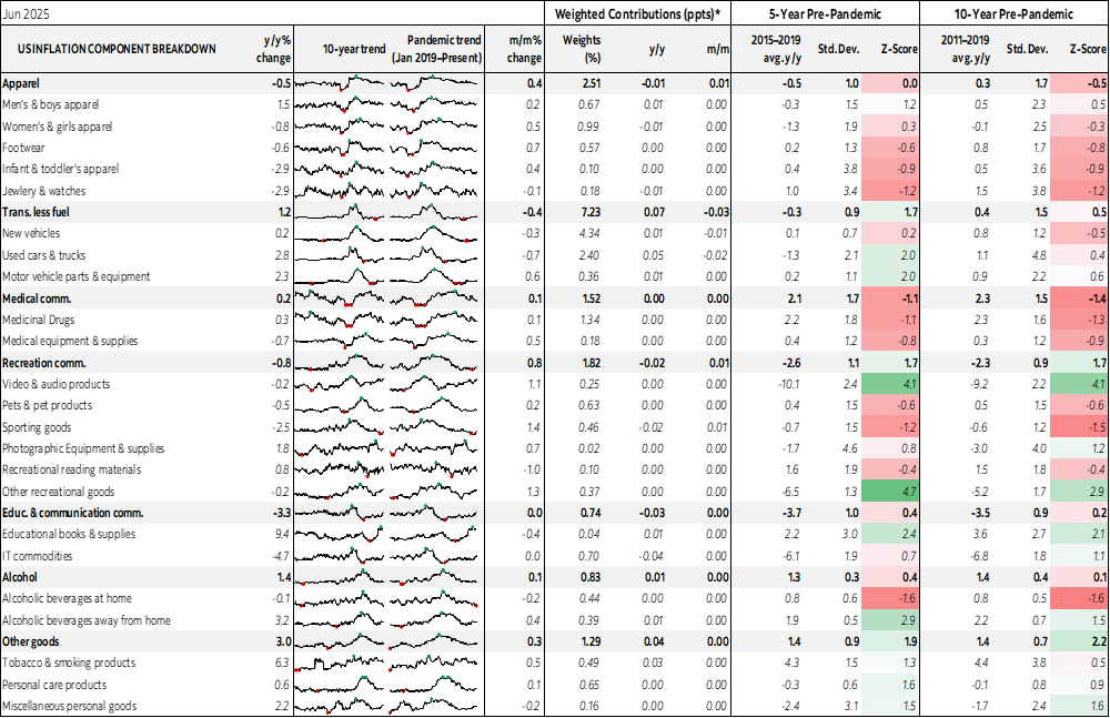
Some of the hottest CPI categories were groceries, energy, clothing, recreation goods and home furnishings, each of which may have had tariff-driven factors behind them given significant import-propensities (chart 2). In seasonally adjusted terms, fruits and vegetables were up 11.5% m/m SAAR, home fuel prices were up by 12.8%, gasoline jumped 12.8%, clothing was up 5.3%, home furnishings jumped by 12.4% with significant breadth across sub-categories like furniture and appliances, and recreation goods were up 9.7% and also with high breadth.
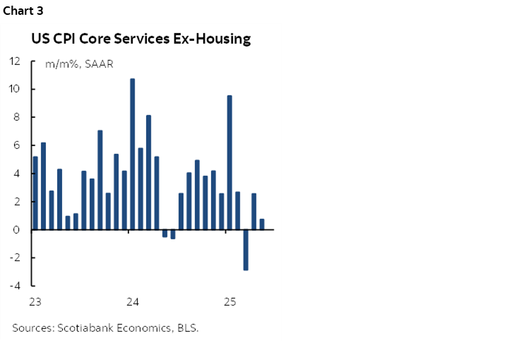
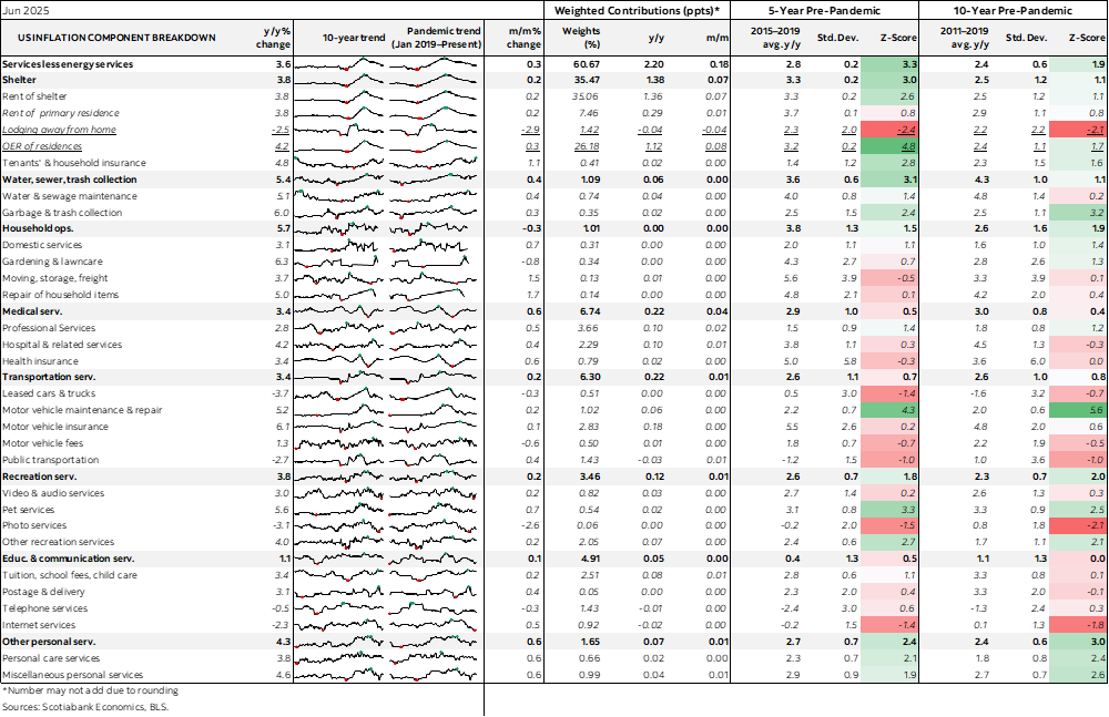
Core services inflation which excludes energy and housing related components was subdued this time (chart 3).
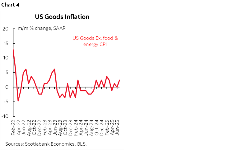
This time, the gain was driven by an acceleration of core goods CPI to 2.4% m/m SAAR (chart 4).
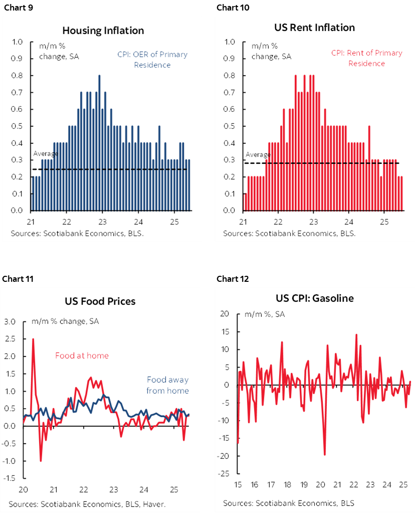
Shelter costs were up by 2.1% m/m SAAR with rent up 2.75% and owners’ equivalent rent up 3.7% alongside higher home heating costs. The perennial wish for cooling market rents to show up in key measures of rent in CPI remains largely elusive.
POOR QUALITY DATA AT THE WORST POSSIBLE MOMENT
US inflation data reliability is highly questionable at the worst possible moment in time. There are two reasons for this.
One is that one of the biggest seasonally unadjusted increases in core CPI compared to like months of June (chart 5) was tamped down by the seasonal adjustment factor that was applied to June core CPI which was the lowest on record compared to like months of June in history (chart 6). At any other June SA factor used in history, this June’s core CPI reading would have been noticeably warmer (chart 7). The SA factor is calculated with a strong recency bias that is skewed to developments over the latest years. All of the pandemic-era SA factors have been the lowest on record. Having faith in these estimates requires having confidence that today’s seasonality is fundamentally different than ever before and that the distortions introduced by the pandemic’s rolling shocks and the timing of stimulus measures still apply in 2025.
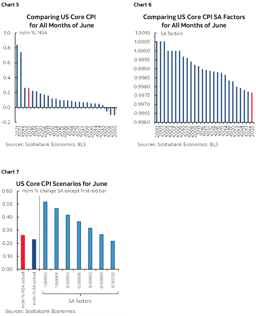
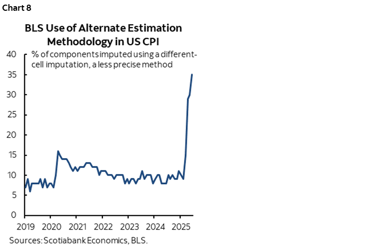
Secondly, the share of the CPI basket estimated by proxy methods instead of hard data increased again. After two months in which that share was at 30%—double the prior record in the depths of the pandemic when agents couldn’t be sent into the field to collect prices—it now stands at 35% (chart 8). The BLS emphasizes the role played by the Trump administration’s budget cuts for such under-sampling and hence the reliance upon proxy methods like substituting prices for goods using comparable goods, and prices for goods from other markets when in-market prices cannot be sampled. Proving that this distorts CPI is impossible, but it would stand to reason that one should be extremely guarded toward the quality of the data when so much of the basket is being inferred and will never be revised since the data has fundamentally gone awol.
Simply put, it is wrong to blindly ignore serious question marks surrounding the quality of US inflation data at the worst possible moment.
DETAILS
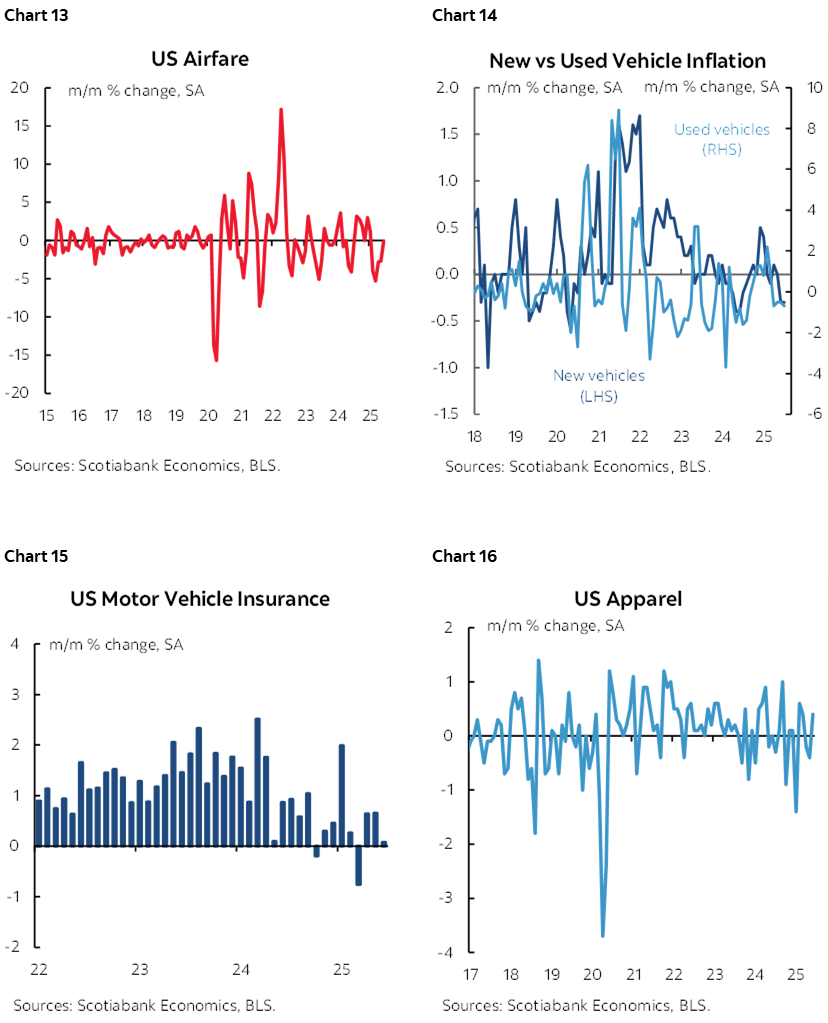
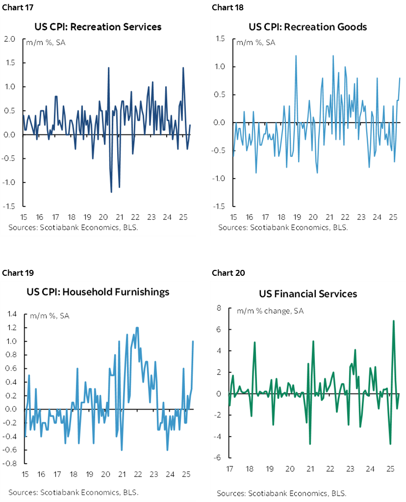
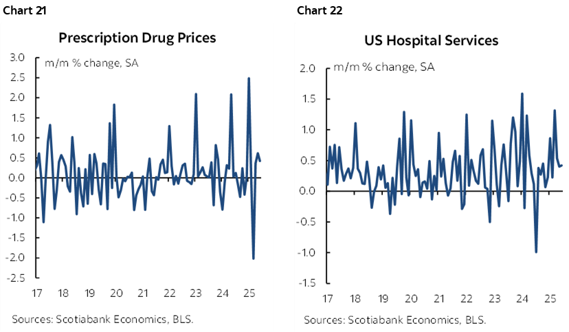
Charts 9–22 break down individual components of the basket to show trends.
Charts 23–24 ranked the y/y % price changes across CPI components in raw terms and weighted contributions to CPI respectively.
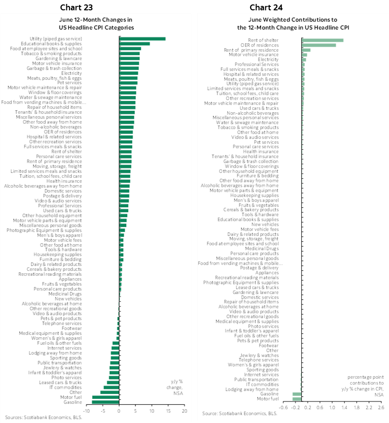
Charts 25–26 do likewise for m/m price changes.
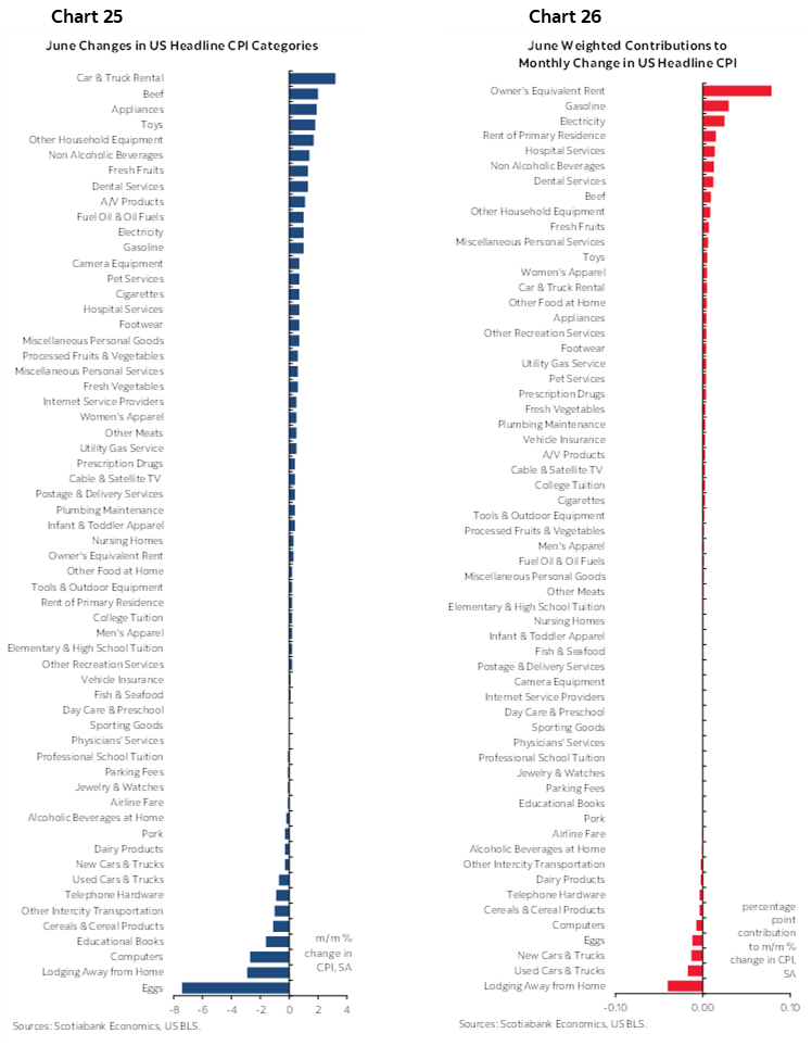
Please also see the accompanying table with further details, micro-charts and measures of deviations from historical tendencies.
DISCLAIMER
This report has been prepared by Scotiabank Economics as a resource for the clients of Scotiabank. Opinions, estimates and projections contained herein are our own as of the date hereof and are subject to change without notice. The information and opinions contained herein have been compiled or arrived at from sources believed reliable but no representation or warranty, express or implied, is made as to their accuracy or completeness. Neither Scotiabank nor any of its officers, directors, partners, employees or affiliates accepts any liability whatsoever for any direct or consequential loss arising from any use of this report or its contents.
These reports are provided to you for informational purposes only. This report is not, and is not constructed as, an offer to sell or solicitation of any offer to buy any financial instrument, nor shall this report be construed as an opinion as to whether you should enter into any swap or trading strategy involving a swap or any other transaction. The information contained in this report is not intended to be, and does not constitute, a recommendation of a swap or trading strategy involving a swap within the meaning of U.S. Commodity Futures Trading Commission Regulation 23.434 and Appendix A thereto. This material is not intended to be individually tailored to your needs or characteristics and should not be viewed as a “call to action” or suggestion that you enter into a swap or trading strategy involving a swap or any other transaction. Scotiabank may engage in transactions in a manner inconsistent with the views discussed this report and may have positions, or be in the process of acquiring or disposing of positions, referred to in this report.
Scotiabank, its affiliates and any of their respective officers, directors and employees may from time to time take positions in currencies, act as managers, co-managers or underwriters of a public offering or act as principals or agents, deal in, own or act as market makers or advisors, brokers or commercial and/or investment bankers in relation to securities or related derivatives. As a result of these actions, Scotiabank may receive remuneration. All Scotiabank products and services are subject to the terms of applicable agreements and local regulations. Officers, directors and employees of Scotiabank and its affiliates may serve as directors of corporations.
Any securities discussed in this report may not be suitable for all investors. Scotiabank recommends that investors independently evaluate any issuer and security discussed in this report, and consult with any advisors they deem necessary prior to making any investment.
This report and all information, opinions and conclusions contained in it are protected by copyright. This information may not be reproduced without the prior express written consent of Scotiabank.
™ Trademark of The Bank of Nova Scotia. Used under license, where applicable.
Scotiabank, together with “Global Banking and Markets”, is a marketing name for the global corporate and investment banking and capital markets businesses of The Bank of Nova Scotia and certain of its affiliates in the countries where they operate, including; Scotiabank Europe plc; Scotiabank (Ireland) Designated Activity Company; Scotiabank Inverlat S.A., Institución de Banca Múltiple, Grupo Financiero Scotiabank Inverlat, Scotia Inverlat Casa de Bolsa, S.A. de C.V., Grupo Financiero Scotiabank Inverlat, Scotia Inverlat Derivados S.A. de C.V. – all members of the Scotiabank group and authorized users of the Scotiabank mark. The Bank of Nova Scotia is incorporated in Canada with limited liability and is authorised and regulated by the Office of the Superintendent of Financial Institutions Canada. The Bank of Nova Scotia is authorized by the UK Prudential Regulation Authority and is subject to regulation by the UK Financial Conduct Authority and limited regulation by the UK Prudential Regulation Authority. Details about the extent of The Bank of Nova Scotia's regulation by the UK Prudential Regulation Authority are available from us on request. Scotiabank Europe plc is authorized by the UK Prudential Regulation Authority and regulated by the UK Financial Conduct Authority and the UK Prudential Regulation Authority.
Scotiabank Inverlat, S.A., Scotia Inverlat Casa de Bolsa, S.A. de C.V, Grupo Financiero Scotiabank Inverlat, and Scotia Inverlat Derivados, S.A. de C.V., are each authorized and regulated by the Mexican financial authorities.
Not all products and services are offered in all jurisdictions. Services described are available in jurisdictions where permitted by law.