- Nonfarm payrolls were mildly higher…
- ...but weaker under the hood
- US private payrolls ex-health care have been down all year
- The FOMC should be more concerned about the state of the job market
- Scotiabank Economics ranked #1 among 71 nonfarm payroll forecasters in 2025
- US payrolls m/m 000s / UR %, December:
- Actual: 50 / 4.4
- Scotia: 25 / 4.5
- Consensus: 70 / 4.5
- Prior: 56 / 4.5 (revised from 64 / 4.6)
- Two-month revision: -76k
Nonfarm payrolls grew by 50k which split the difference between consensus and my estimate. Not bad, right? Wrong.
For starters, it’s a minor point, but revisions removed 76,000 jobs from the prior two months and mainly from October that fell 173k before gains of 56k and 50k in the next two months.
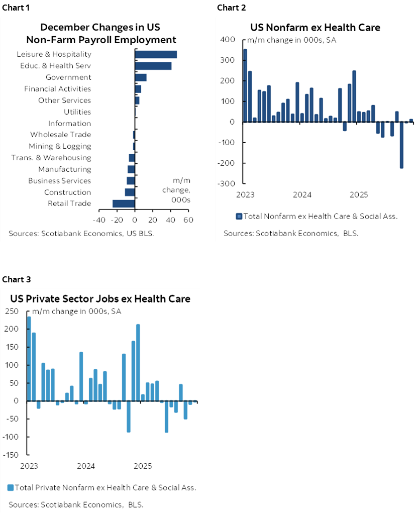
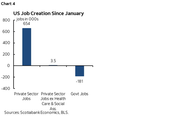
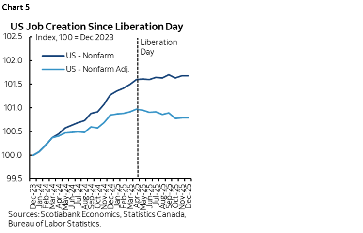
The details leave a sour taste behind. For one thing, there was narrow breadth (chart 1). Take health sector hiring out of the picture and there isn’t much else. In fact, chart 2 shows that nonfarm has been down in four of the past eight months and roughly flat in three others with only September posting a small gain. The same holds true if we just look at private payrolls minus healthcare (chart 3).
Monthly breakeven estimates for job growth are lower in the context of tighter immigration policy, but it’s a stretch to say the payroll numbers ex-healthcare should be trending negative. And yet, nonfarm ex-health since April has been down by about –354k. That’s an extremely important observation from a monetary policy standpoint: health care hiring is less likely to be rate sensitive than the rest of the labour market, although other drivers like massive non-Fed policy uncertainty and AI haven’t helped.
The FOMC should therefore view the full employment side of its dual mandate as under more pressure than the inflation side for now. That should motivate a cut on January given the Congressional mandate, even if it’s a plug-your-nose-on-moral-hazard cut by potentially emboldening other aggressive policies.
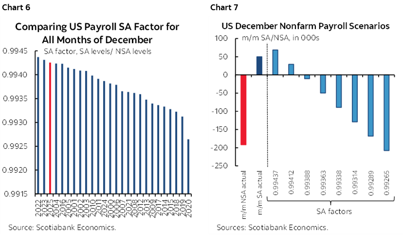
President Trump posted aggregated ytd numbers last evening (here) that showed decent private sector job growth in 2025. Tisk tisk. He gets the numbers from the White House Director of the Economic Council late the day before but is supposed to sit on them. There’s just one small problem—it’s all been in the health sector (chart 4). Take health out, and nonfarm private payrolls were flat in 2025.
Then consider the expiration of ACA subsidies at the end of 2025 and it’s not hard to imagine downside risk to health sector hiring in 2026. Trump clearly hates many government jobs and isn’t a fan of health care subsidies which the data suggests leaves nothing much else to drive the US labour market.
The numbers are weaker yet upon consideration of additional points. One is that the payroll figures do not yet include the effects of annual benchmarking numbers. That takes two forms. One is that next month—with the January report—the annual revisions to March 2025 payrolls will be finalized and incorporated in the official nonfarm payroll readings and they were initially estimated in September to take the March level down by 911k. Second is that from April onward there is an ongoing overestimation bias as Fed Chair Powell has indicated when he said he thinks payroll changes since April have been overestimated by about 60k per month.
If that overestimation since April holds—and we won’t get the annual benchmarking revisions for the period from April 2025 to March 2026 until September while relying upon quarterly estimates in the meantime—then the figures shown in charts 2-4 are likely considerably weaker yet. Chart 5 offers an attempt at showing how much weaker by plotting official payrolls and payrolls adjusted for these points on including revisions.
Further, seasonal adjustment factors were not quite as high as the prior three months of consecutive record SA factors when comparing like months in history, but chart 6 shows the BLS still went to the high side. Chart 7 shows that this kept the payroll change positive versus what would have happened at other SA factors. Those SA factors are calculated using standard statistical methods but the opaqueness leaves questions behind in terms of judgement around whether SA factors should be as high as they have been ever since Trump fired the BLS Commissioner.
Where to from here? Consumers may have the answer (chart 8). And we’re getting perilously close to a worse outcome for the economy before even incorporating any of the arguments above about overstated payrolls (chart 9, grey bars are recessions).

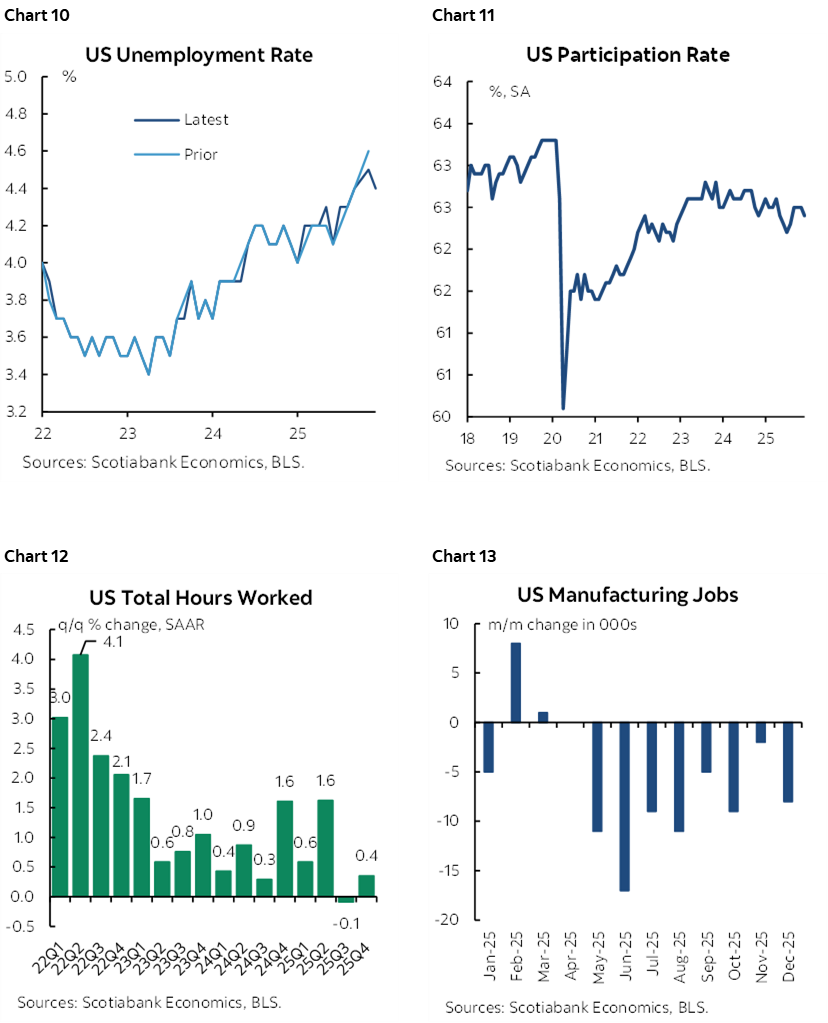
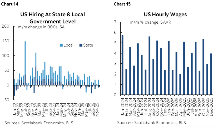
The next page offers additional charts for your consideration. The unemployment rate edged lower to 4.4% from 4.5% (revised from 4.6%) as the more volatile household survey posted a solid job gain and a mild contraction in the workforce. The noise on this survey blows nonfarm’s statistical noise out of the water. Further, a tight labour market is one thing; job growth and income growth are what drive consumption growth.
DISCLAIMER
This report has been prepared by Scotiabank Economics as a resource for the clients of Scotiabank. Opinions, estimates and projections contained herein are our own as of the date hereof and are subject to change without notice. The information and opinions contained herein have been compiled or arrived at from sources believed reliable but no representation or warranty, express or implied, is made as to their accuracy or completeness. Neither Scotiabank nor any of its officers, directors, partners, employees or affiliates accepts any liability whatsoever for any direct or consequential loss arising from any use of this report or its contents.
These reports are provided to you for informational purposes only. This report is not, and is not constructed as, an offer to sell or solicitation of any offer to buy any financial instrument, nor shall this report be construed as an opinion as to whether you should enter into any swap or trading strategy involving a swap or any other transaction. The information contained in this report is not intended to be, and does not constitute, a recommendation of a swap or trading strategy involving a swap within the meaning of U.S. Commodity Futures Trading Commission Regulation 23.434 and Appendix A thereto. This material is not intended to be individually tailored to your needs or characteristics and should not be viewed as a “call to action” or suggestion that you enter into a swap or trading strategy involving a swap or any other transaction. Scotiabank may engage in transactions in a manner inconsistent with the views discussed this report and may have positions, or be in the process of acquiring or disposing of positions, referred to in this report.
Scotiabank, its affiliates and any of their respective officers, directors and employees may from time to time take positions in currencies, act as managers, co-managers or underwriters of a public offering or act as principals or agents, deal in, own or act as market makers or advisors, brokers or commercial and/or investment bankers in relation to securities or related derivatives. As a result of these actions, Scotiabank may receive remuneration. All Scotiabank products and services are subject to the terms of applicable agreements and local regulations. Officers, directors and employees of Scotiabank and its affiliates may serve as directors of corporations.
Any securities discussed in this report may not be suitable for all investors. Scotiabank recommends that investors independently evaluate any issuer and security discussed in this report, and consult with any advisors they deem necessary prior to making any investment.
This report and all information, opinions and conclusions contained in it are protected by copyright. This information may not be reproduced without the prior express written consent of Scotiabank.
™ Trademark of The Bank of Nova Scotia. Used under license, where applicable.
Scotiabank, together with “Global Banking and Markets”, is a marketing name for the global corporate and investment banking and capital markets businesses of The Bank of Nova Scotia and certain of its affiliates in the countries where they operate, including; Scotiabank Europe plc; Scotiabank (Ireland) Designated Activity Company; Scotiabank Inverlat S.A., Institución de Banca Múltiple, Grupo Financiero Scotiabank Inverlat, Scotia Inverlat Casa de Bolsa, S.A. de C.V., Grupo Financiero Scotiabank Inverlat, Scotia Inverlat Derivados S.A. de C.V. – all members of the Scotiabank group and authorized users of the Scotiabank mark. The Bank of Nova Scotia is incorporated in Canada with limited liability and is authorised and regulated by the Office of the Superintendent of Financial Institutions Canada. The Bank of Nova Scotia is authorized by the UK Prudential Regulation Authority and is subject to regulation by the UK Financial Conduct Authority and limited regulation by the UK Prudential Regulation Authority. Details about the extent of The Bank of Nova Scotia's regulation by the UK Prudential Regulation Authority are available from us on request. Scotiabank Europe plc is authorized by the UK Prudential Regulation Authority and regulated by the UK Financial Conduct Authority and the UK Prudential Regulation Authority.
Scotiabank Inverlat, S.A., Scotia Inverlat Casa de Bolsa, S.A. de C.V, Grupo Financiero Scotiabank Inverlat, and Scotia Inverlat Derivados, S.A. de C.V., are each authorized and regulated by the Mexican financial authorities.
Not all products and services are offered in all jurisdictions. Services described are available in jurisdictions where permitted by law.