- Canada posted the first monthly job loss since August
- Weather and sickies might have been the culprits
- Details were mixed: full-time up, UR down…
- ...as wage growth decelerated…
- ...but expanding hours worked lean toward recovering GDP into Q1
- Markets ignored the mixed readings. So will the BoC.
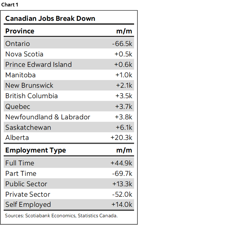
Canada lost jobs last month and markets couldn’t have cared less. Heartless? Not really, it’s a rational response to a dog’s breakfast of data and shaky underlying drivers. Chart 1 shows some summary stats to get us started.
First the sticker shock was a drop of 24.8k jobs in January. You would think that would skunk CAD and send traders scurrying to buy short-dated bonds. Nope. Canada’s 2-year yield is unchanged and the Canadian dollar slightly appreciated.
Why? Could it be that folks rationally understand that the Bank of Canada is more focused upon a broad set of supply and demand drivers of the inflation outlook with a high bar set against doing much of anything for a while? Could it be that markets understand this is a noisy survey? Gosh, perhaps there’s hope after all.
As for other reasons to discount the headline job loss, there are a few.
An obvious starting point is that it’s just one month along a bullish jobs trend. Canada is still up 165k jobs since August when the gains started, of which 172k full-time job creation dominated and part-time jobs fell by 7.3k.
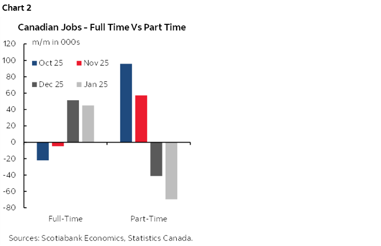
For another, the employment drop was due to part-time jobs (-69.7k) as full-time jobs were up 44.9k (chart 2). No job loss would be preferred, but if you have to lose any, then a large full-time gain is a very welcome antidote. Full-time job holders are more likely to drive stronger economic activity with more attachment to the workforce.
For another, the unemployment rate fell three-tenths to 6.5% which is the lowest since September 2024. The labour market appeared to tighten. Having said that, the only reason the UR fell was because 119k folks left the labour force as an offset to the 24.8k job loss. That’s the biggest drop in the labour force since January 2021.
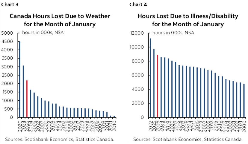
Weather and sickies may have explained weakness perhaps in both the jobs tally and the labour force exits. Charts 3 and 4 show lost hours due to bad weather and lost hours due to sickness. This has been a bad flu/cold season and an awful winter even by Canadian standards. That could reasonably have impacted the ability to enter the workforce, weighed on total hours worked, and particularly impacted part-time workers who are less attached to the workforce.
Weather and sickies might have also explained the contraction in the labour force.
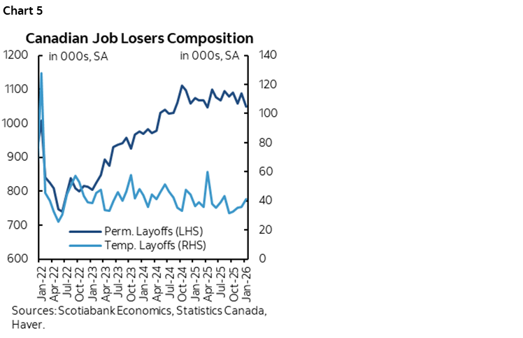
The fact that the job ‘losers’ were due to temporary layoffs (not permanent) also lessens concern about the weak headline and leans in favour of transitory factors that weighed on employment (chart 5).
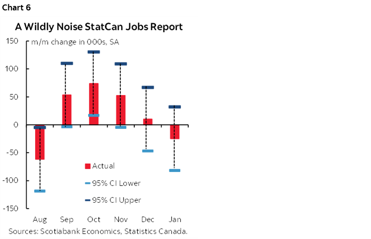
There is also the statistical noise consideration. We couldn’t credibly dismiss the job gains in September, October and November as driven by noise since the gains during those months were within the 95% confidence bands for the survey sample (chart 6). December and January are more doubtful; those months could have been worse than reported, or better than reported in the context of the statistical noise factor which should make for careful interpretation.
It was all about Ontario this month. Chart 7 shows that Ontario lost 67k jobs in January, all in private payrolls (-70k) and self-employed (-8.9k) as public payrolls expanded by 12.5k. Since I live in Ontario I can readily attest to how bad the weather has been and how many sickies there are!
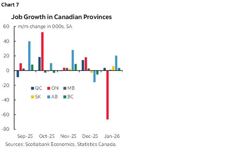
Add reason to doubt the job loss is my simple disbelief that education sector jobs suddenly became among the riskiest to hold. Educational services jobs fell by 24k in January. Let’s see, heavily funded by public money, and unionized. Right. I suspect survey answers during sickness and weather in the reference week alongside statistical noise may have explained that one.
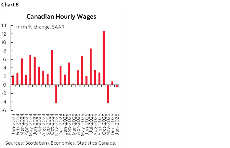
Wage growth has sharply slowed (chart 8). Average hourly earnings of permanent employees fell by –0.5% m/m at a seasonally adjusted and annualized rate (SAAR) after a 0.8% prior gain and a 4.2% drop before that. That makes for a –1.3% m/m SAAR three-month moving average, but it’s off of a quirky 12.7% m/m SAAR gain in the month of October so colour me sceptical. Further, wage settlements remain high over the 3–4 year contract periods that lean toward sustained future trend wage gains. And productivity remains weak which mitigates any overreaction to recently softening wage growth.
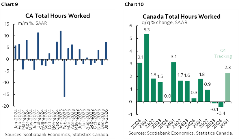
Hours worked were up by 0.6% m/m SA in January (chart 9). That’s massive. In fact, it’s the biggest gain since last January. The result translates into a 2.3% q/q SAAR gain in hours worked during Q1 (chart 10). Both January’s gain and the Q1 tracking buoy GDP expectations since GDP is defined as hours worked times labour productivity. We can’t observe the latter, but the jump in hours worked leans toward expectations for a GDP rebound (both ours and the BoC’s expectations).
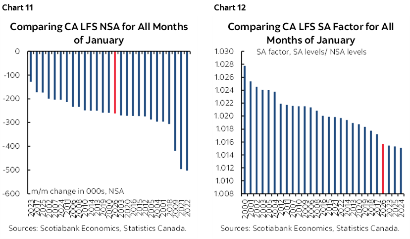
Seasonal adjustment factors tamped down the headline change in jobs. This January was not unusual in terms of the seasonally unadjusted change in employment compared to like months of January in history (chart 11), but the SA factor was among the lowest on record just as other pandemic-era SA factors have been (chart 12). SA factors are subject to a recency bias in how they are calculated and there remains plausible reason to think that the pandemic era messed up seasonality of a broad set of data readings in multiple economies.
As for sectors, chart 13 shows the ups and downs for job growth by industry. Manufacturing took it on the chin this time along with the education sector that I’m doubtful toward.
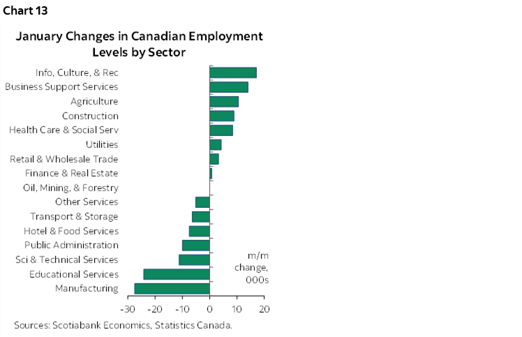
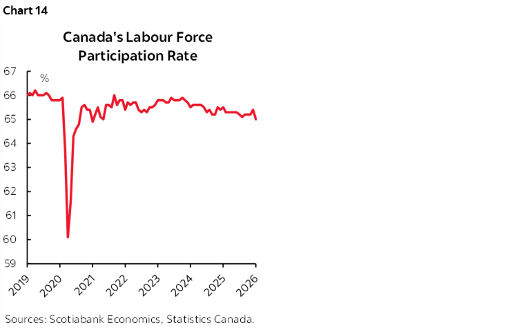
Chart 14 shows the slightly declining trend in the labour force participation rate. On the heels of Macklem’s supply-and-demand primer speech yesterday, it bears noting that if the demand for labour weakens, we need to consider the supply side along with it. Tighter immigration policy may be driving the monthly breakeven rate in Canadian jobs (that leaves the UR tight) closer to zero.
Like the US, that’s good and bad. Good in the sense it means the labour market may remain tight. Bad in the sense that job growth and income growth are needed to support consumption growth. Stay tuned.
DISCLAIMER
This report has been prepared by Scotiabank Economics as a resource for the clients of Scotiabank. Opinions, estimates and projections contained herein are our own as of the date hereof and are subject to change without notice. The information and opinions contained herein have been compiled or arrived at from sources believed reliable but no representation or warranty, express or implied, is made as to their accuracy or completeness. Neither Scotiabank nor any of its officers, directors, partners, employees or affiliates accepts any liability whatsoever for any direct or consequential loss arising from any use of this report or its contents.
These reports are provided to you for informational purposes only. This report is not, and is not constructed as, an offer to sell or solicitation of any offer to buy any financial instrument, nor shall this report be construed as an opinion as to whether you should enter into any swap or trading strategy involving a swap or any other transaction. The information contained in this report is not intended to be, and does not constitute, a recommendation of a swap or trading strategy involving a swap within the meaning of U.S. Commodity Futures Trading Commission Regulation 23.434 and Appendix A thereto. This material is not intended to be individually tailored to your needs or characteristics and should not be viewed as a “call to action” or suggestion that you enter into a swap or trading strategy involving a swap or any other transaction. Scotiabank may engage in transactions in a manner inconsistent with the views discussed this report and may have positions, or be in the process of acquiring or disposing of positions, referred to in this report.
Scotiabank, its affiliates and any of their respective officers, directors and employees may from time to time take positions in currencies, act as managers, co-managers or underwriters of a public offering or act as principals or agents, deal in, own or act as market makers or advisors, brokers or commercial and/or investment bankers in relation to securities or related derivatives. As a result of these actions, Scotiabank may receive remuneration. All Scotiabank products and services are subject to the terms of applicable agreements and local regulations. Officers, directors and employees of Scotiabank and its affiliates may serve as directors of corporations.
Any securities discussed in this report may not be suitable for all investors. Scotiabank recommends that investors independently evaluate any issuer and security discussed in this report, and consult with any advisors they deem necessary prior to making any investment.
This report and all information, opinions and conclusions contained in it are protected by copyright. This information may not be reproduced without the prior express written consent of Scotiabank.
™ Trademark of The Bank of Nova Scotia. Used under license, where applicable.
Scotiabank, together with “Global Banking and Markets”, is a marketing name for the global corporate and investment banking and capital markets businesses of The Bank of Nova Scotia and certain of its affiliates in the countries where they operate, including; Scotiabank Europe plc; Scotiabank (Ireland) Designated Activity Company; Scotiabank Inverlat S.A., Institución de Banca Múltiple, Grupo Financiero Scotiabank Inverlat, Scotia Inverlat Casa de Bolsa, S.A. de C.V., Grupo Financiero Scotiabank Inverlat, Scotia Inverlat Derivados S.A. de C.V. – all members of the Scotiabank group and authorized users of the Scotiabank mark. The Bank of Nova Scotia is incorporated in Canada with limited liability and is authorised and regulated by the Office of the Superintendent of Financial Institutions Canada. The Bank of Nova Scotia is authorized by the UK Prudential Regulation Authority and is subject to regulation by the UK Financial Conduct Authority and limited regulation by the UK Prudential Regulation Authority. Details about the extent of The Bank of Nova Scotia's regulation by the UK Prudential Regulation Authority are available from us on request. Scotiabank Europe plc is authorized by the UK Prudential Regulation Authority and regulated by the UK Financial Conduct Authority and the UK Prudential Regulation Authority.
Scotiabank Inverlat, S.A., Scotia Inverlat Casa de Bolsa, S.A. de C.V, Grupo Financiero Scotiabank Inverlat, and Scotia Inverlat Derivados, S.A. de C.V., are each authorized and regulated by the Mexican financial authorities.
Not all products and services are offered in all jurisdictions. Services described are available in jurisdictions where permitted by law.