- Core CPI was warm and the breadth of price increases rose
- Core services drove most of the heat
- Tariff pass through evidence could take a while yet
- Markets reacted dovishly. The FOMC majority will not.
- US CPI / core CPI, m/m %, SA, July:
- Actual: 0.2 / 0.3
- Scotia: 0.2 / 0.2
- Consensus: 0.2 / 0.3
- Prior: 0.3 / 0.2
US core inflation warmed up in August as the breadth of price increases rose. Most of the heat came from core services with limited evidence of any obvious tariff pass through effects that could take a while to burn through old pre-tariff inventory, transition through to recent implementation of tariff hikes, and first-round effects on margins awaiting potential pass through. There are serious concerns about data quality that I’ll come back to and I’ll leave it to you to review the disturbing political aftermath.
DETAILS
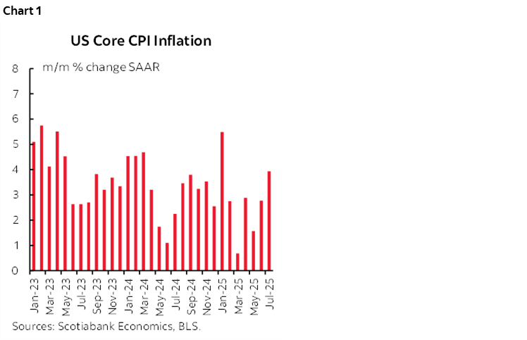
First the details. Core CPI was up 0.32% m/m SA. That’s the warmest reading since January. It equated to a seasonally adjusted and annualized reading of 3.94% m/m SAAR after the 2.77% reading in June, 1.57% in May, and 2.88% in April (chart 1). These are not light trend readings. The three-month moving average has now pushed up to 2.76% and is rising.
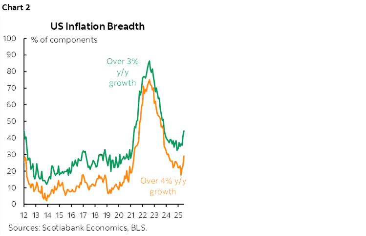
The breadth of price increases picked up (chart 2).
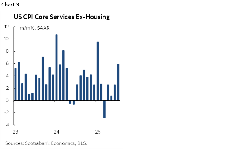
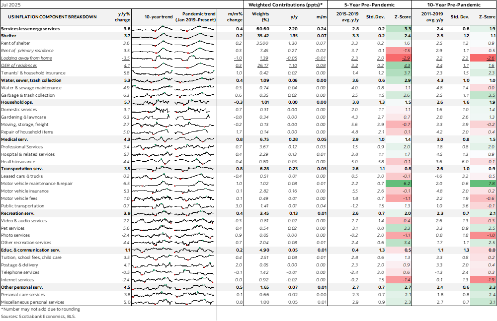
Core services—that exclude housing and energy services—accelerated to 0.48% m/m SA which is the hottest reading since January. That works out to 5.9% m/m SAAR (chart 3).
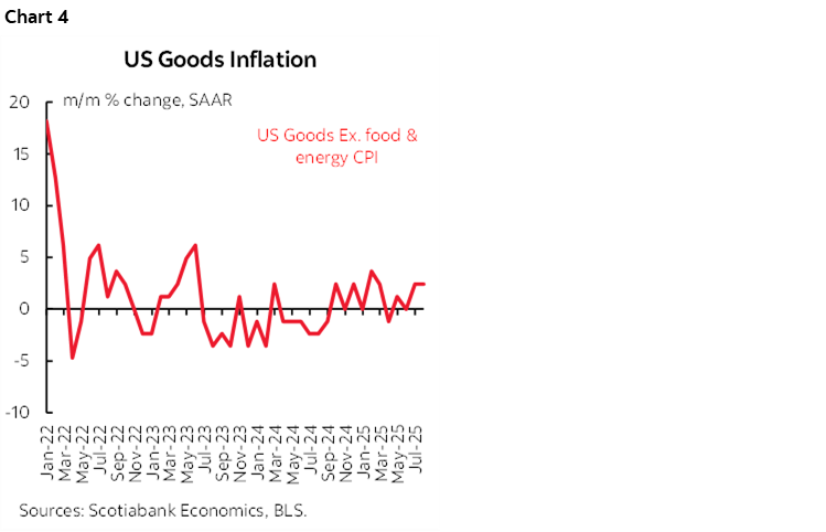
Core goods inflation—that excludes food and energy commodities— was up by 0.21% m/m SA and 2.54% m/m SAAR. That’s not ripping, but it’s also not light (chart 4).
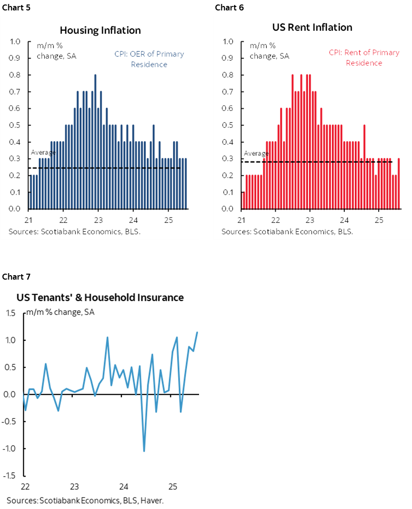
Owners’ equivalent rent was up by 0.3% m/m SA which is the same as the prior month (chart 5). Rent of primary residence picked up a tenth to 0.3 as well (chart 6). Insurance for renters and homeowners soared (chart 7).
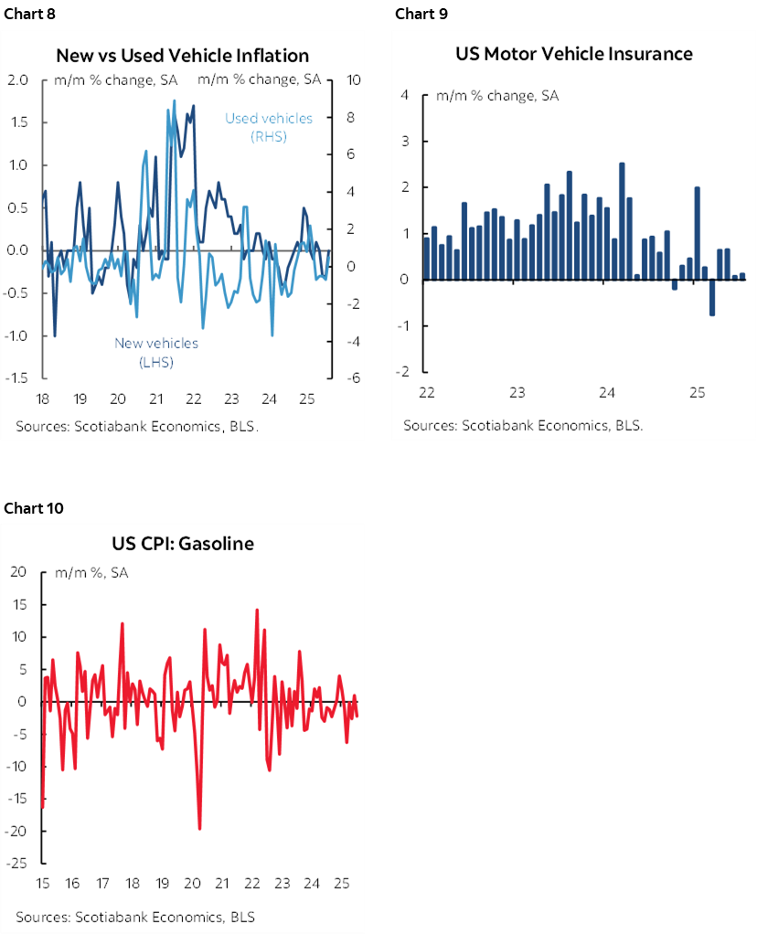
New vehicle prices were flat, and used vehicle prices were up by 0.5% m/m SA after two months of decline (chart 8). Auto insurance was subdued at 0.1% m/m SA (chart 9) and gasoline prices fell 2.2% m/m SA (chart 10).
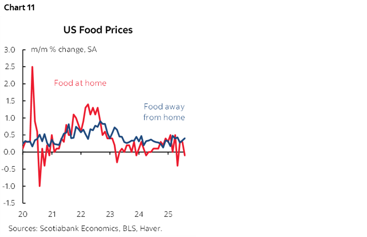
Food prices were flat as groceries (aka food at home) slipped –0.1% m/m SA and food away from home (eg. Take-out, seated dining etc) was warm again at 0.3% m/m (chart 11).
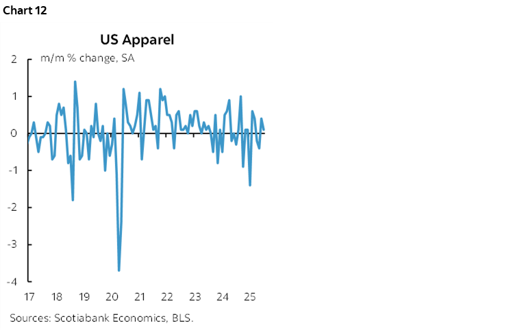
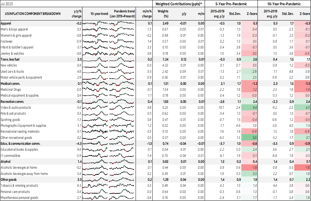
Apparel prices were subdued at 0.1% m/m SA (chart 12).
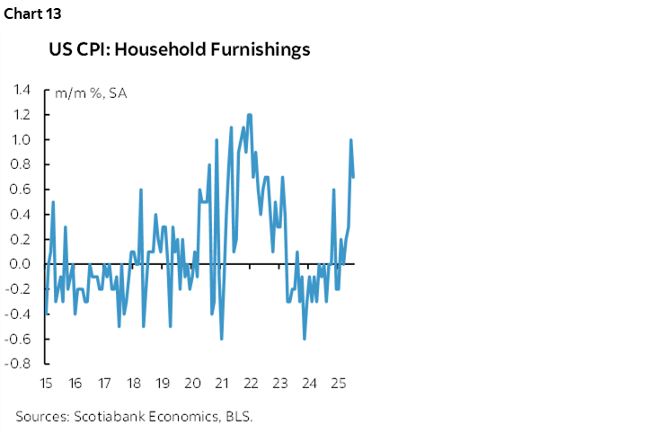
Prices for household furnishings soared again at 0.7% m/m SA after a 1.0% m/m SA gain in June (chart 13).
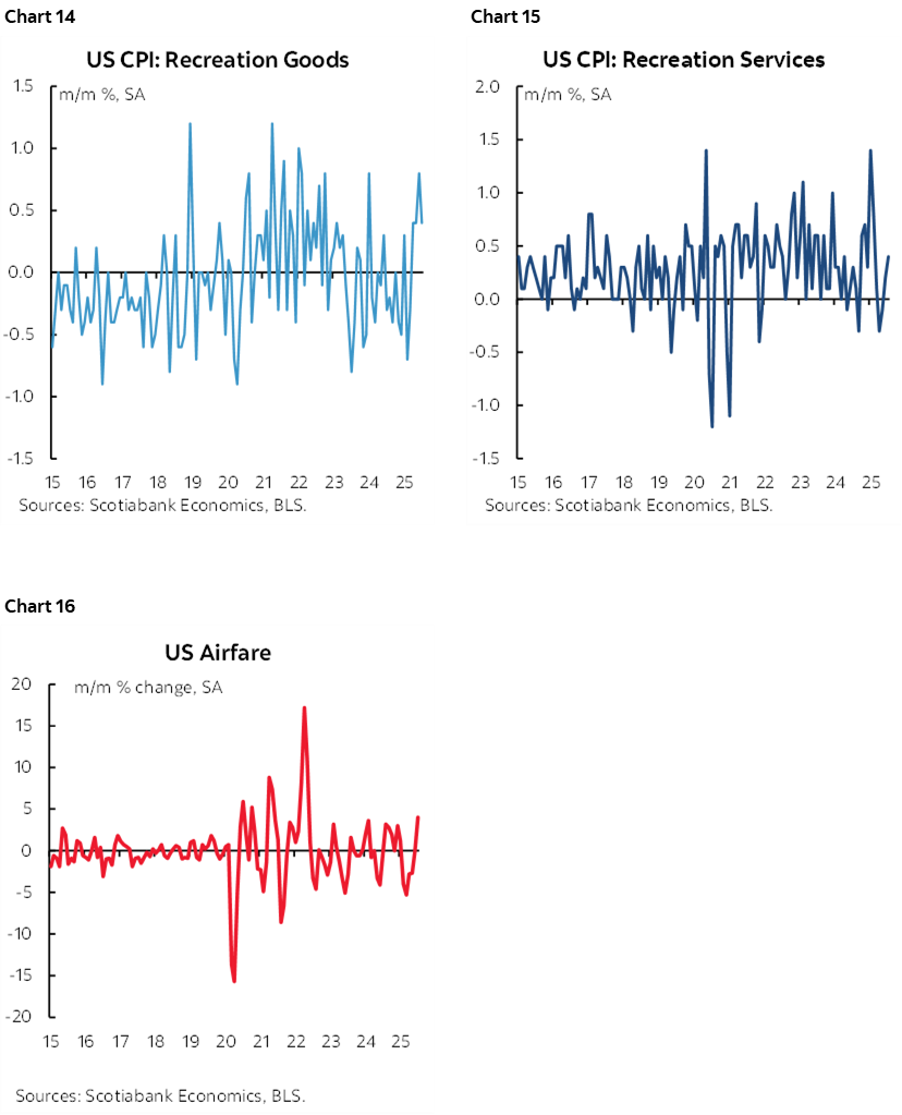
Travel and leisure related categories like recreation goods, recreation prices and airfare were all warm (charts 14–16).
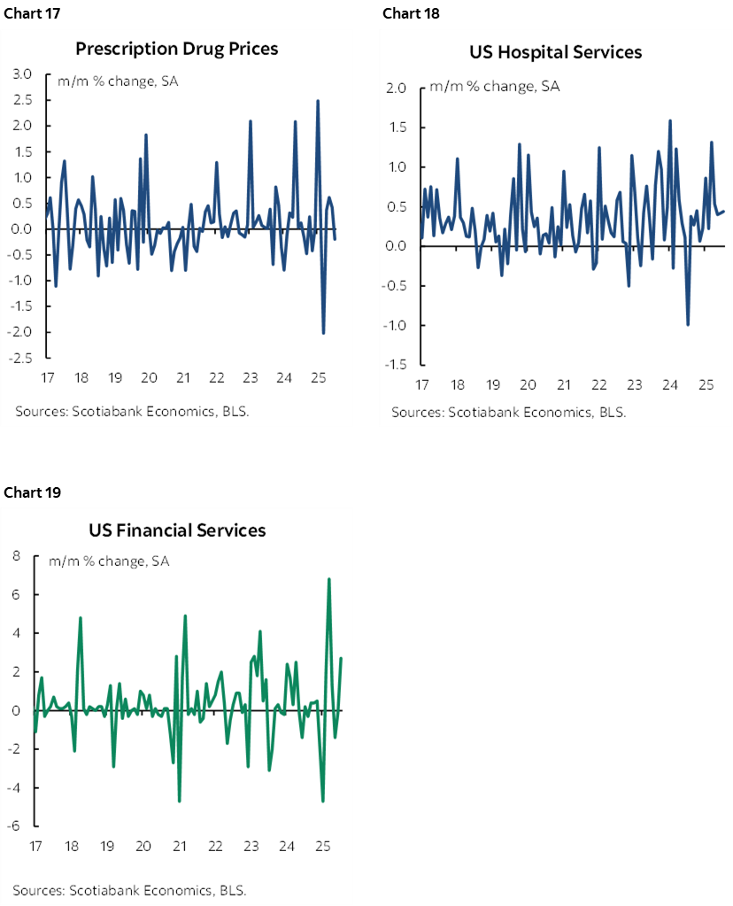
Also see prescription drug prices, hospital services, and financial services in charts 17–19.
DATA QUALITY ISSUES
There are several data quality issues.
First is that all BLS data from this point onward is sketch given the overt politicization of the agency. CPI, PPI, PCE and nonfarm will have a dark cloud over each of them because of the firing of the former BLS head, her replacement by a politicized Trump acolyte, the fear that likely exists across BLS staff when it comes to giving numbers that Trump may not like, and the possibility of coming methodological changes that will be viewed skeptically.
For example, recall this earlier announcement from the BLS that amid the turmoil they've delayed the rebasing of the CPI figures that were supposed to be delivered with today’s report and with no date set for doing so.
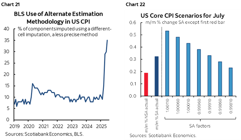
Second is that a large share of the CPI basket is being guesstimated through proxy methods due to the Trump administration’s cuts to the BLS budget. Recall that the issue is that budget cuts impaired the ability to collect data and so they are using alternative methods like using prices from other cities when they can't get them for some cities, or using prices of alternate products deemed somewhat close to products for which they cannot obtain prices etc. We usually get the imputed share of the basket for the latest numbers by about 11:15amET here. It has risen in each of the prior three months to 29% in March, 30% in May, 35% in June to record highs that far surpass even what was guesstimated in the depths of the pandemic when restrictions prevented data collection (chart 20). More detail is here and here. In short, an alarmingly high share of the CPI basket is made up data, even if not for the fact we have a Trump acolyte now running the BLS which impairs the reliability of all US inflation and jobs data henceforth.
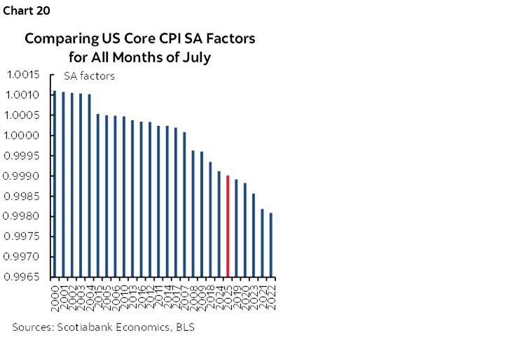
Third is that the seasonal adjustments continue to reflect a recency bias that is tamping down the estimate. Chart 21 shows this month’s SA factor that continues the pattern of relatively low SA factors in the pandemic era when comparing like months of July over time. Chart 22 shows that at alternative historical SA factors for July the reading would have been higher.
FOMC IMPLICATIONS
Nothing is settled by this one report as we'll get another round of August inflation data in September before the next FOMC, plus other data (nonfarm) and developments. That said, nothing in here says cut.
MARKET REACTION
So why the market reaction with lower yields on the back of it? That's unclear, but some possibilities:
- markets were braced for something higher yet and covering now
- markets are watching y/y headline readings that were unchanged which would be silly to do imo, versus looking at m/m and also y/y core that accelerated to over 3 (3.1)
- markets didn't see much tariff effect on the commodities ex-food&energy
- markets ignored the rest of the sources of heat behind core and the pick-up in the moving average trend
I don't think the majority of the FOMC will have the same reaction as markets.
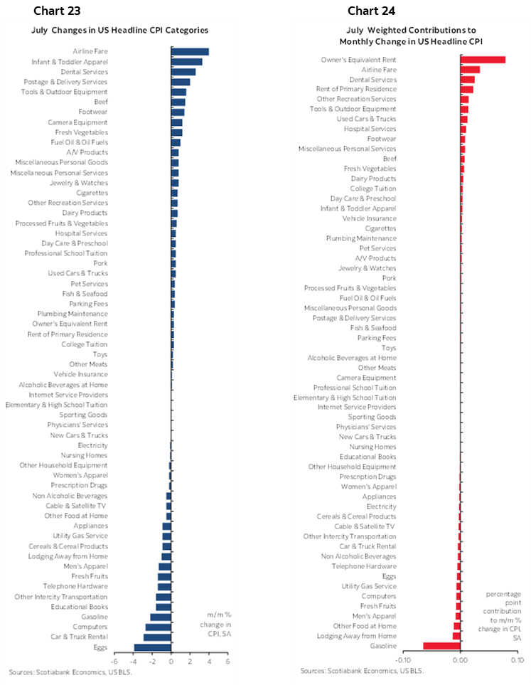
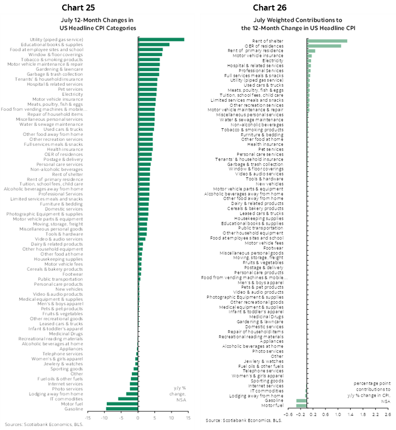
Also see charts 23–26 for breakdowns of the basket in y/y and m/m terms and in weighted contribution terms.
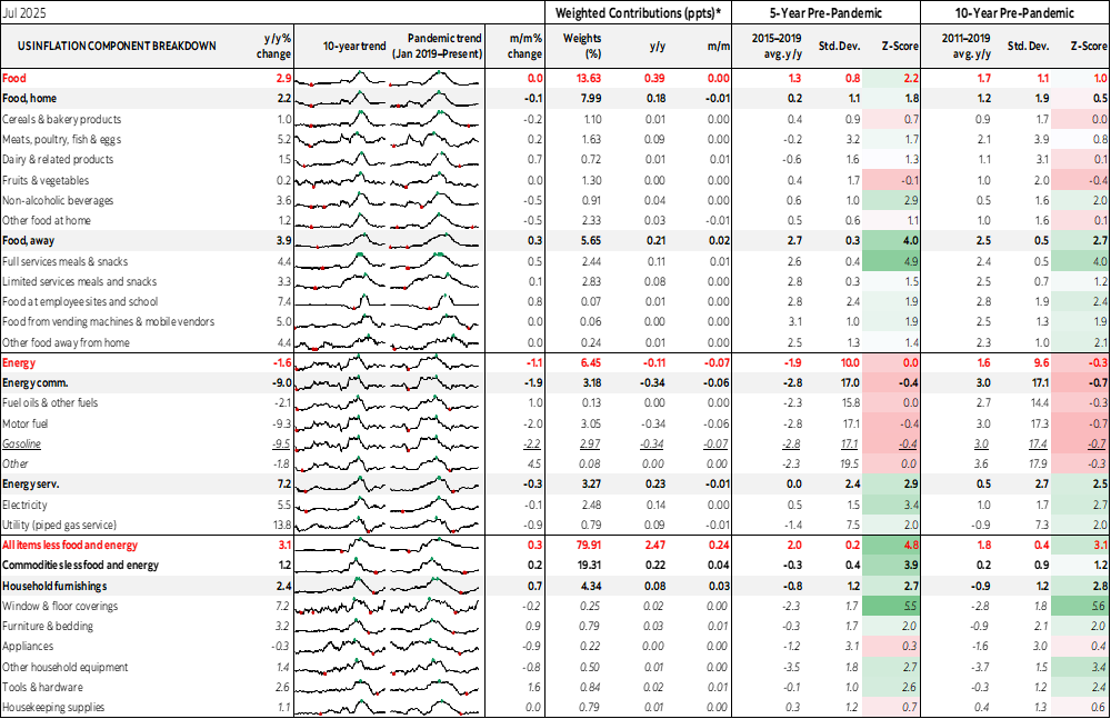
Finally, see the accompanying table that provides further detail.
DISCLAIMER
This report has been prepared by Scotiabank Economics as a resource for the clients of Scotiabank. Opinions, estimates and projections contained herein are our own as of the date hereof and are subject to change without notice. The information and opinions contained herein have been compiled or arrived at from sources believed reliable but no representation or warranty, express or implied, is made as to their accuracy or completeness. Neither Scotiabank nor any of its officers, directors, partners, employees or affiliates accepts any liability whatsoever for any direct or consequential loss arising from any use of this report or its contents.
These reports are provided to you for informational purposes only. This report is not, and is not constructed as, an offer to sell or solicitation of any offer to buy any financial instrument, nor shall this report be construed as an opinion as to whether you should enter into any swap or trading strategy involving a swap or any other transaction. The information contained in this report is not intended to be, and does not constitute, a recommendation of a swap or trading strategy involving a swap within the meaning of U.S. Commodity Futures Trading Commission Regulation 23.434 and Appendix A thereto. This material is not intended to be individually tailored to your needs or characteristics and should not be viewed as a “call to action” or suggestion that you enter into a swap or trading strategy involving a swap or any other transaction. Scotiabank may engage in transactions in a manner inconsistent with the views discussed this report and may have positions, or be in the process of acquiring or disposing of positions, referred to in this report.
Scotiabank, its affiliates and any of their respective officers, directors and employees may from time to time take positions in currencies, act as managers, co-managers or underwriters of a public offering or act as principals or agents, deal in, own or act as market makers or advisors, brokers or commercial and/or investment bankers in relation to securities or related derivatives. As a result of these actions, Scotiabank may receive remuneration. All Scotiabank products and services are subject to the terms of applicable agreements and local regulations. Officers, directors and employees of Scotiabank and its affiliates may serve as directors of corporations.
Any securities discussed in this report may not be suitable for all investors. Scotiabank recommends that investors independently evaluate any issuer and security discussed in this report, and consult with any advisors they deem necessary prior to making any investment.
This report and all information, opinions and conclusions contained in it are protected by copyright. This information may not be reproduced without the prior express written consent of Scotiabank.
™ Trademark of The Bank of Nova Scotia. Used under license, where applicable.
Scotiabank, together with “Global Banking and Markets”, is a marketing name for the global corporate and investment banking and capital markets businesses of The Bank of Nova Scotia and certain of its affiliates in the countries where they operate, including; Scotiabank Europe plc; Scotiabank (Ireland) Designated Activity Company; Scotiabank Inverlat S.A., Institución de Banca Múltiple, Grupo Financiero Scotiabank Inverlat, Scotia Inverlat Casa de Bolsa, S.A. de C.V., Grupo Financiero Scotiabank Inverlat, Scotia Inverlat Derivados S.A. de C.V. – all members of the Scotiabank group and authorized users of the Scotiabank mark. The Bank of Nova Scotia is incorporated in Canada with limited liability and is authorised and regulated by the Office of the Superintendent of Financial Institutions Canada. The Bank of Nova Scotia is authorized by the UK Prudential Regulation Authority and is subject to regulation by the UK Financial Conduct Authority and limited regulation by the UK Prudential Regulation Authority. Details about the extent of The Bank of Nova Scotia's regulation by the UK Prudential Regulation Authority are available from us on request. Scotiabank Europe plc is authorized by the UK Prudential Regulation Authority and regulated by the UK Financial Conduct Authority and the UK Prudential Regulation Authority.
Scotiabank Inverlat, S.A., Scotia Inverlat Casa de Bolsa, S.A. de C.V, Grupo Financiero Scotiabank Inverlat, and Scotia Inverlat Derivados, S.A. de C.V., are each authorized and regulated by the Mexican financial authorities.
Not all products and services are offered in all jurisdictions. Services described are available in jurisdictions where permitted by law.