- Payrolls jumped by more than our top–of–consensus call
- Revisions were positive as were many details
- But the lack of breadth to sectors and potential temporary effects are yellow flags
- Why hopping on the hike bandwagon may be premature
- US nonfarm payrolls m/m 000s / UR %, SA, May:
- Actual: 172 / 4.3
- Scotia: 125 / 4.3
- Consensus: 88 / 4.3
- Prior: 179 / 4.3 (revised from +115 / 4.3)
The US job market performed rather well last month including positive revisions. Nonfarm payrolls jumped higher by 172k exceeding all estimates although mine was the highest in consensus at 125k. A 90% confidence band around the estimated change would be between about 50k–300k. Details were fairly solid but the lack of breadth by sector and the potential temporary effects merit caution.
MARKETS PREMATURELY PRICING HIKES?
Markets reacted by slamming the US front-end. The US 2-year Treasury yield is about 10bps higher on the day in a bear flattener move. The dollar is up against all comers except CAD that also got a jobs boost. Markets increased pricing for a Fed hike later this year by about 9bps to a full 25bps hike. Markets also lean toward most of another hike being priced into next Spring. Stocks fell because of fears the Fed could hike.
Pricing hikes feels highly premature. The Fed is in restrictive territory, unlike the BoC that also got a solid jobs report. Annual nonfarm benchmarking revisions are ahead in September about one week before that month’s FOMC meeting. Inflation’s spike may be more temporary this time than previously. Chair Warsh may change up the preferred measure of core inflation toward central tendency gauges like trimmed mean PCE that is tracking considerably lower than core PCE and thereby talk through an inflation spurt. The pressures on growth have been meaningful to date (0.5% in Q4, 1.6% in Q1). Further pressures probably lie ahead given no inflation-adjusted disposable income growth for three quarters up to Q1 and with real wages getting squeezed by the commodity surge. With growth risks go employment risks. And short-term reports don’t wave goodbye to uncertainty around AI’s effects and tighter immigration.
DETAILS—MOSTLY POSITIVE
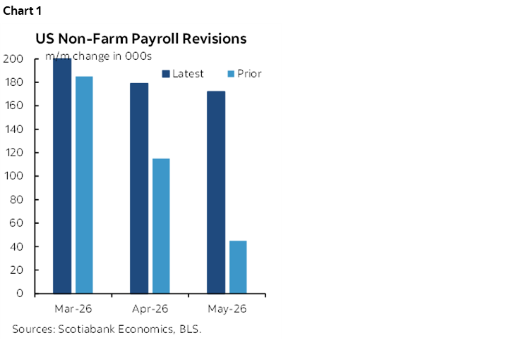
On top of the 172k nonfarm payroll positions that were created there were positive revisions that added 93k jobs to the prior two months including 64k more in April (179k) and 29k more to March (+214k). Chart 1. The three-month moving average for payroll gains is now 188k/mth. I still want to see what revisions up to March survive annual benchmarking in September. It’s extra impressive to see such job growth in May despite a higher jumping off point that—all else equal—would have made it more difficult to post another gain.
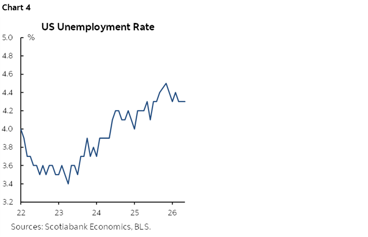
By sector the gains were highly concentrated in just three categories which suggests the overall report wasn’t as strong as the headline gain (chart 2). One sector was the leisure/hospitality category that led the way (+70k) followed by government that added 52k jobs, all of which was in state/local employment (+51k, chart 3). Education and health services added 40k entirely due to health and social assistance (+47k).
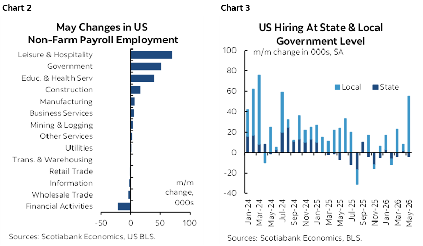
Within leisure/hospitality, most of the gain was in accommodation (10k) and food services and drinking places (48k). That could be driven by patio weather and Spring travel but also bear in mind the possibility that it could be in preparation for FIFA World Cup hiring and related tourism.
What if leisure/hospitality and local government hiring is related to temporary factors like the World Cup with 11 US cities hosting (3 Mexico, two Canada)?
Within health care’s 35k rise, two-thirds of it was in ambulatory services.
Within government’s 52k extra payrolls, 43.5k was attributable to local governments excluding education sector roles.
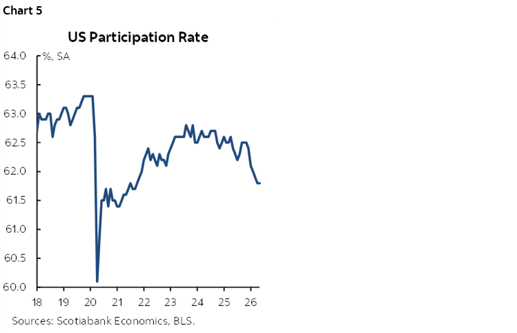
The unemployment rate was stable at 4.3% (chart 4). That’s because it’s drawn from the companion household survey which registered a job gain of 149k that exceeded the increase in the labour force of 83k. The household survey’s job gain was the first one this year as its trend continues to defy nonfarm’s trend.
The softness in the labour force reflects a falling labour force participation rate (ie: the share of the population that counts itself employed or looking for work). Chart 5. This is heavily driven by falling participation rates by those aged 55+.
Private payrolls were up by 120k with services (92k) leading while goods sectors added 28k.
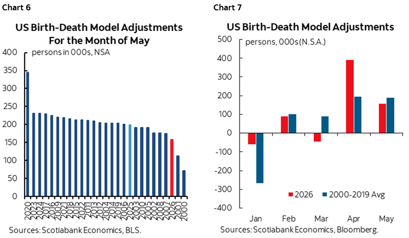
The birth-death model additions added fewer than normal months of May in the past (chart 6). This follows the outsized contributions of birth-death model adjustments to seasonally unadjusted payrolls in some prior months (chart 7).
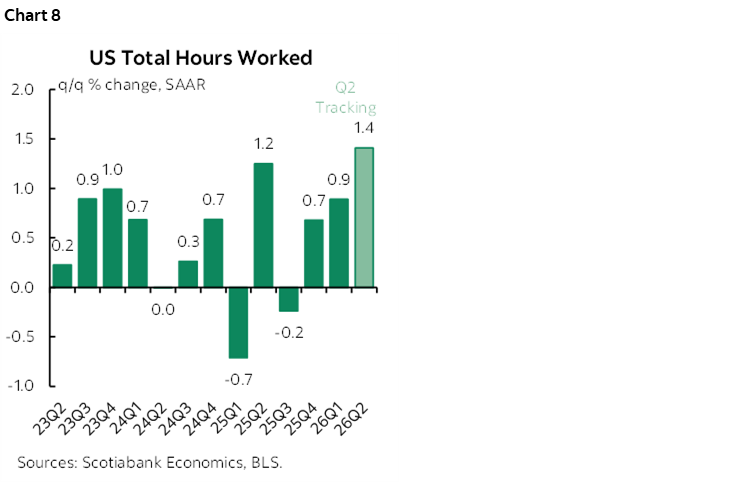
Hours worked were up by about 0.1% m/m SA with Q2 tracking a gain of 1.4% q/q SAAR which would be strong compared to the past pattern (chart 8). This could be a solid indicator of Q2 GDP growth as GDP is hours times labour productivity.
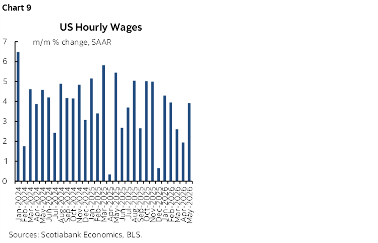
Nominal wages were solid at 3.9% m/m SAAR (chart 9). The smoothed trend is weaker and real wages (ie: inflation adjusted) are weakening.
DISCLAIMER
This report has been prepared by Scotiabank Economics as a resource for the clients of Scotiabank. Opinions, estimates and projections contained herein are our own as of the date hereof and are subject to change without notice. The information and opinions contained herein have been compiled or arrived at from sources believed reliable but no representation or warranty, express or implied, is made as to their accuracy or completeness. Neither Scotiabank nor any of its officers, directors, partners, employees or affiliates accepts any liability whatsoever for any direct or consequential loss arising from any use of this report or its contents.
These reports are provided to you for informational purposes only. This report is not, and is not constructed as, an offer to sell or solicitation of any offer to buy any financial instrument, nor shall this report be construed as an opinion as to whether you should enter into any swap or trading strategy involving a swap or any other transaction. The information contained in this report is not intended to be, and does not constitute, a recommendation of a swap or trading strategy involving a swap within the meaning of U.S. Commodity Futures Trading Commission Regulation 23.434 and Appendix A thereto. This material is not intended to be individually tailored to your needs or characteristics and should not be viewed as a “call to action” or suggestion that you enter into a swap or trading strategy involving a swap or any other transaction. Scotiabank may engage in transactions in a manner inconsistent with the views discussed this report and may have positions, or be in the process of acquiring or disposing of positions, referred to in this report.
Scotiabank, its affiliates and any of their respective officers, directors and employees may from time to time take positions in currencies, act as managers, co-managers or underwriters of a public offering or act as principals or agents, deal in, own or act as market makers or advisors, brokers or commercial and/or investment bankers in relation to securities or related derivatives. As a result of these actions, Scotiabank may receive remuneration. All Scotiabank products and services are subject to the terms of applicable agreements and local regulations. Officers, directors and employees of Scotiabank and its affiliates may serve as directors of corporations.
Any securities discussed in this report may not be suitable for all investors. Scotiabank recommends that investors independently evaluate any issuer and security discussed in this report, and consult with any advisors they deem necessary prior to making any investment.
This report and all information, opinions and conclusions contained in it are protected by copyright. This information may not be reproduced without the prior express written consent of Scotiabank.
™ Trademark of The Bank of Nova Scotia. Used under license, where applicable.
Scotiabank, together with “Global Banking and Markets”, is a marketing name for the global corporate and investment banking and capital markets businesses of The Bank of Nova Scotia and certain of its affiliates in the countries where they operate, including; Scotiabank Europe plc; Scotiabank (Ireland) Designated Activity Company; Scotiabank Inverlat S.A., Institución de Banca Múltiple, Grupo Financiero Scotiabank Inverlat, Scotia Inverlat Casa de Bolsa, S.A. de C.V., Grupo Financiero Scotiabank Inverlat, Scotia Inverlat Derivados S.A. de C.V. – all members of the Scotiabank group and authorized users of the Scotiabank mark. The Bank of Nova Scotia is incorporated in Canada with limited liability and is authorised and regulated by the Office of the Superintendent of Financial Institutions Canada. The Bank of Nova Scotia is authorized by the UK Prudential Regulation Authority and is subject to regulation by the UK Financial Conduct Authority and limited regulation by the UK Prudential Regulation Authority. Details about the extent of The Bank of Nova Scotia's regulation by the UK Prudential Regulation Authority are available from us on request. Scotiabank Europe plc is authorized by the UK Prudential Regulation Authority and regulated by the UK Financial Conduct Authority and the UK Prudential Regulation Authority.
Scotiabank Inverlat, S.A., Scotia Inverlat Casa de Bolsa, S.A. de C.V, Grupo Financiero Scotiabank Inverlat, and Scotia Inverlat Derivados, S.A. de C.V., are each authorized and regulated by the Mexican financial authorities.
Not all products and services are offered in all jurisdictions. Services described are available in jurisdictions where permitted by law.