- Core CPI came in light
- Core goods prices slipped…
- …while core services inflation ebbed a touch
- Breadth signals more of a relative price shock this time…
- …versus the pandemic’s generalized inflation
- A record-low core CPI seasonal adjustment factor kinda smells
- Treasury yields fell…
- …but escalating tensions in the Middle East restrained the reaction
- US CPI / core CPI, m/m %, SA, May:
- Actual: 0.47 / 0.21
- Scotia: 0.4 / 0.3
- Consensus: 0.5 / 0.3
- Prior: unrevised from 0.6 / 0.4
This was the inflation report that Chair Warsh was dreaming about. Soft underlying inflation and details motivated a slightly lower US 2-year Treasury yield. Markets may be holding back in their reaction perhaps because escalating tensions in the Middle East are overshadowing data with conflict and supply chain challenges likely to persist.
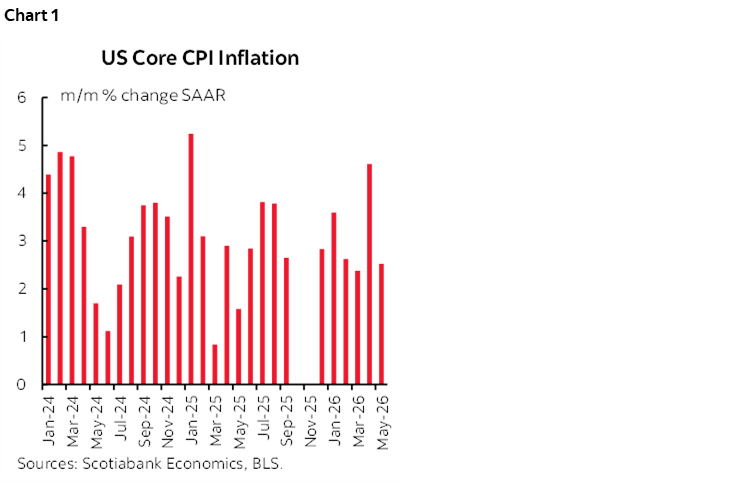
Core CPI inflation at 0.21% m/m SA climbed down from a gain of about double that the prior month, indicating little to no sustained pass through of the energy shock into underlying inflation. Chart 1 shows the annualized m/m changes.
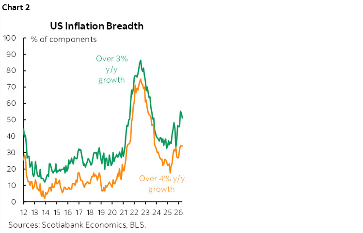
Breadth improved ever-so-slightly with a touch less widespread price pressures (chart 2). With about one-third of the CPI basket rising by over 4% and about half over 3% y/y, Chair Warsh may be inclined to view pressures as more contained and much less widespread than coming out of the pandemic. That augurs well for him viewing today’s circumstances as more about a relative price shock than widespread generalized inflation.
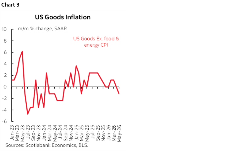
Little pass through is particularly evident in core goods prices (ex-food and energy) that remain very tame. They slipped by -0.1% m/m SA in May and have been basically flat for four months now (chart 3).
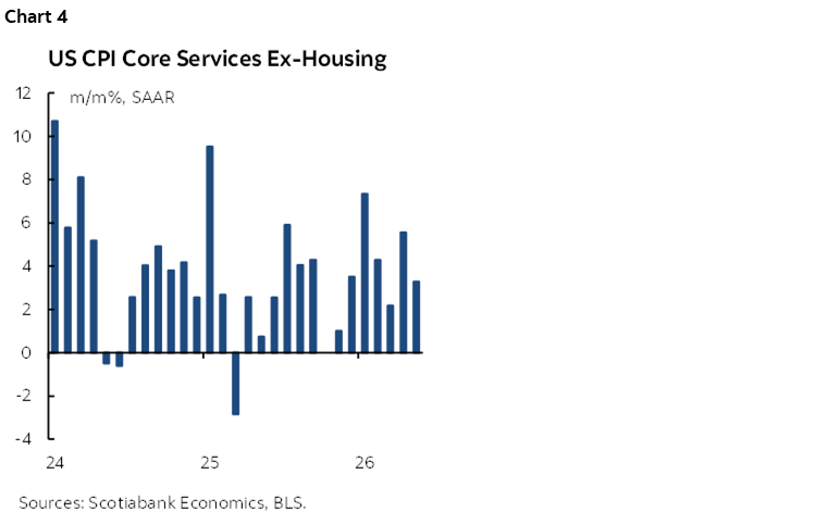
Core services prices (ex-shelter and energy prices) were also a bit tamer than the prior month at 0.26% m/m SA. They have been all over the map this year but the three month moving average of 0.26% m/m SA is reasonably contained relative to some of the months (chart 4).
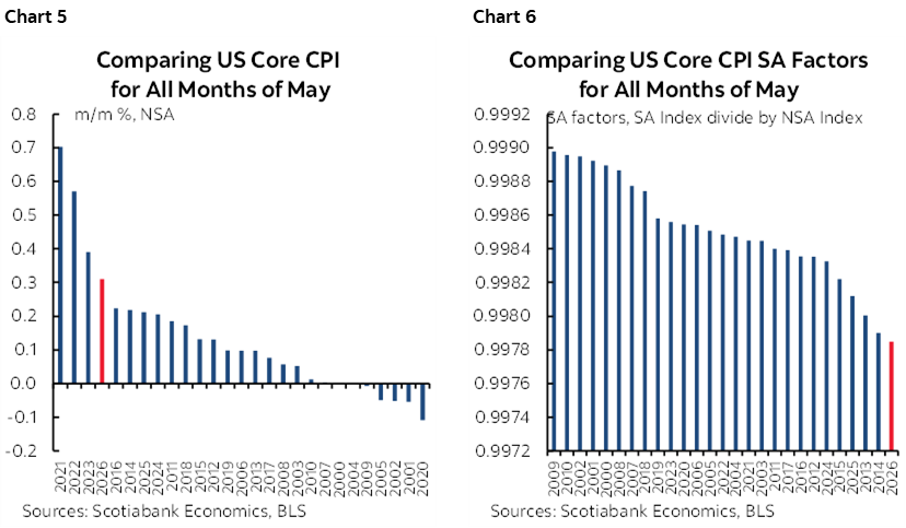
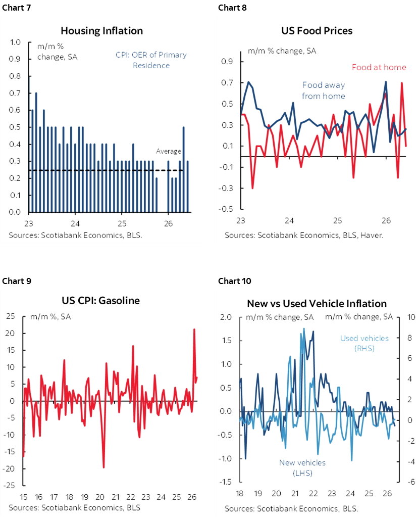
While the seasonally unadjusted core price gain was relatively high compared to like months of May in history (chart 5), this was tamped down by a low seasonal adjustment factor (chart 6). In fact, it’s the lowest SA factor in modern times and the second lowest in history behind only May 1969. That carries with it a bit of the scent of a public washroom. Have I mentioned lately how little trust I have for US data on jobs and inflation? There, just did.
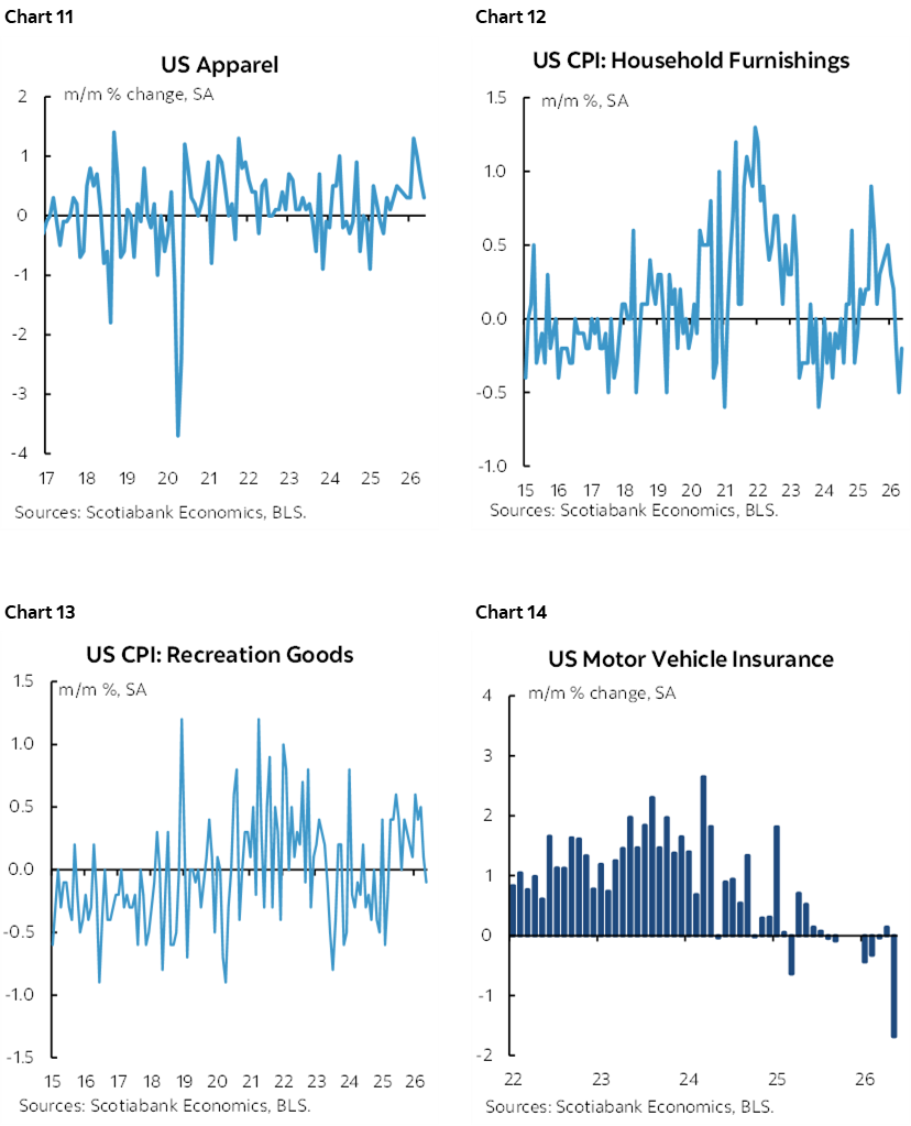
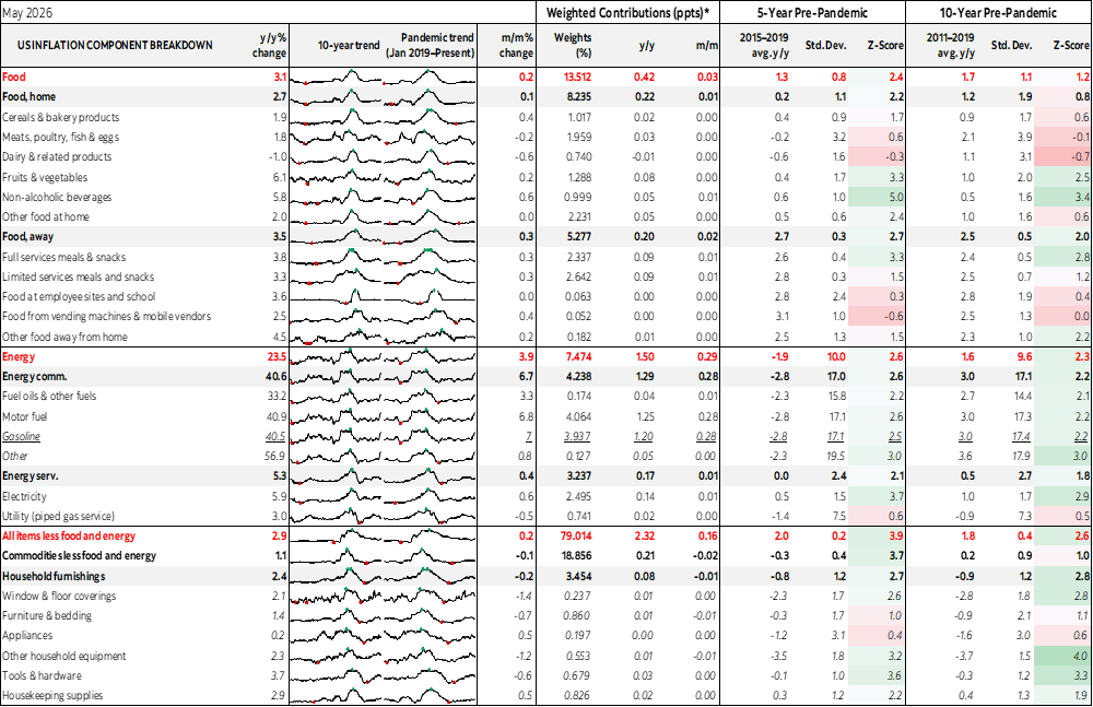
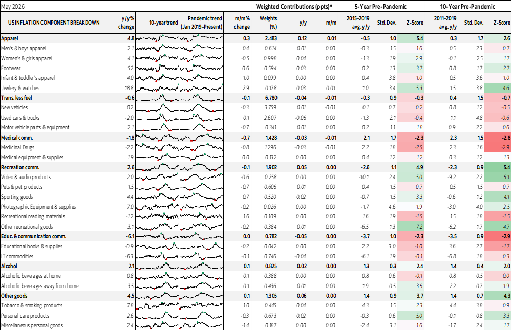
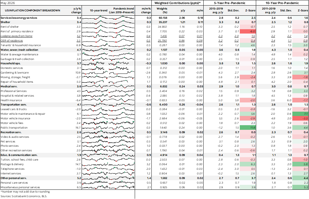
Charts 7–19 offer further breakdowns.
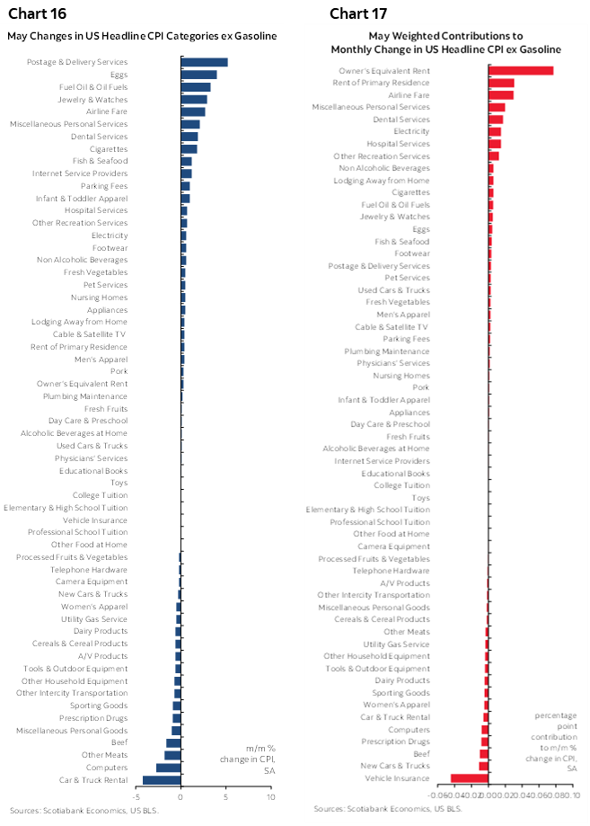
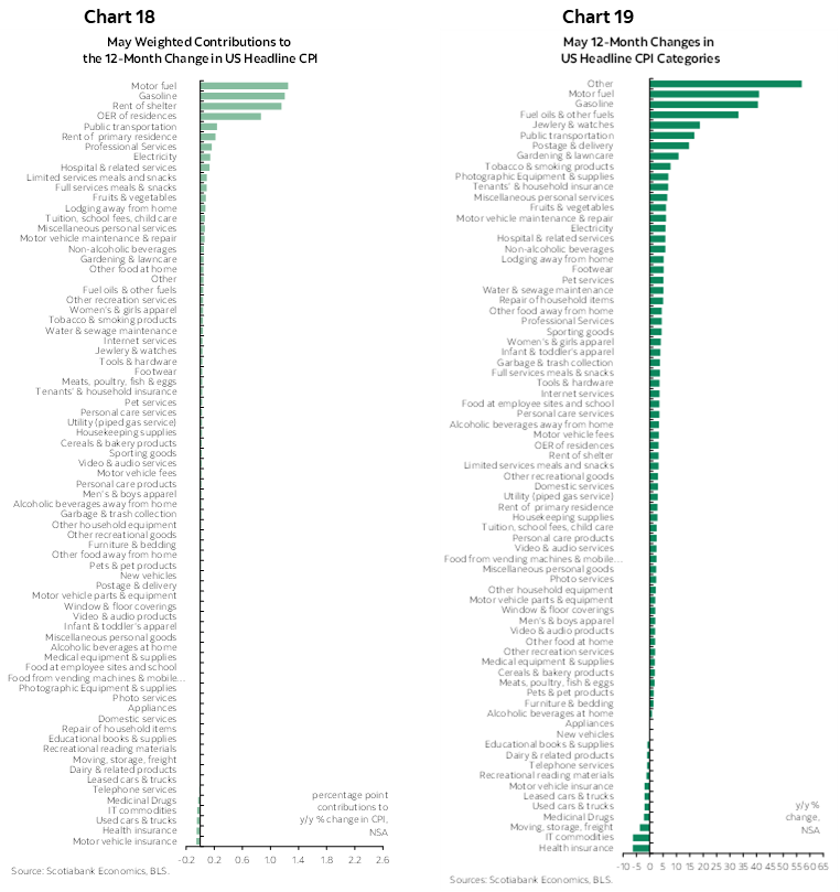
Please also see the accompanying table for further details including micro charts.
DISCLAIMER
This report has been prepared by Scotiabank Economics as a resource for the clients of Scotiabank. Opinions, estimates and projections contained herein are our own as of the date hereof and are subject to change without notice. The information and opinions contained herein have been compiled or arrived at from sources believed reliable but no representation or warranty, express or implied, is made as to their accuracy or completeness. Neither Scotiabank nor any of its officers, directors, partners, employees or affiliates accepts any liability whatsoever for any direct or consequential loss arising from any use of this report or its contents.
These reports are provided to you for informational purposes only. This report is not, and is not constructed as, an offer to sell or solicitation of any offer to buy any financial instrument, nor shall this report be construed as an opinion as to whether you should enter into any swap or trading strategy involving a swap or any other transaction. The information contained in this report is not intended to be, and does not constitute, a recommendation of a swap or trading strategy involving a swap within the meaning of U.S. Commodity Futures Trading Commission Regulation 23.434 and Appendix A thereto. This material is not intended to be individually tailored to your needs or characteristics and should not be viewed as a “call to action” or suggestion that you enter into a swap or trading strategy involving a swap or any other transaction. Scotiabank may engage in transactions in a manner inconsistent with the views discussed this report and may have positions, or be in the process of acquiring or disposing of positions, referred to in this report.
Scotiabank, its affiliates and any of their respective officers, directors and employees may from time to time take positions in currencies, act as managers, co-managers or underwriters of a public offering or act as principals or agents, deal in, own or act as market makers or advisors, brokers or commercial and/or investment bankers in relation to securities or related derivatives. As a result of these actions, Scotiabank may receive remuneration. All Scotiabank products and services are subject to the terms of applicable agreements and local regulations. Officers, directors and employees of Scotiabank and its affiliates may serve as directors of corporations.
Any securities discussed in this report may not be suitable for all investors. Scotiabank recommends that investors independently evaluate any issuer and security discussed in this report, and consult with any advisors they deem necessary prior to making any investment.
This report and all information, opinions and conclusions contained in it are protected by copyright. This information may not be reproduced without the prior express written consent of Scotiabank.
™ Trademark of The Bank of Nova Scotia. Used under license, where applicable.
Scotiabank, together with “Global Banking and Markets”, is a marketing name for the global corporate and investment banking and capital markets businesses of The Bank of Nova Scotia and certain of its affiliates in the countries where they operate, including; Scotiabank Europe plc; Scotiabank (Ireland) Designated Activity Company; Scotiabank Inverlat S.A., Institución de Banca Múltiple, Grupo Financiero Scotiabank Inverlat, Scotia Inverlat Casa de Bolsa, S.A. de C.V., Grupo Financiero Scotiabank Inverlat, Scotia Inverlat Derivados S.A. de C.V. – all members of the Scotiabank group and authorized users of the Scotiabank mark. The Bank of Nova Scotia is incorporated in Canada with limited liability and is authorised and regulated by the Office of the Superintendent of Financial Institutions Canada. The Bank of Nova Scotia is authorized by the UK Prudential Regulation Authority and is subject to regulation by the UK Financial Conduct Authority and limited regulation by the UK Prudential Regulation Authority. Details about the extent of The Bank of Nova Scotia's regulation by the UK Prudential Regulation Authority are available from us on request. Scotiabank Europe plc is authorized by the UK Prudential Regulation Authority and regulated by the UK Financial Conduct Authority and the UK Prudential Regulation Authority.
Scotiabank Inverlat, S.A., Scotia Inverlat Casa de Bolsa, S.A. de C.V, Grupo Financiero Scotiabank Inverlat, and Scotia Inverlat Derivados, S.A. de C.V., are each authorized and regulated by the Mexican financial authorities.
Not all products and services are offered in all jurisdictions. Services described are available in jurisdictions where permitted by law.