- US job growth stalled with payrolls up 57k, household survey down half a million
- Unemployment rate fell as the labour force shrank by more than jobs
- Quirky SA factors, low sampling, outlier birth-death changes dampened quality
- Where’d the World Cup effect go? Looking to Canada might offer some insight
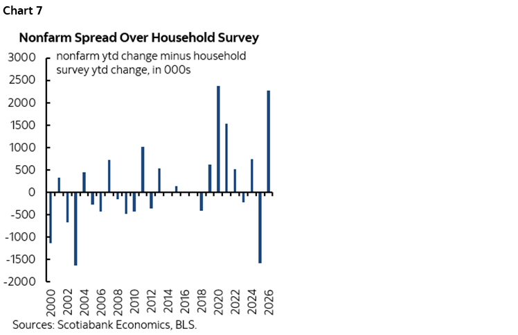
- This is the biggest gap between ytd job market readings since 2020
- Slow growth in hours needs productivity to support GDP growth
- Advice to receive near-term OIS is being rewarded
- US nonfarm payrolls m/m 000s // UR %, SA, June:
- Actual: 57 / 4.2
- Scotia: 90 / 4.2
- Consensus: 113 / 4.3
- Prior: 129 / 4.3 (revised from 172 / 4.3)
- Two-month payroll revision: -74
The US job market stumbled in June and wasn’t quite as solid as previously believed over the prior two months. The result drove down shorter-term US Treasury yields and reduced OIS contract pricing for hikes with the September contract now down 10bps from the full hike pricing back on September 22nd.
Payrolls increased by 57k in June which was close to my below-consensus 90k call and vastly weaker than some of the outliers to the high side. Details were weak.
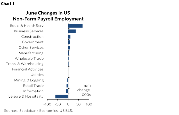
Breadth of hiring activity was poor (chart 1). The goods sector added just 10k, while services added just 39k. Within goods, only construction was up in an semi-material way (+11k). Within services, the only notable strength was in prof/business services +36k with temp help about one-third of that, plus education/health that was up by 69k and led by health/social assistance up 47k.
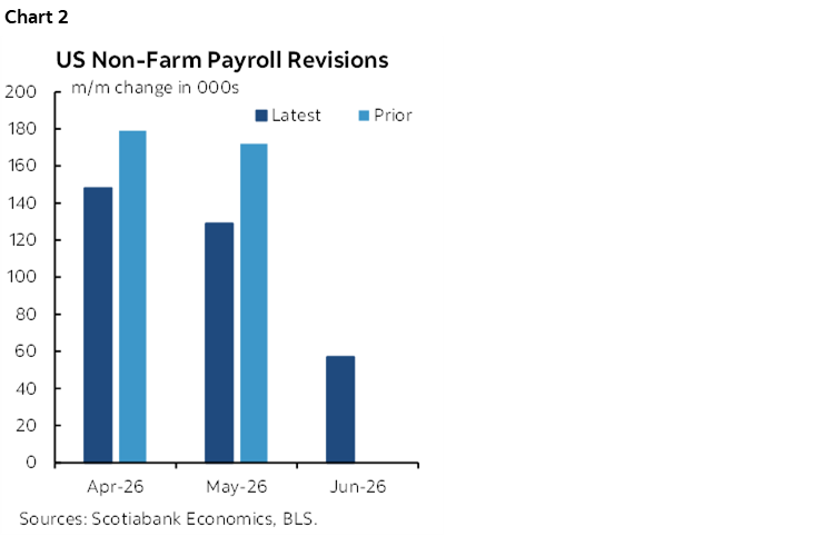
A net 74k jobs were wiped out over the prior two months through negative revisions with 43k of that coming out of May payrolls (chart 2). That leaves the past three months of gains at 148k, 129k and 57k from April to June respectively.
Private payrolls were up by only 49k with government adding 8k as the federal government adding only 2k and state and local governments added 6k. This was one area where revisions were concentrated as the previously reported 51k gain in state/local government hiring in May now stands at 29k.
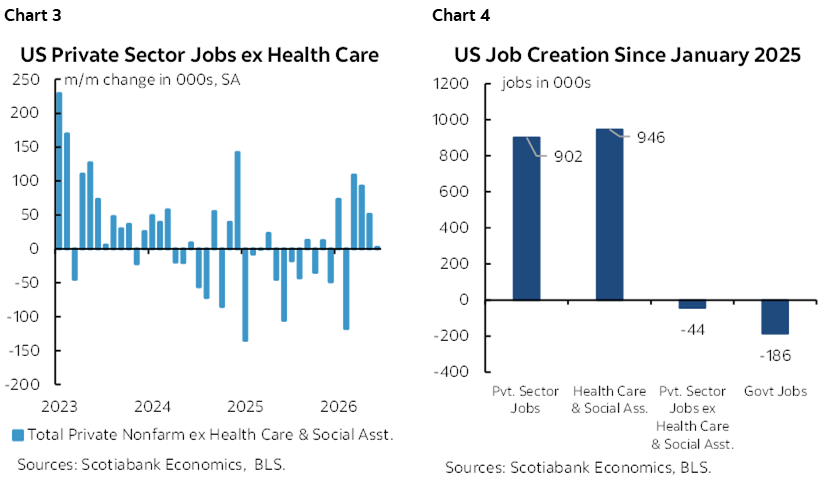
June ended three months of gains in private ex-health employment and it is on a slowing trend (chart 3). The fact of the matter is that private jobs ex-health have stumbled since Inauguration Day (chart 4). I continue to believe that policy has played a role.
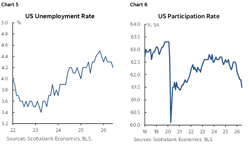
The unemployment rate dipped a tick to 4.2% in line with my estimate and below consensus. It is derived from the companion household survey which registered a -507,000 job hit in June but an even bigger decline of -720k to the size of the labour force. It has been declining somewhat for a few months now (chart 5) as the labour force participation rate tumbles (chart 6) due to cycle and immigration policy effects but this time not due to the 55+ category.
The striking differences between what the household survey and the payrolls report are showing for year-to-date job growth are breathtaking. The household survey says 1.73 million jobs have been lost ytd versus nonfarm that is up by 552k. That spread of about 2¼ million in six months is too big to ignore as just a function of relative survey noise. It either says that off-payroll employment has done into the sewer, and/or that relative methodological issues are driving a widening disparity.
Chart 7 shows that the spread between what the two sources are saying about ytd job growth this year is at its widest since the onslaught of the pandemic in 2020. Why? Other than relative methodological differences, one theory is that developments are hitting typically smaller, off-payroll jobs harder than payroll positions. Pick your driver on that count, whether soaring costs due to tariffs, energy and other commodities, prospective revisions, or high uncertainty or AI’s influences or the effects of tighter immigration policy or, heck, why choose between them?!
A curiosity is that there was no evidence of any World Cup hiring binge last month. It's possible that it's in there, in which case the -61k drop in leisure/hospitality hiring would have been even weaker, but I'm admittedly surprised there is nothing obvious by way of World Cup hiring. So, why? Many of the WC spots are volunteers so maybe that's part of it. We also know there have been plenty of stories about immigration issues, sky high prices, hotel cancellations, issues with air traffic controllers etc. But still, 11 cities hosting with just about every country playing in the June nonfarm reference period before starting to get booted into the round of 32 should have had some sort of effect. Maybe it's buried. Or maybe the WC is a bust.
Charts 8–9 offer an interesting Canada-US comparison that may help to explain the prior point. Flights took off in Canada but not in the US. That likely reflects some combination of US travel concerns like awol and disgruntled traffic controllers, Canada being perceived as less complicated, and relative consumer drivers.
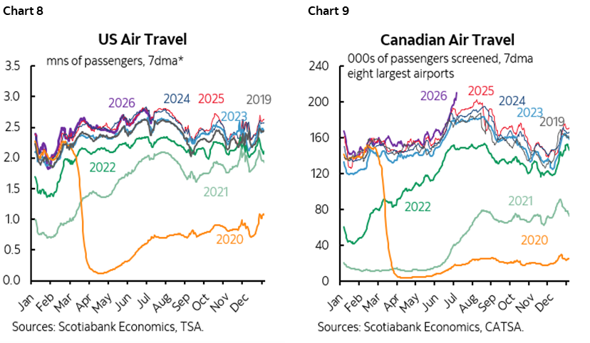
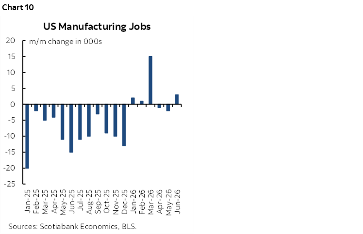
Chart 10 shows that nothing much is coming home in terms of manufacturing jobs.
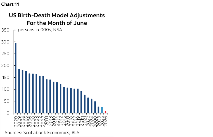
While birth-death model adjustments play a small role at this time of year, the adjustment this June was the lowest ever for like months of June (chart 11). Some—including me—don’t have much faith in b-d models.
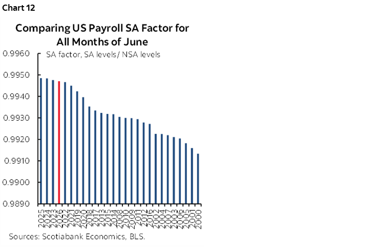
Payrolls may have been even weaker than reported if not for a juiced SA factor. Chart 12 shows that this June was not quite as high as last year's seasonal adjustment factor but they're still using SA factors that are biased higher than ever for like months in history. All else equal, this overstates payrolls due to a recency bias in how they are calculated.
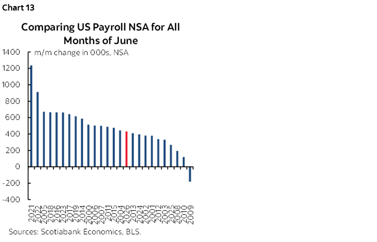
By contrast, the seasonally unadjusted change in June payrolls was slightly below average when comparing like months of June (chart 13).
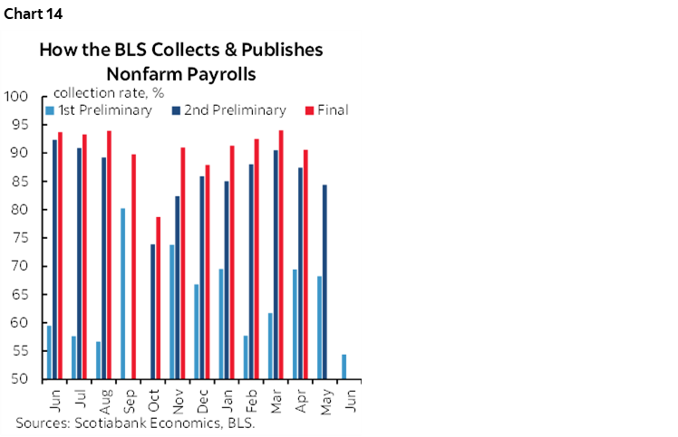
Further on the data quality issue is that this June marked the lowest collection rate on the first pass for nonfarm data in quite a while (chart 14). It is simply not becoming of a first world nation to have such poor data sampling. I understand the role of cuts in Trump 1.0, restored funding under Biden, renewed cuts in Trump 2.0 and the associated instability and impact upon morale especially when their leader was fired, but also feel that the BLS has failed for many years to pivot toward different collection tactics.
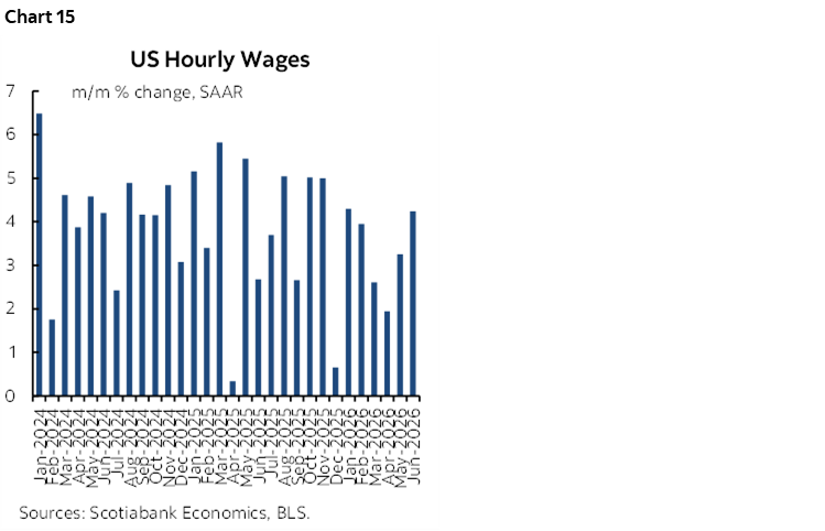
Wage growth was on the mark at 0.3% m/m and 3.5% y/y. Chart 15 shows wages were up 4.2% m/m SAAR.
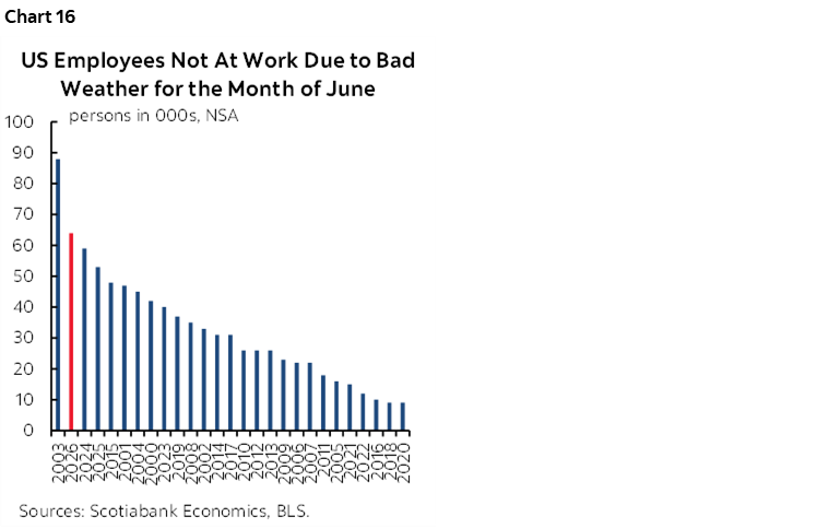
More Americans claimed that weather prevented them from working last month than a usual month of June (chart 16). Was that perhaps because of heat exhaustion, and/or that people in 11 cities and elsewhere were watching the World Cup and blaming it on the weather?
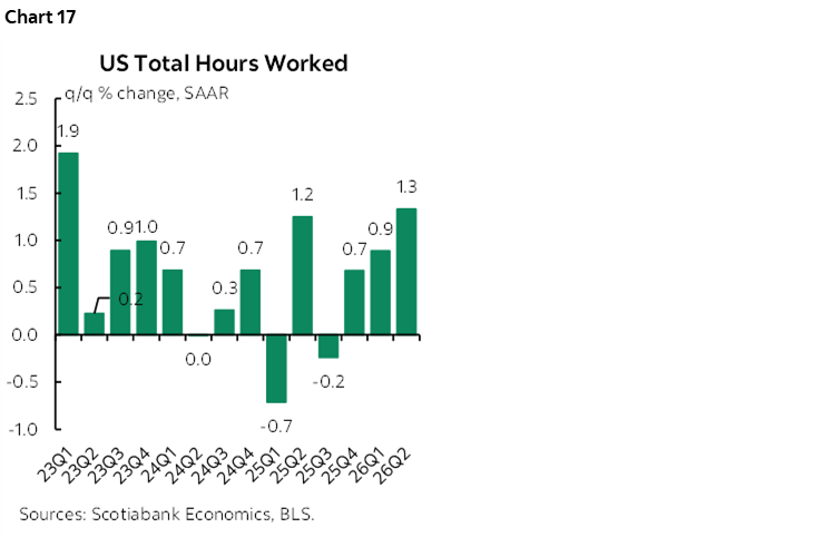
Hours worked were up by 1.3% q/q SAAR in Q2 after 0.9% in Q1 (chart 17). Since GDP is hours times labour productivity, the US had better continue to enjoy rapid productivity growth. I'm counting on the US to do so, but at the expense of jobs over H2 as US companies do what they do—hunker down, slash costs including payrolls to deal with soaring input costs and seek faster productivity to support earnings. It's what they do better than anyone anywhere else. It’s also why I believe the forces are in place to counter inflation risk going forward.
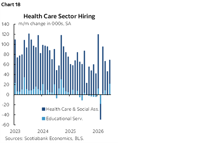
Finally, chart 18 shows that outside of health sector hiring, the rest of the job market has been soft.
FOMC Implications
Overall I’m happy with my receive call on July and September OIS that I've been marketing for a while—including in Europe last week—but still think it has further to run. September pricing is down about 5bps post-payrolls to about 15bps priced from a peak of 25bps. There is still a lot of data ahead—as foolish as extreme data dependence may be—but weakening payrolls, Warsh's comments on inflation risk yesterday, Warsh's comments on how the framework for implementing price stability won't be available for a while, and his guidance not to pre-judge the task forces that report later in the year, all suggest no hurry to raise if they choose to hike at all from an already restrictive stance. Buried in all of that is some form of forward guidance, despite saying that he loathes forward guidance….we just have to work a little harder to get at it.
DISCLAIMER
This report has been prepared by Scotiabank Economics as a resource for the clients of Scotiabank. Opinions, estimates and projections contained herein are our own as of the date hereof and are subject to change without notice. The information and opinions contained herein have been compiled or arrived at from sources believed reliable but no representation or warranty, express or implied, is made as to their accuracy or completeness. Neither Scotiabank nor any of its officers, directors, partners, employees or affiliates accepts any liability whatsoever for any direct or consequential loss arising from any use of this report or its contents.
These reports are provided to you for informational purposes only. This report is not, and is not constructed as, an offer to sell or solicitation of any offer to buy any financial instrument, nor shall this report be construed as an opinion as to whether you should enter into any swap or trading strategy involving a swap or any other transaction. The information contained in this report is not intended to be, and does not constitute, a recommendation of a swap or trading strategy involving a swap within the meaning of U.S. Commodity Futures Trading Commission Regulation 23.434 and Appendix A thereto. This material is not intended to be individually tailored to your needs or characteristics and should not be viewed as a “call to action” or suggestion that you enter into a swap or trading strategy involving a swap or any other transaction. Scotiabank may engage in transactions in a manner inconsistent with the views discussed this report and may have positions, or be in the process of acquiring or disposing of positions, referred to in this report.
Scotiabank, its affiliates and any of their respective officers, directors and employees may from time to time take positions in currencies, act as managers, co-managers or underwriters of a public offering or act as principals or agents, deal in, own or act as market makers or advisors, brokers or commercial and/or investment bankers in relation to securities or related derivatives. As a result of these actions, Scotiabank may receive remuneration. All Scotiabank products and services are subject to the terms of applicable agreements and local regulations. Officers, directors and employees of Scotiabank and its affiliates may serve as directors of corporations.
Any securities discussed in this report may not be suitable for all investors. Scotiabank recommends that investors independently evaluate any issuer and security discussed in this report, and consult with any advisors they deem necessary prior to making any investment.
This report and all information, opinions and conclusions contained in it are protected by copyright. This information may not be reproduced without the prior express written consent of Scotiabank.
™ Trademark of The Bank of Nova Scotia. Used under license, where applicable.
Scotiabank, together with “Global Banking and Markets”, is a marketing name for the global corporate and investment banking and capital markets businesses of The Bank of Nova Scotia and certain of its affiliates in the countries where they operate, including; Scotiabank Europe plc; Scotiabank (Ireland) Designated Activity Company; Scotiabank Inverlat S.A., Institución de Banca Múltiple, Grupo Financiero Scotiabank Inverlat, Scotia Inverlat Casa de Bolsa, S.A. de C.V., Grupo Financiero Scotiabank Inverlat, Scotia Inverlat Derivados S.A. de C.V. – all members of the Scotiabank group and authorized users of the Scotiabank mark. The Bank of Nova Scotia is incorporated in Canada with limited liability and is authorised and regulated by the Office of the Superintendent of Financial Institutions Canada. The Bank of Nova Scotia is authorized by the UK Prudential Regulation Authority and is subject to regulation by the UK Financial Conduct Authority and limited regulation by the UK Prudential Regulation Authority. Details about the extent of The Bank of Nova Scotia's regulation by the UK Prudential Regulation Authority are available from us on request. Scotiabank Europe plc is authorized by the UK Prudential Regulation Authority and regulated by the UK Financial Conduct Authority and the UK Prudential Regulation Authority.
Scotiabank Inverlat, S.A., Scotia Inverlat Casa de Bolsa, S.A. de C.V, Grupo Financiero Scotiabank Inverlat, and Scotia Inverlat Derivados, S.A. de C.V., are each authorized and regulated by the Mexican financial authorities.
Not all products and services are offered in all jurisdictions. Services described are available in jurisdictions where permitted by law.