- Another hot core CPI print crush rate cut pricing
- The BoC would be even more unwise to turn dovish now
- US CPI / core CPI, m/m % SA, March:
- Actual: 0.4 / 0.4
- Scotia: 0.4 / 0.3
- Consensus: 0.3 / 0.3
- Prior: 0.4 / 0.4
Forget rate cuts in 2024? That’s a very distinct possibility. The whole front-end blew up after another strong inflation reading out of the US. The result drove a nearly instant response from markets as fed funds futures almost entirely wiped out pricing for a June cut by the FOMC. We might need to push out our own Q3 start and reduce if not eliminate easing. Markets are now pricing about a half percentage point cumulative rate cut by year-end at most. The US two-year Treasury yield is up 19bps on the day so far with a bear flattening overall curve, a stronger dollar and with the S&P losing ground.
Core inflation landed at 0.359% m/m SA. Chart 1 shows this at an annualized rate over the months. The exact numbers from November to March are 3.8% m/m SAAR, 3.4%, 4.8%, 4.4% and 4.4% in sequence. That’s incredible stickiness this far into a hike cycle.
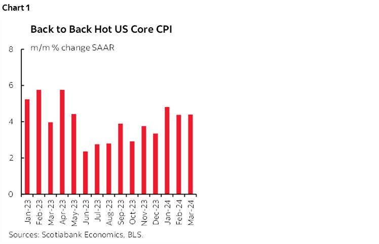
Chart 2 shows that it wasn’t core goods that drove it. CPI goods ex-food and energy was down by –0.2% m/m SA which extends a generally soft pattern.
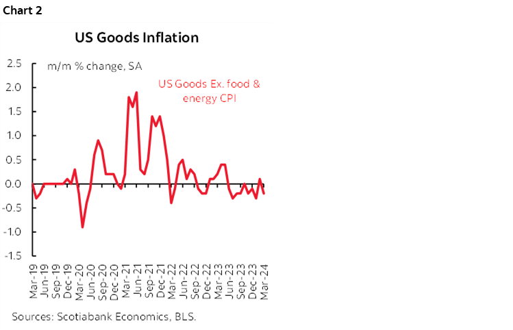
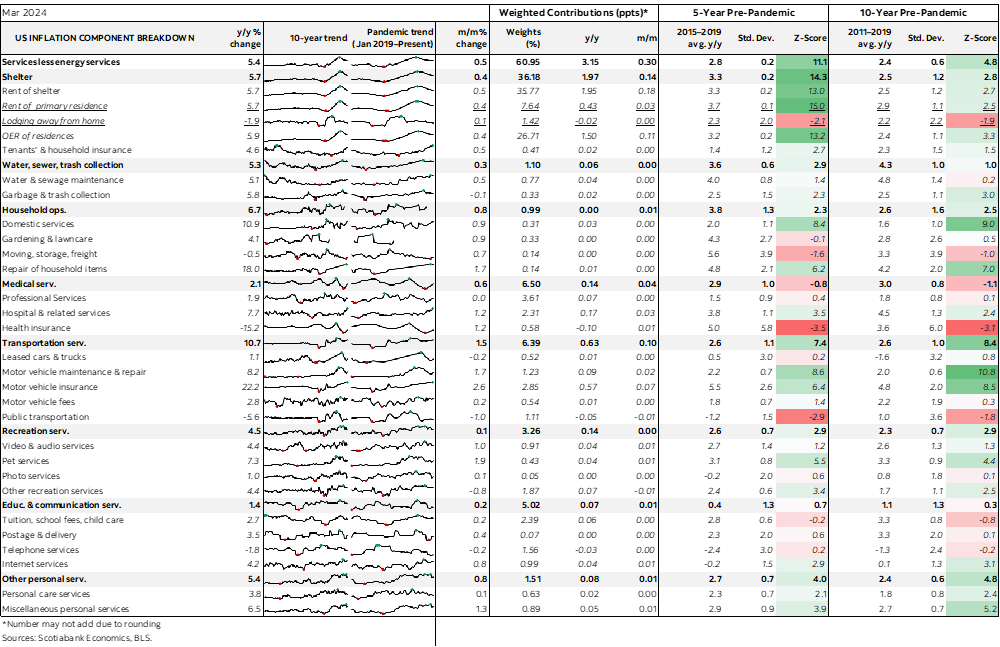
Chart 3 shows where the heat came from. Core services CPI (ex-energy services and housing) was up by 0.65% m/m SA. That follows prints of 0.5% in February and 0.85% in January.
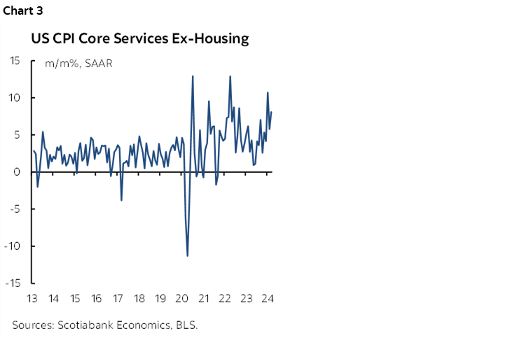
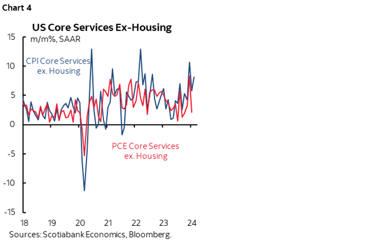
Chart 4 speaks to the possibility that this could flow through to the Fed’s preferred core PCE gauge when it comes out on April 26th. CPI core services is more volatile than PCE core services but PCE core services might have some catching up to do given the general correlation between the gauges. PCE core services was much softer in February than CPI core services which presents a weak jumping off point.
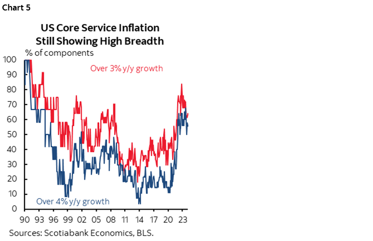
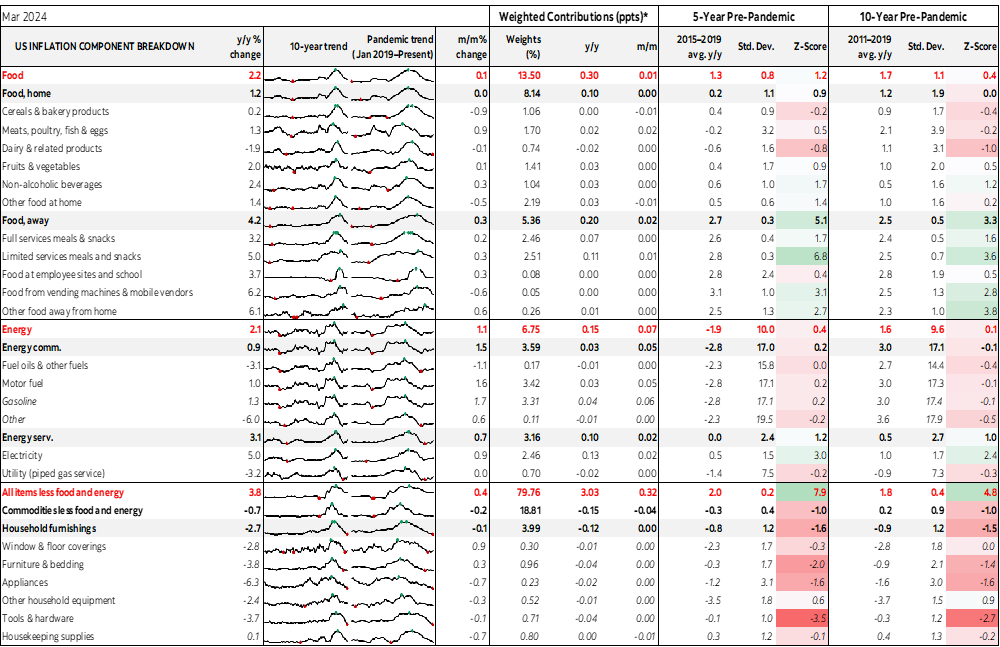
There was also substantial breadth to the CPI figures as indicated by chart 5.
Headline CPI matched core CPI because of little variation in gasoline and food prices especially in terms of weighted contributions to the overall change in CPI.
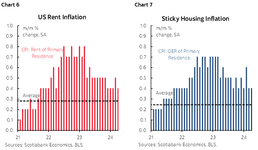
Shelter inflation remained hot (charts 6, 7).
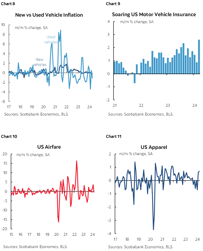
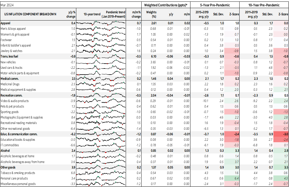
Transportation categories were not big drivers except for a large jump in auto insurance (charts 8–10). Clothing jumped which may be a warning to Canada after its soft readings (chart 11).
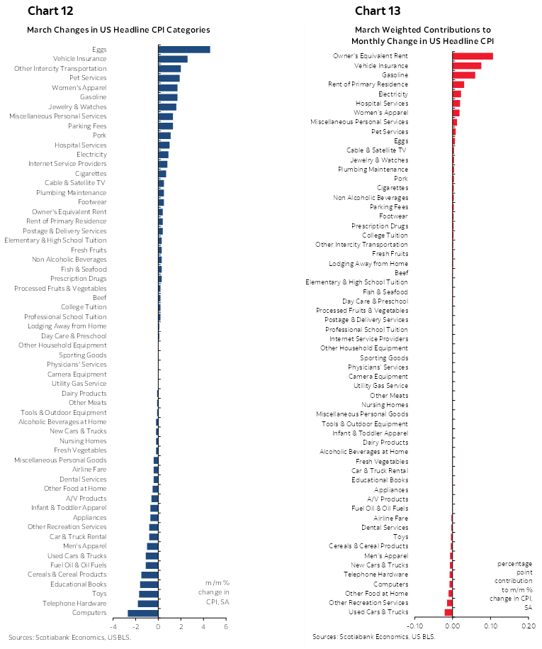
Also see the basket break down in m/m unweighted terms (chart 12) and in terms of weighted contributions (chart 13).
Please also see the full table at the back of this publication for more detail including micro-charts and z-score measures of deviations from trend.
As for the BoC, they’re even less likely to turn dovish now given the risk of totally unmooring CAD with the Fed being pushed down and out.
DISCLAIMER
This report has been prepared by Scotiabank Economics as a resource for the clients of Scotiabank. Opinions, estimates and projections contained herein are our own as of the date hereof and are subject to change without notice. The information and opinions contained herein have been compiled or arrived at from sources believed reliable but no representation or warranty, express or implied, is made as to their accuracy or completeness. Neither Scotiabank nor any of its officers, directors, partners, employees or affiliates accepts any liability whatsoever for any direct or consequential loss arising from any use of this report or its contents.
These reports are provided to you for informational purposes only. This report is not, and is not constructed as, an offer to sell or solicitation of any offer to buy any financial instrument, nor shall this report be construed as an opinion as to whether you should enter into any swap or trading strategy involving a swap or any other transaction. The information contained in this report is not intended to be, and does not constitute, a recommendation of a swap or trading strategy involving a swap within the meaning of U.S. Commodity Futures Trading Commission Regulation 23.434 and Appendix A thereto. This material is not intended to be individually tailored to your needs or characteristics and should not be viewed as a “call to action” or suggestion that you enter into a swap or trading strategy involving a swap or any other transaction. Scotiabank may engage in transactions in a manner inconsistent with the views discussed this report and may have positions, or be in the process of acquiring or disposing of positions, referred to in this report.
Scotiabank, its affiliates and any of their respective officers, directors and employees may from time to time take positions in currencies, act as managers, co-managers or underwriters of a public offering or act as principals or agents, deal in, own or act as market makers or advisors, brokers or commercial and/or investment bankers in relation to securities or related derivatives. As a result of these actions, Scotiabank may receive remuneration. All Scotiabank products and services are subject to the terms of applicable agreements and local regulations. Officers, directors and employees of Scotiabank and its affiliates may serve as directors of corporations.
Any securities discussed in this report may not be suitable for all investors. Scotiabank recommends that investors independently evaluate any issuer and security discussed in this report, and consult with any advisors they deem necessary prior to making any investment.
This report and all information, opinions and conclusions contained in it are protected by copyright. This information may not be reproduced without the prior express written consent of Scotiabank.
™ Trademark of The Bank of Nova Scotia. Used under license, where applicable.
Scotiabank, together with “Global Banking and Markets”, is a marketing name for the global corporate and investment banking and capital markets businesses of The Bank of Nova Scotia and certain of its affiliates in the countries where they operate, including; Scotiabank Europe plc; Scotiabank (Ireland) Designated Activity Company; Scotiabank Inverlat S.A., Institución de Banca Múltiple, Grupo Financiero Scotiabank Inverlat, Scotia Inverlat Casa de Bolsa, S.A. de C.V., Grupo Financiero Scotiabank Inverlat, Scotia Inverlat Derivados S.A. de C.V. – all members of the Scotiabank group and authorized users of the Scotiabank mark. The Bank of Nova Scotia is incorporated in Canada with limited liability and is authorised and regulated by the Office of the Superintendent of Financial Institutions Canada. The Bank of Nova Scotia is authorized by the UK Prudential Regulation Authority and is subject to regulation by the UK Financial Conduct Authority and limited regulation by the UK Prudential Regulation Authority. Details about the extent of The Bank of Nova Scotia's regulation by the UK Prudential Regulation Authority are available from us on request. Scotiabank Europe plc is authorized by the UK Prudential Regulation Authority and regulated by the UK Financial Conduct Authority and the UK Prudential Regulation Authority.
Scotiabank Inverlat, S.A., Scotia Inverlat Casa de Bolsa, S.A. de C.V, Grupo Financiero Scotiabank Inverlat, and Scotia Inverlat Derivados, S.A. de C.V., are each authorized and regulated by the Mexican financial authorities.
Not all products and services are offered in all jurisdictions. Services described are available in jurisdictions where permitted by law.